BRANDING, 2024
Animal
allies society
allies society
Animal Allies Society is a Greece-based NGO committed to raising awareness about the plight of stray animals across the country. Their mission is to shed light on the challenges faced by these vulnerable animals while working tirelessly to provide them with a safer, healthier life off the streets. By fostering a deeper understanding of animal welfare issues, Animal Allies Society encourages compassionate action and strives to create lasting change for Greece's stray animals through rescue, rehabilitation, and advocacy efforts.
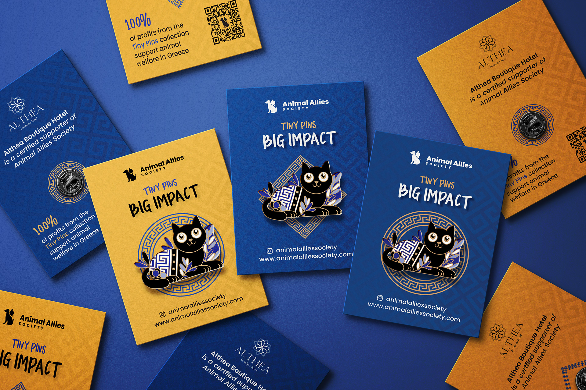
Pin packaging designs
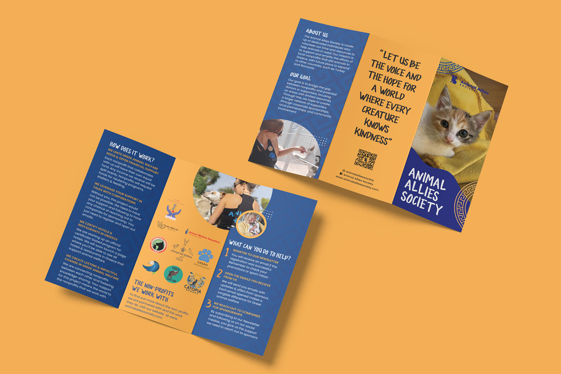
Brochure pages
BRIEF
The brief for Animal Allies Society was to redesign their branding to create a stronger, more cohesive visual identity that resonates with both potential partners—such as hotel and restaurant owners—and the broader target audience. The goal was not only to refresh the society’s look but also to create a suite of collateral materials, such as brochures, flyers, and digital assets, that could be effectively presented to business owners to garner their support for the cause. These materials were designed to communicate the mission of Animal Allies clearly, highlighting the society's impact and the mutual benefits of collaboration. At the same time, the redesign aimed to engage the target audience emotionally, using compelling visuals and messaging to encourage donations, raise awareness, and build a stronger community of animal advocates.
RESEARCH
BRANDING
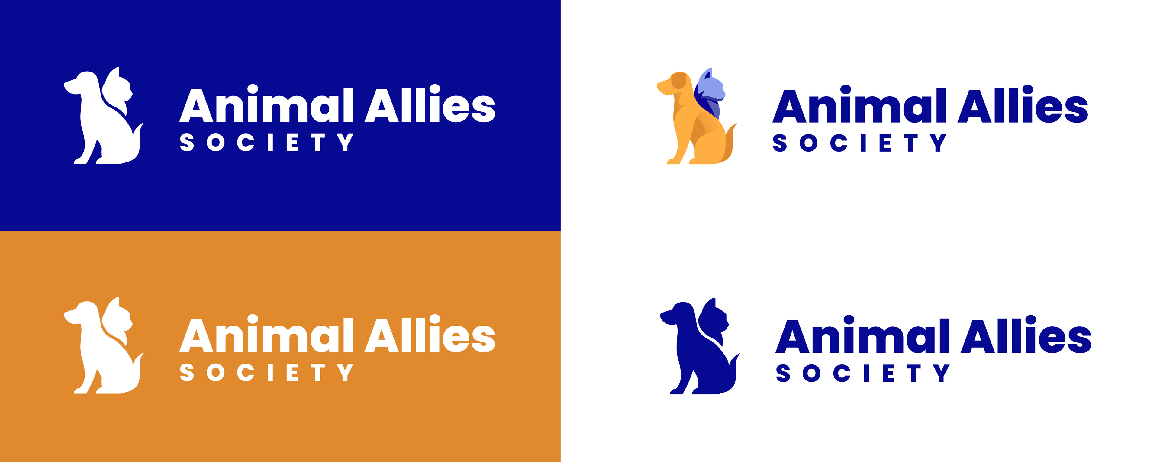
Primary logo suite
The primary logo features both a cat and dog to symbolise the animals that the NGO is focused on helping. This harmonious integration within a streamlined, illustrative design ensures a visually accessible representation, effectively communicating the organisation’s purpose to its audience. The result is a distinctive icon that not only establishes a strong and recognisable brand identity but also immediately conveys the sector in which the NGO operates. Three colour variations of the primary logo exist to be used as alternatives in instances where the original logo may not work.
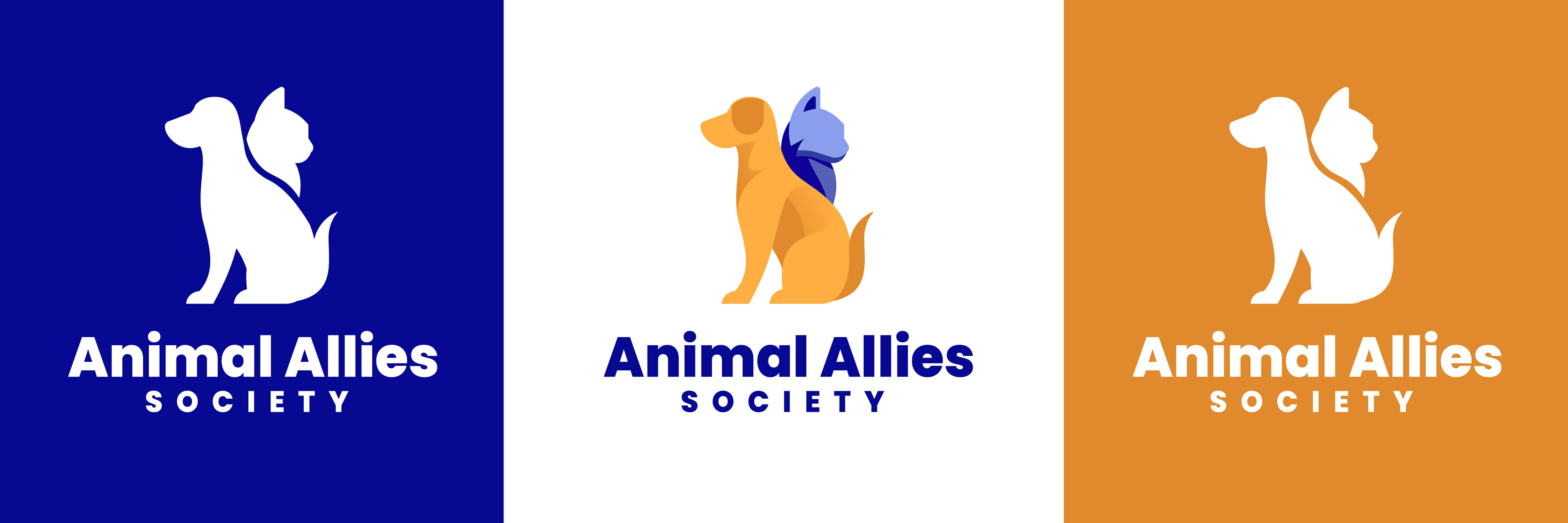
Secondary logo suite
The secondary logo consists of the same colour palette and styling as the primary logo but instead features the typography stacked underneath the illustration rather than to its side. The secondary logo has two colour variations which incorporate the white logo on either a blue or orange background, or where needed, on imagery. The white logo variations feature negative space between the dog and cat in order to distinct between the two, which is not present in the original logo.
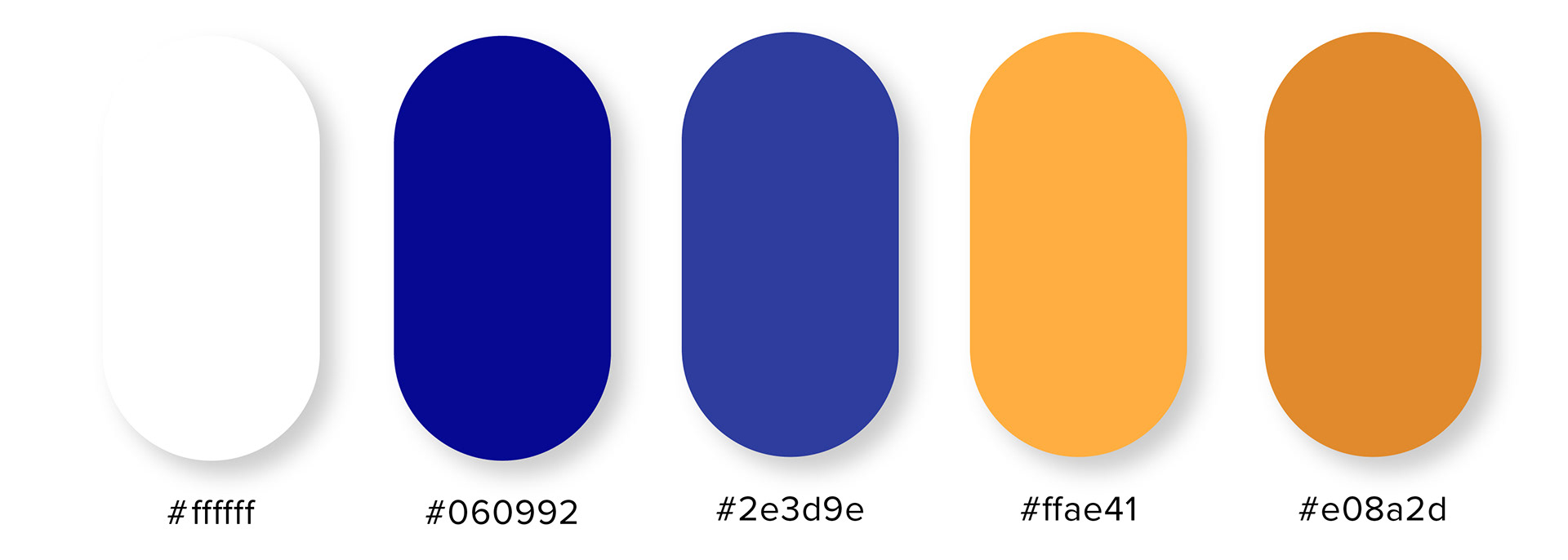
Primary colour palette

Secondary colour palette
The choice of a blue and orange colour palette is based on the principles of colour psychology in relation to the goals of the NGO. Blue symbolises trust, peace, and loyalty, while orange represents confidence, bravery, and success. This combination creates a visually striking and emotionally engaging brand identity that will resonate with the target audience, establishing a strong and memorable presence in the market, whilst also retaining some of the current brand colours. By incorporating gradients into the colour palette, the brand gains an added dimensionality and visual intrigue. Gradients can be applied to various design elements, such as backgrounds, overlays, or transitions, to create a sense of depth and movement. This dynamic use of gradients adds a modern and engaging touch to the NGO’s visual identity, contributing to a memorable and impactful brand presence.

Typefaces
The typeface family Poppins has been selected for its high legibility, clarity, and contemporary design, making it versatile across a range of formats and sizes. Poppins Semi-Bold serves as the primary typeface for body text and smaller informational content, ensuring readability in all contexts. Poppins Bold is used for main headings when the accent typeface, Ugroh Regular, is not suitable for smaller or more detailed text. Poppins Extra-Bold is applied sparingly to highlight or emphasise specific information. Ugroh Regular, the accent typeface, is reserved for larger, more prominent elements such as headings and pull quotes, adding a distinctive and sophisticated touch to key content.

Pattern
The brand patterns incorporate the core colours of the palette, creating a vibrant, cohesive aesthetic that reflects energy, warmth, and trust. These colours are complemented by a symbolic Greek pattern, widely recognised for its timeless, cultural significance. The fusion of these elements not only reinforces the brand identity but also adds a sense of global resonance, connecting the NGO’s mission to a broader, universal audience.
BRAND GUIDELINES
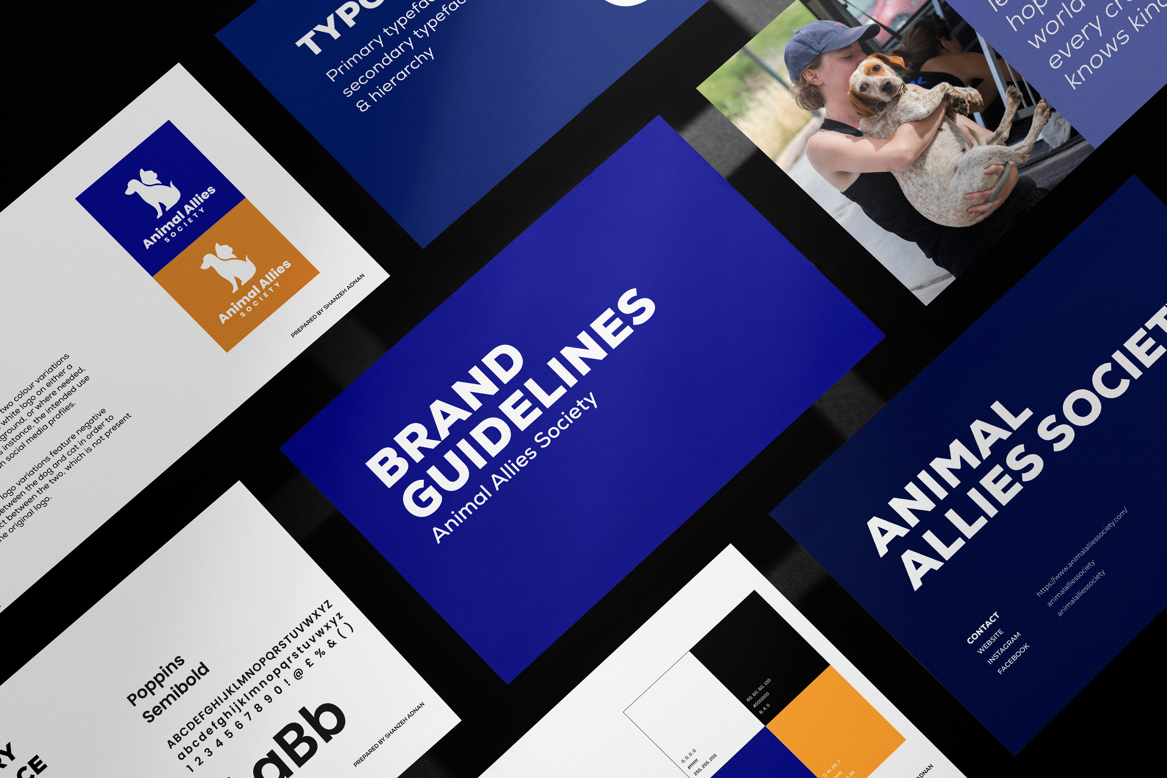
Brand guideline pages
SOCIAL MEDIA
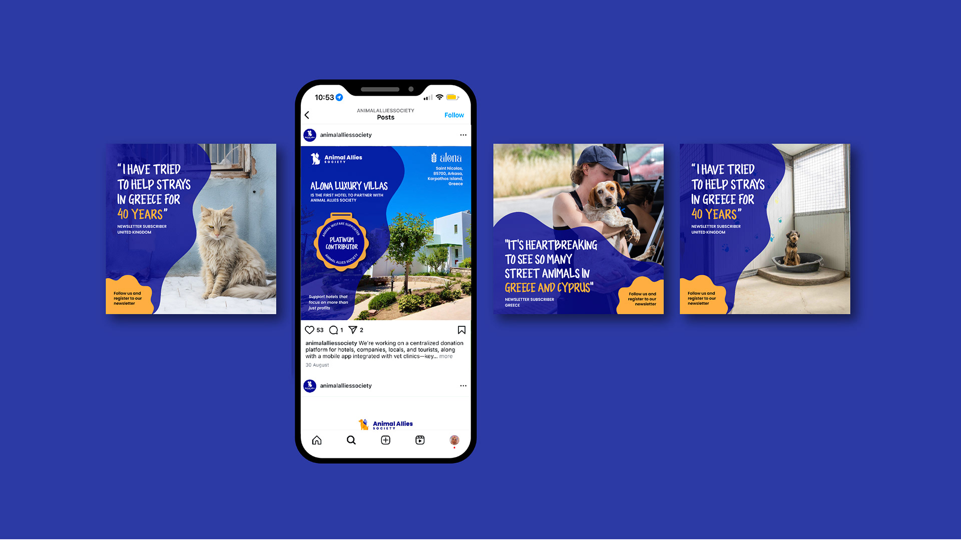
Instagram page featuring designed social media posts
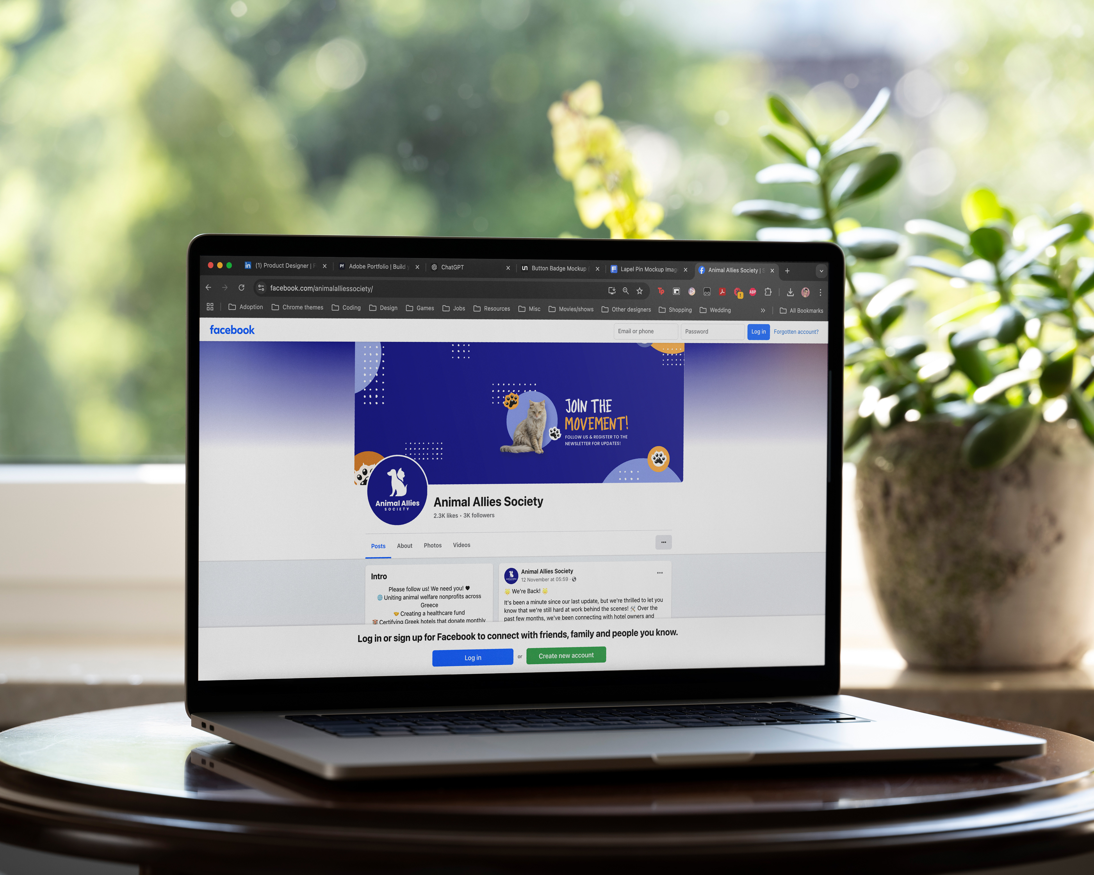
Facebook page featuring designed banner
OUTPUTS
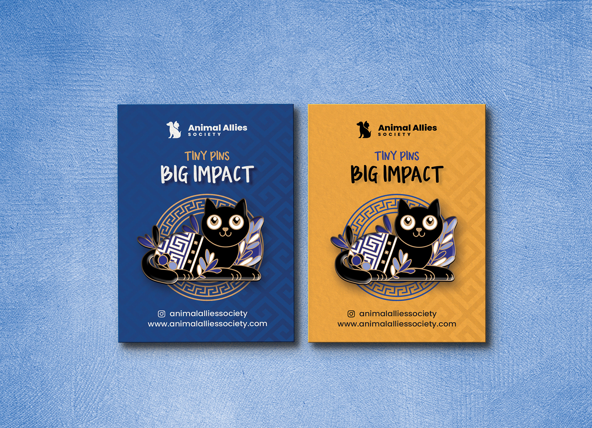
Pin packaging designs
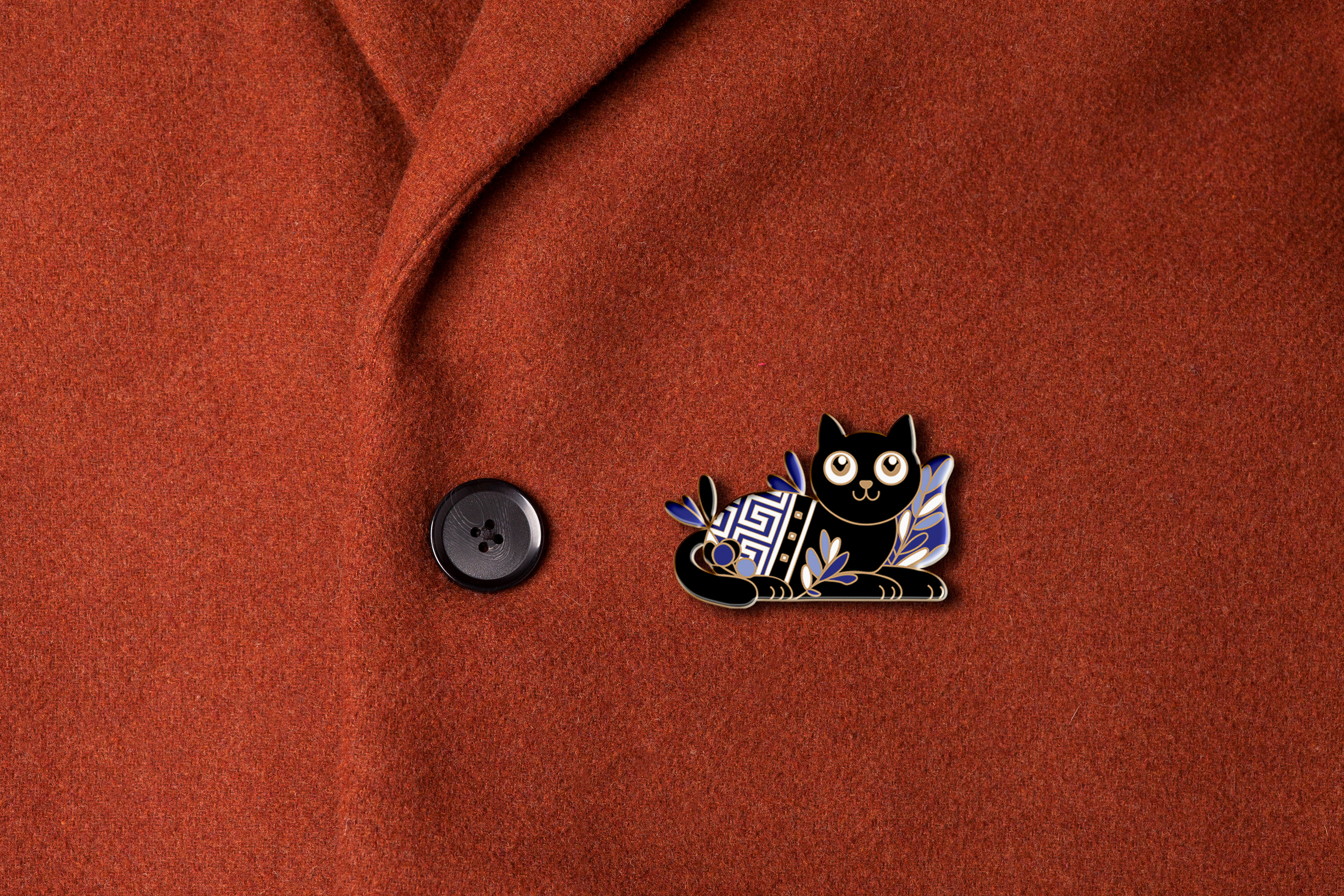
As part of the fundraising and awareness efforts, a unique set of pins were designed to be sold through the hotels partnered with AAS. This packaging not only serves as a tangible souvenir for tourists but also communicates the NGO's mission. Featuring iconic Greek symbols, the design integrates the brand’s colour palette, ensuring a cohesive and memorable experience. The pins act as both a fundraiser and a tool to raise awareness about the goals of the project, blending culture, branding, and philanthropy in one product.Additionally, a brochure to be displayed alongside the pins in the hotels was created, offering tourists and customers a deeper understanding of the NGO's mission and impact.
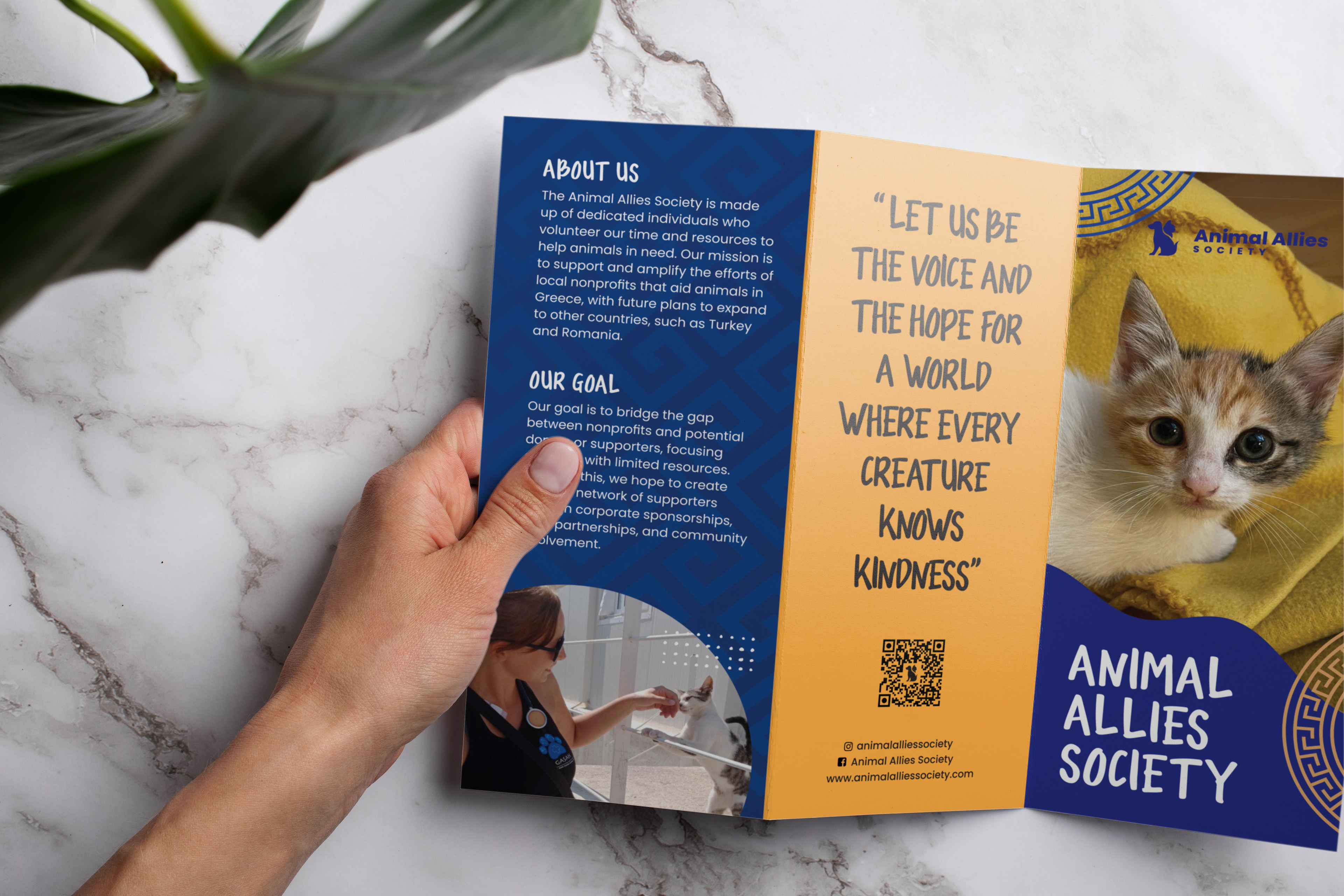
Brochure pages
The brochure design seamlessly mirrors the pin packaging, incorporating the brand’s colour palette and the same iconic Greek symbols. This cohesive visual identity ensures that the brochure not only provides valuable information but also reinforces the branding, making it an accessible and engaging resource for those interested in learning more about the work and goals.
