infographics, 2020
bame behind bars
bame behind bars
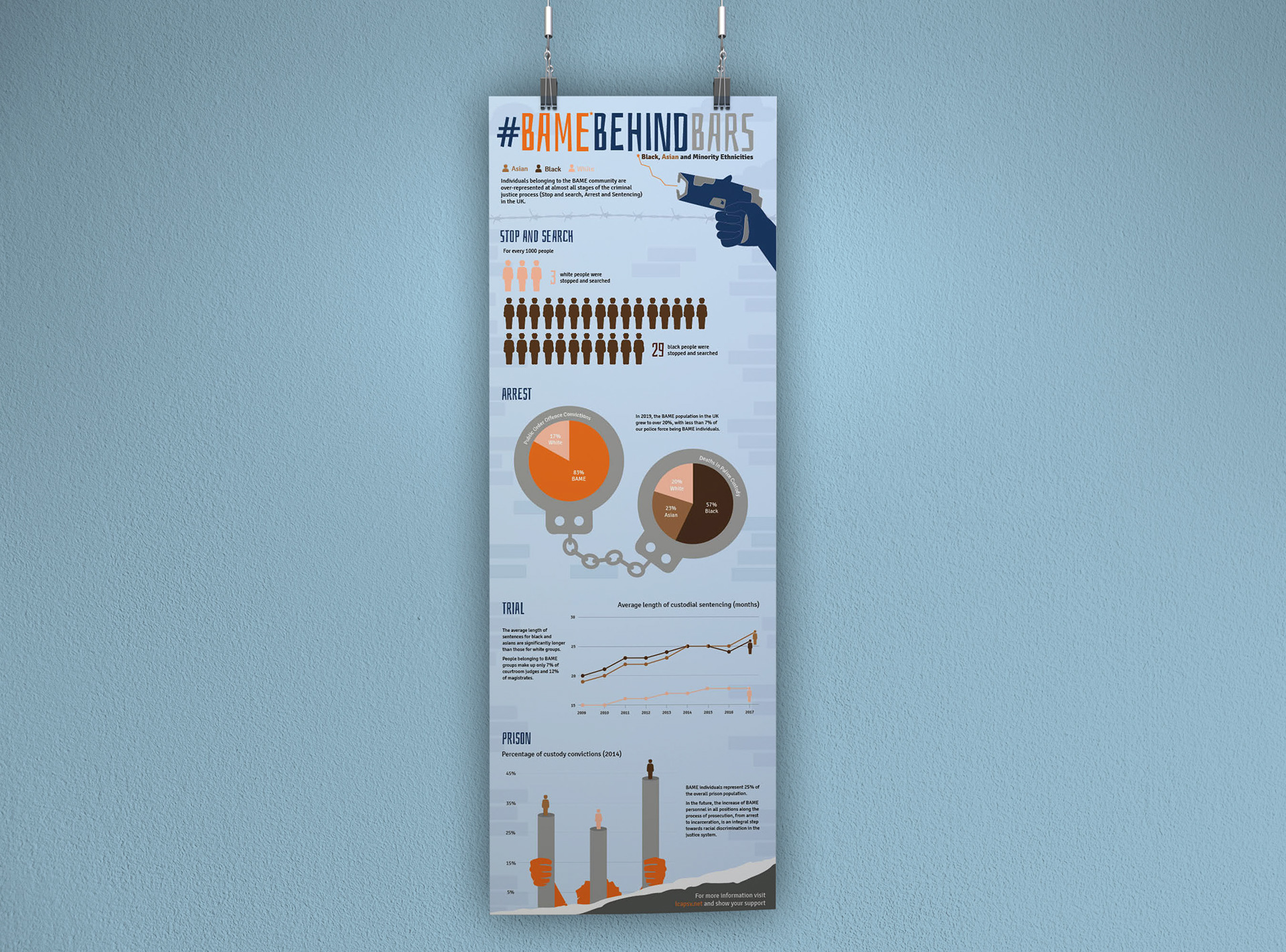
The objective of this project was to develop an informative infographic poster that sheds light on a pressing global issue pertinent to the 21st century. Collaborating with a group of three other designers, our focus centred around the topic of ‘BAME Behind Bars,’ highlighting the racial inequalities present within the Criminal Justice System. Through our work, we aimed to raise awareness among audiences regarding the pervasive disparities that persist in society even today.

Infographic poster
The design inspiration for this project was derived from a comprehensive study of various successful infographic mediums, including posters, animations, and brochures. This analysis enabled us to identify the most effective elements that resonated with audiences. Subsequently, extensive research was conducted and analysis of diverse datasets, which formed the foundation for the compelling narrative depicted in the poster. The primary objective was to shed light on the persisting racial discrimination faced by ethnic minorities within the criminal justice system. Through a visual journey portrayed in the infographics, the experiences of an individual from the BAME community were highlighted, starting from being subjected to stop and search at the top of the poster, to facing incarceration at the bottom.
BRIEF
The brief for this project was to create an infographics poster and an accompanying video focused on an important environmental or social issue. The chosen topic explored the disparities in prison rates among BAME (Black, Asian, and Minority Ethnic) communities. The goal was to present complex and sensitive data in a clear, engaging, and respectful way that raises awareness and encourages thoughtful reflection. The infographic needed to visually communicate key statistics and insights, while the video complemented this by telling a compelling story through motion graphics and narration. Both deliverables aimed to educate a broad audience, making the issue accessible without sacrificing depth or nuance, and fostering greater understanding of the social challenges faced by these communities.
BRANDING

The colour palette for this project predominantly features blues and oranges, reflecting the traditional uniforms of officers, often represented in blue with occasional use of orange. The remaining colors were carefully selected to represent the diverse races included in the data, with each hue chosen to subtly reflect the uniqueness of each group while maintaining a cohesive and meaningful visual language. This approach allows for both clear identification and a respectful representation of the various demographic categories.

Typeface
The typeface selection for this project was intentionally chosen to enhance both visual impact and readability. Bahiana Regular, a straight and condensed typeface, was used for headings and key elements, providing a strong, modern aesthetic. Paired with the Signika font family for body text, the combination ensures optimal legibility, making the data easy to navigate and understand. This thoughtful pairing balances style with functionality, ensuring a clear and effective presentation of the information.
VIDEO
The animation was created as a complementary piece to the infographic poster, featuring illustrations that are consistent with the visual style of the poster. However, in contrast to the poster's focus on illustrations and data, the animation combines these elements with real-world footage depicting instances of racial injustice. This deliberate choice was made to amplify the impact of the message, drawing greater attention to the issue and emphasising the gravity of the ongoing racial injustices. By incorporating real-world footage, the animation provides a tangible representation of the subject matter, effectively highlighting the urgent need for addressing and confronting these systemic challenges.
