marketing, 2022
Watchshop
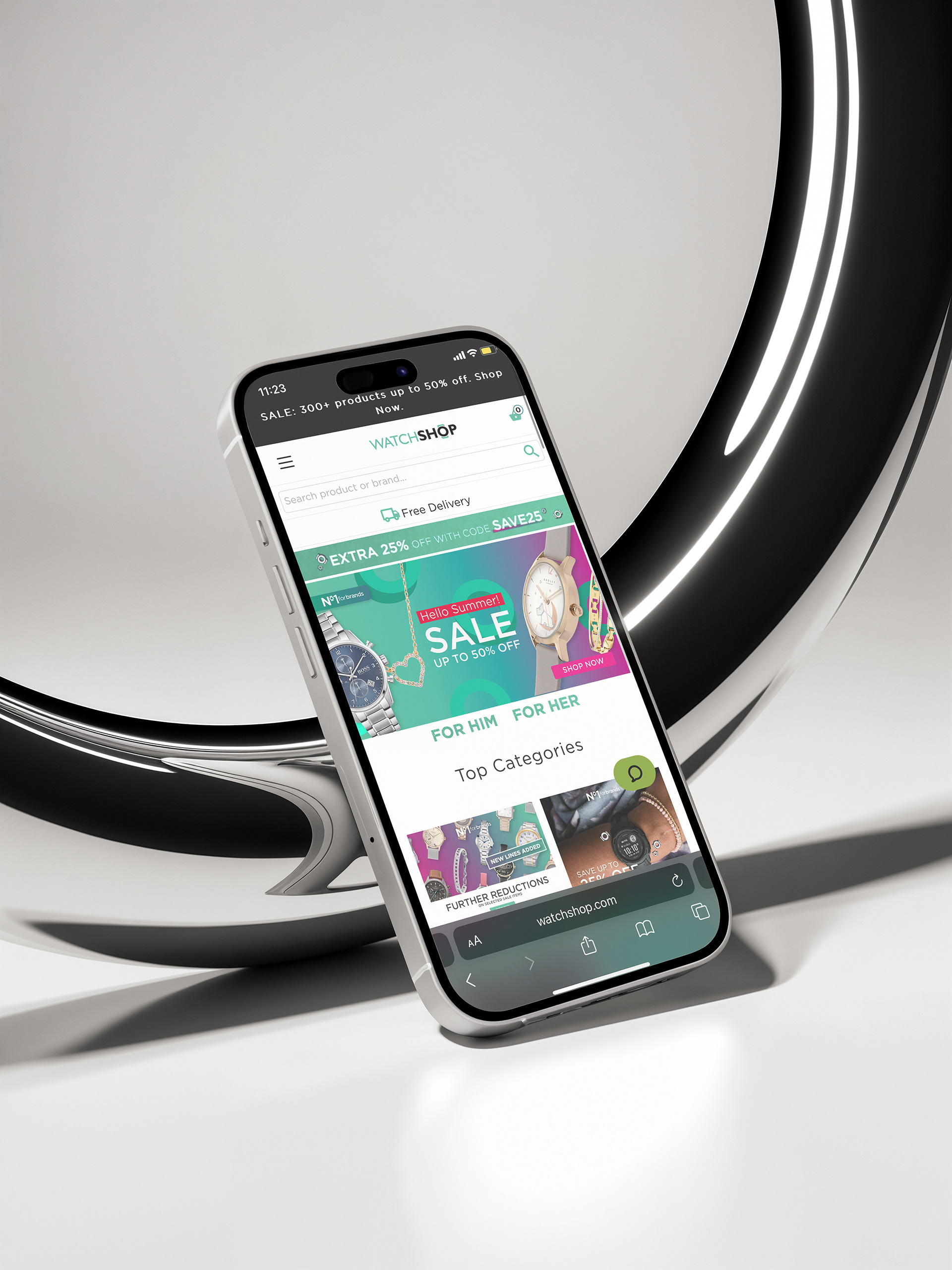
This was a marketing design project created for The WatchShop, an online retail company specialising in watches. This focused on designing visual assets for their new sale campaign, including homepage banners and social media creatives. The goal was to produce eye-catching, on-brand designs that would drive engagement and promote key promotional messages across digital platforms.

BRIEF
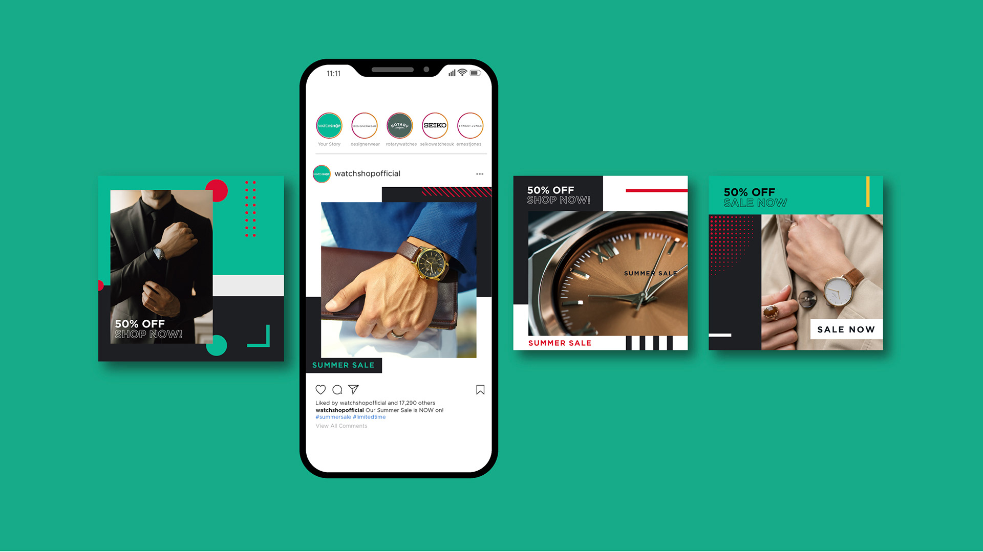
The brief was to create a set of marketing assets for social media to support The WatchShop’s new sale campaign. The designs needed to highlight their product range—primarily watches and accessories—while maintaining a strong visual emphasis on the brand’s signature green. The aim was to create engaging, on-brand visuals that would capture attention and drive traffic during the promotional period.
RESEARCH
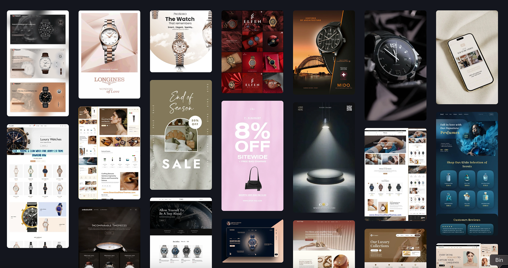
Moodboard
The moodboard draws inspiration from a range of jewellery retailers and watch brand websites to better understand current trends and common marketing strategies within the industry. By analysing how these brands highlight products, use typography, colour, and layout, the goal was to identify what visual elements are most effective in capturing customer attention and driving engagement. This helped inform the design direction and ensure the campaign assets aligned with both industry standards and The WatchShop’s brand identity.
BRANDING

Colour palette
The colour palette is centred around a vibrant green, complemented by subtle accents of red and pink. Green serves as the dominant brand colour, symbolising growth, freshness, and balance—reflecting a forward-thinking and eco-conscious identity. The red accents inject moments of boldness and energy, adding contrast and drawing attention to key elements. Pink introduces a softer, more playful touch, creating a sense of approachability and warmth. Together, these colours form a dynamic yet harmonious visual language that captures both the vitality and human side of the brand.
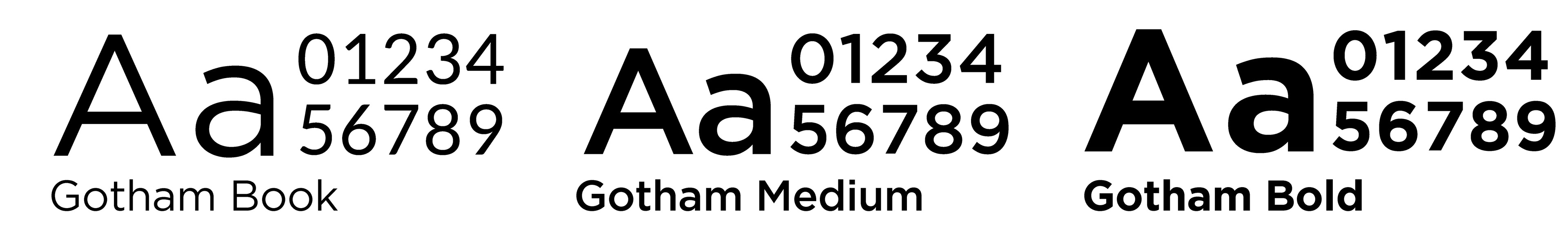
Typeface
The typeface used is Gotham, a modern, clean, and highly legible font that aligns seamlessly with the brand’s visual identity. Its geometric structure and bold presence reflect confidence, clarity, and professionalism—qualities that underpin the brand's tone. Gotham is consistently used across the website and brand assets, ensuring visual cohesion and reinforcing brand recognition at every touchpoint. Its versatility makes it suitable for both headlines and body text, maintaining a strong and unified look throughout all communications.
SOCIAL MEDIA