EDITORIAL, 2022
COSMOS
Cosmos is a magazine which centres around Marvel characters, comics and movies, informing audiences and fans about the captivating journey of the characters. The chosen tagline ‘From the Studio to the Screen’ chronicles their evolution from origins to their most recent portrayals. Each issue centres on an individual character from the Marvel universe, showcasing enthralling comic pages, exclusive interviews, striking movie stills, comprehensive reviews, and listings.
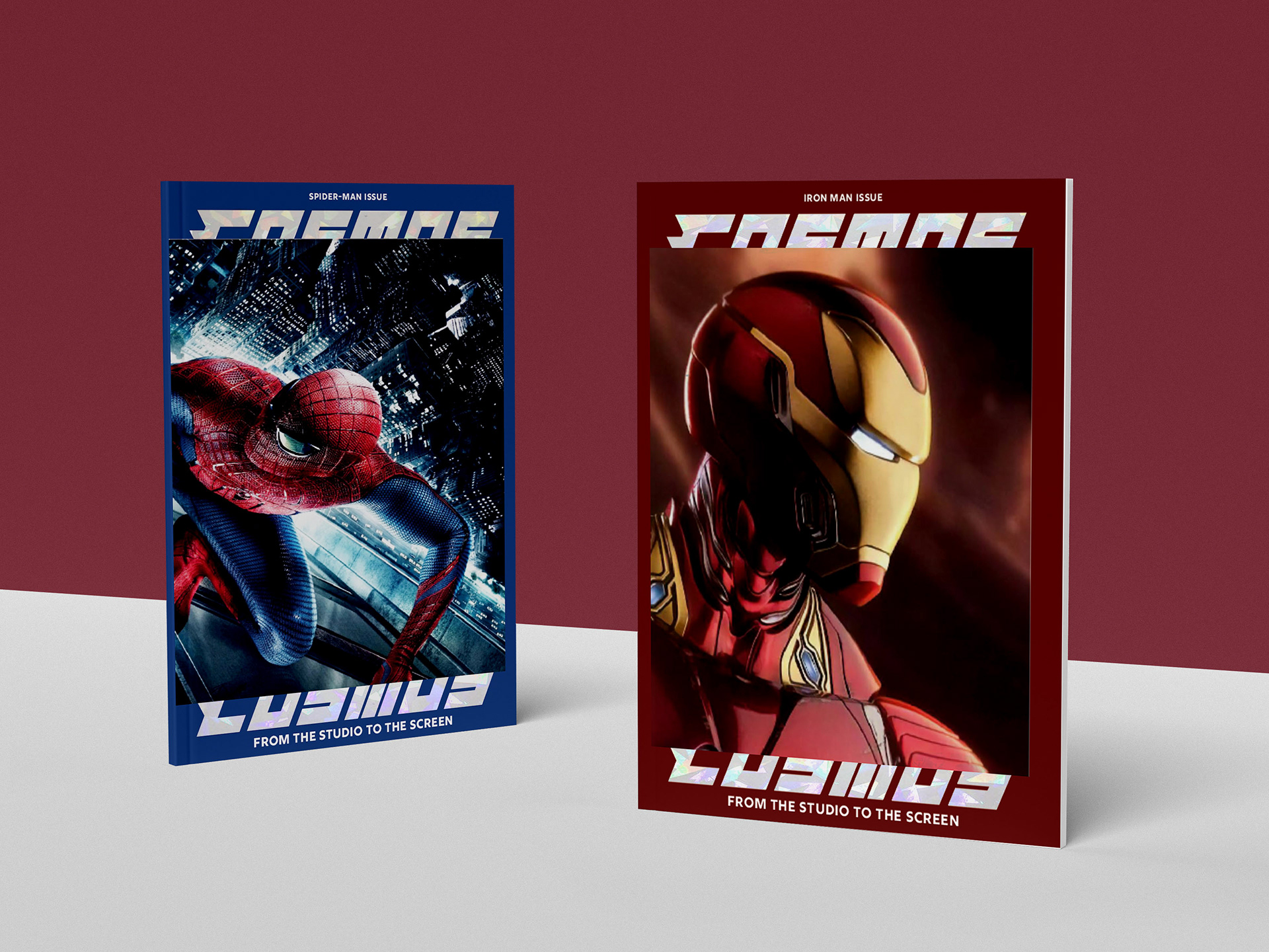
Series covers
BRIEF
The brief for this project was to create a branded series of magazines with a clear, cohesive identity that effectively communicates the brand’s values and vision. Each magazine was designed with a distinct topic in mind, ensuring that the content was both relevant and engaging for its specific audience. The goal was to establish a strong, recognisable brand across all editions, making each issue immediately identifiable while also maintaining consistency in design and messaging.
RESEARCH

The moodboard for this project draws inspiration from existing niche magazines like Eye Magazine and Little White Lies, both of which are renowned for their unique design sensibilities and distinct target audiences. These magazines were chosen for their ability to blend creative layouts, bold typography, and striking imagery in a way that resonates deeply with their respective readers. The moodboard also explores various page spread layouts and typographic treatments, ensuring that the design evokes a similar sense of character and editorial style. By taking cues from these publications, the aim was to develop a visually engaging experience that speaks directly to a specific audience, while maintaining a high level of creative and design integrity across all pages.
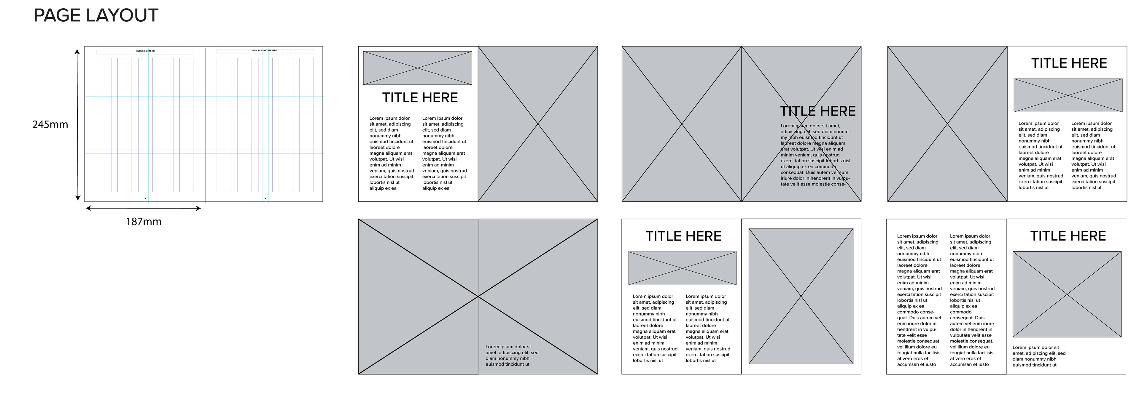
Cosmos maintains a concise yet comprehensive format, with approximately 70–75 pages per issue, released on a quarterly basis. With a mindful approach to size, the magazine strikes a balance that ensures an engaging reading experience without overwhelming its audience. Given the vast wealth of information spanning several years, the decision was made to cap each issue at 75 pages, guaranteeing both enjoyment and ease of reading for users.
BRANDING

The core branding of Cosmos predominantly revolves around a captivating combination of white and black, while the cover colour varies depending on the image featured. The online presence and websites also adhere to the distinct monochrome palette, which effectively distinguishes Cosmos' overall branding from the individual colour schemes used in each issue. As for the inside pages, a vibrant array of shades including blue, purple, orange, yellow, and red are employed. This deliberate use of multiple colours aligns with the vibrant and vivid appearances of Marvel characters, allowing the magazine to authentically reflect their brightly dressed and coloured nature within its pages.

Logo suite
Prior to delving into content research for the magazine, careful consideration was given to the title, masthead, and tagline. This involved addressing fundamental questions about the magazine's purpose, as well as identifying the target audience. By gaining clarity on these aspects, it became possible to envision the trajectory of each issue and determine the most suitable branding direction. Multiple potential name options were explored, alongside the creation of various taglines, which were then visually represented using different typefaces. This process facilitated a visualisation of the options and aided in determining the most effective choices.

For this project, Hindsight was chosen as the display typeface for larger titles and magazine covers due to its bold, recognisable design and its subtle resemblance to the iconic typography often associated with superhero comics. This sense of strength and visual impact was essential for creating a dynamic and engaging first impression. For smaller headers, taglines, and dates, the Rig Shaded family was used, offering excellent legibility with its clean, structured forms. Finally, Soleil Regular was selected for body text, ensuring readability and a smooth flow for longer content, balancing the stronger display elements with a more approachable, neutral style. Together, these typefaces provide a cohesive yet dynamic typographic experience.
SOCIAL MEDIA
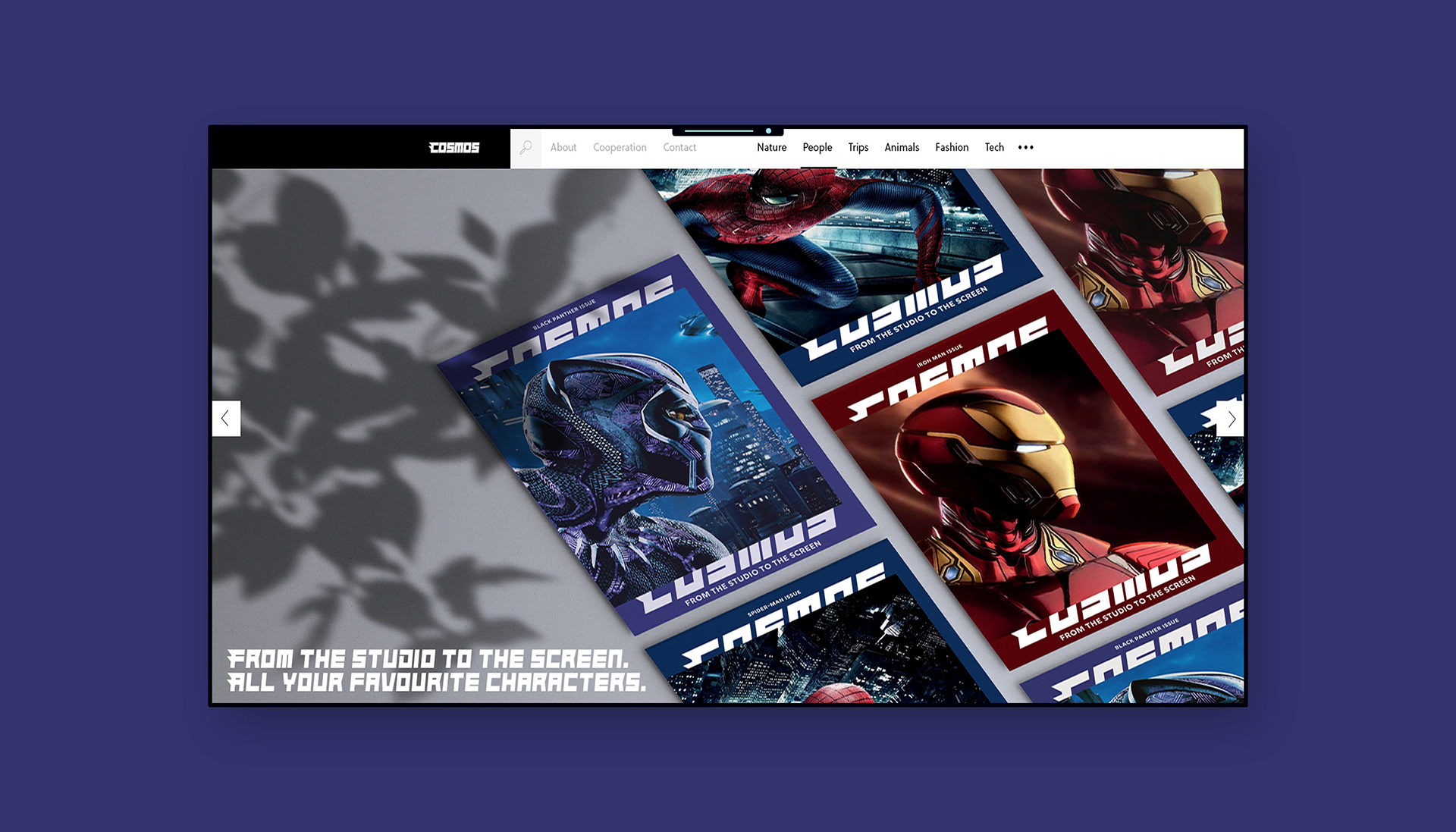
Cosmos website
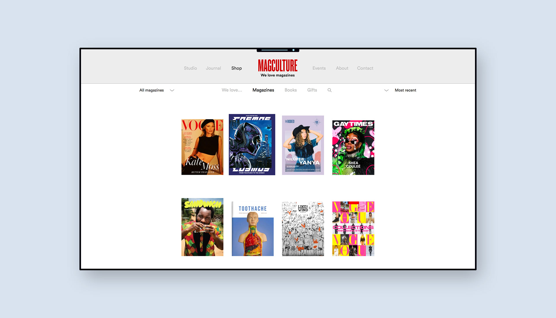
Magculture website
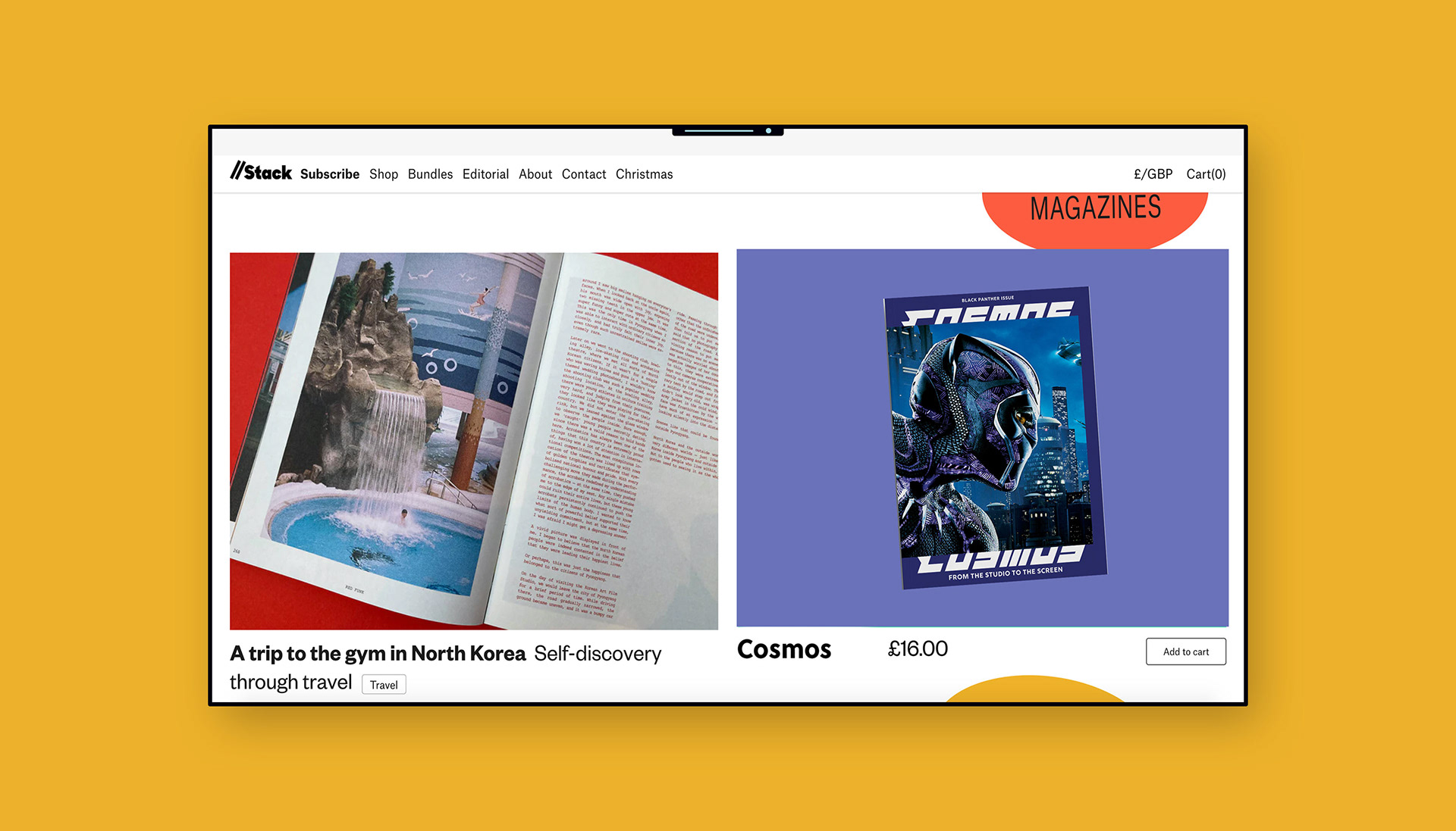
Stack website
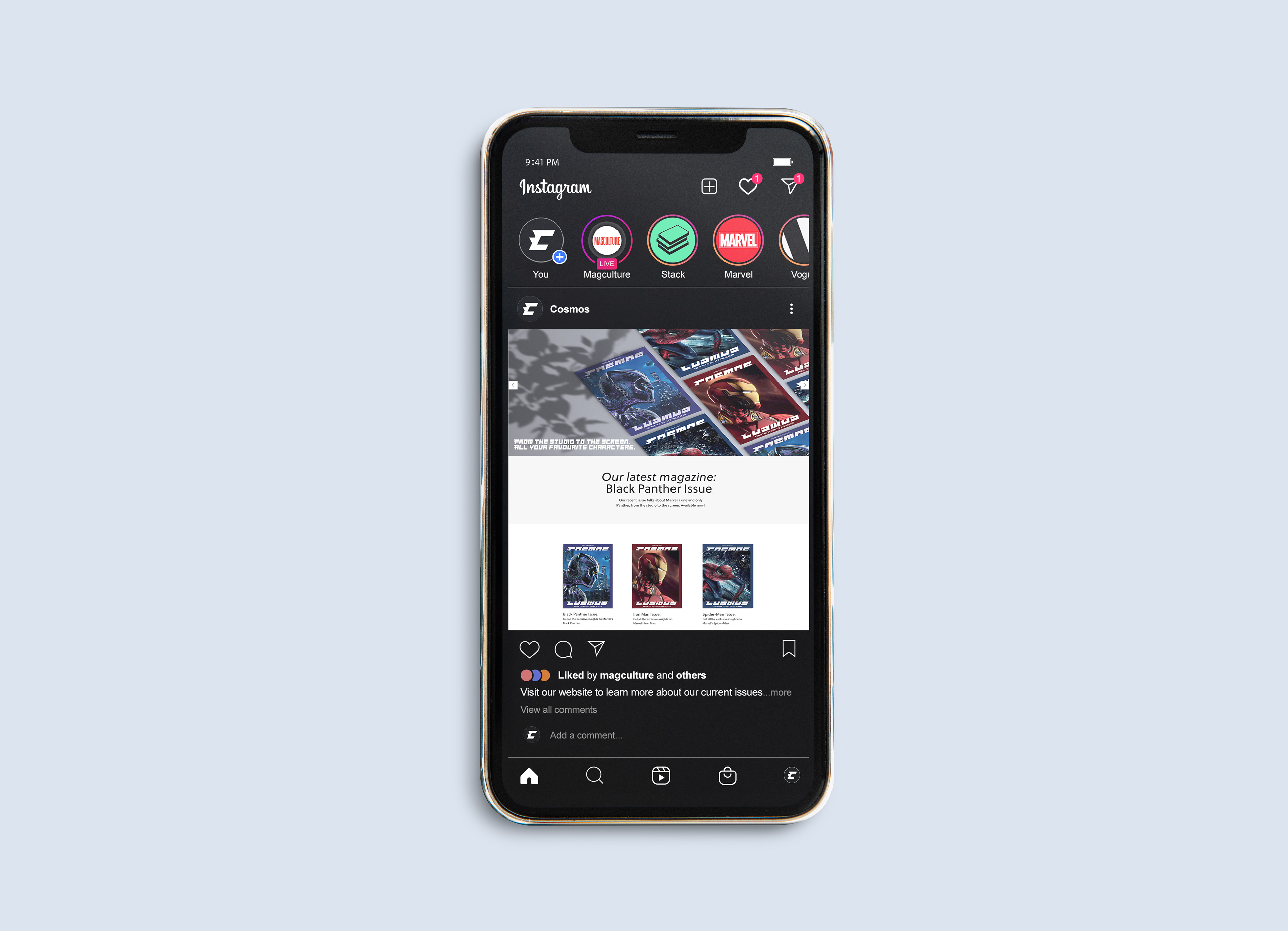
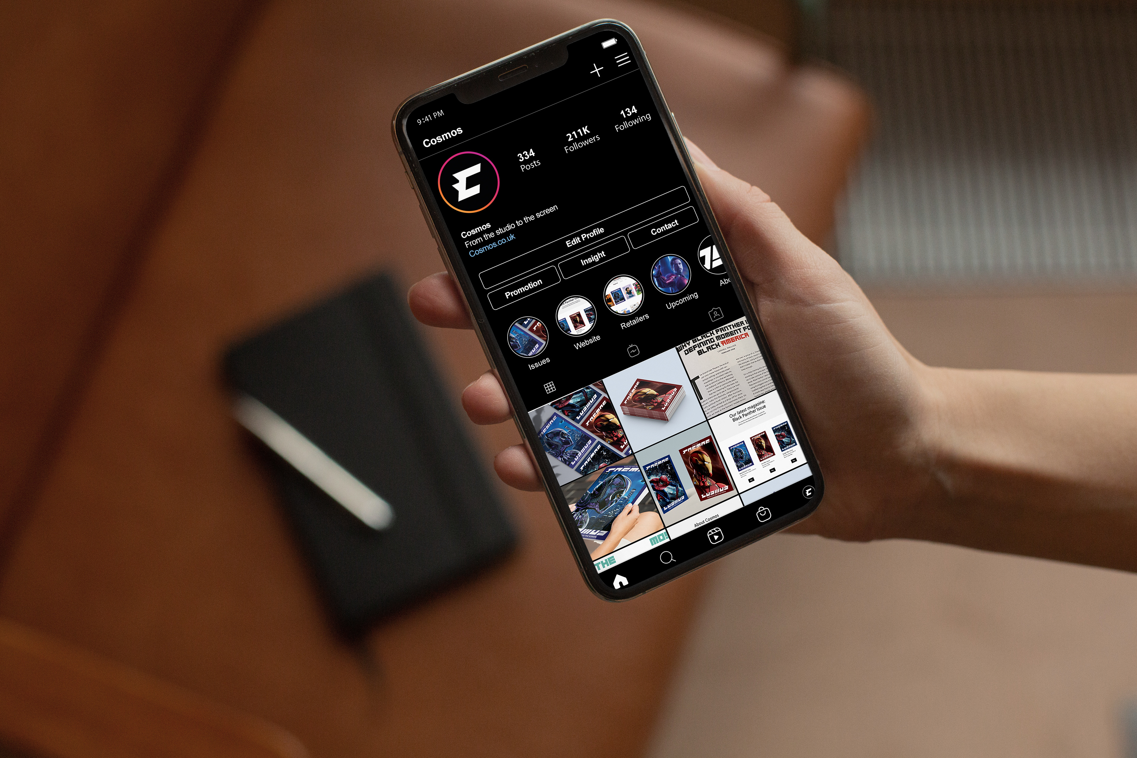
To complement the magazine, an online presence was established to showcase the advertising approach for each issue to target audiences. Additionally, visuals depicting the promotion of Cosmos on various retailers like Stack and Magculture were created.
OUTPUTS
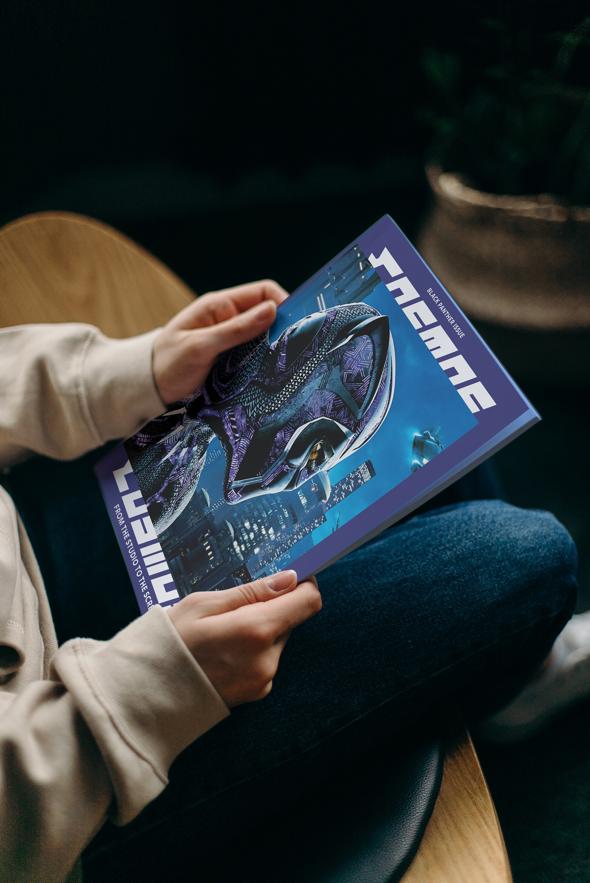
Front cover
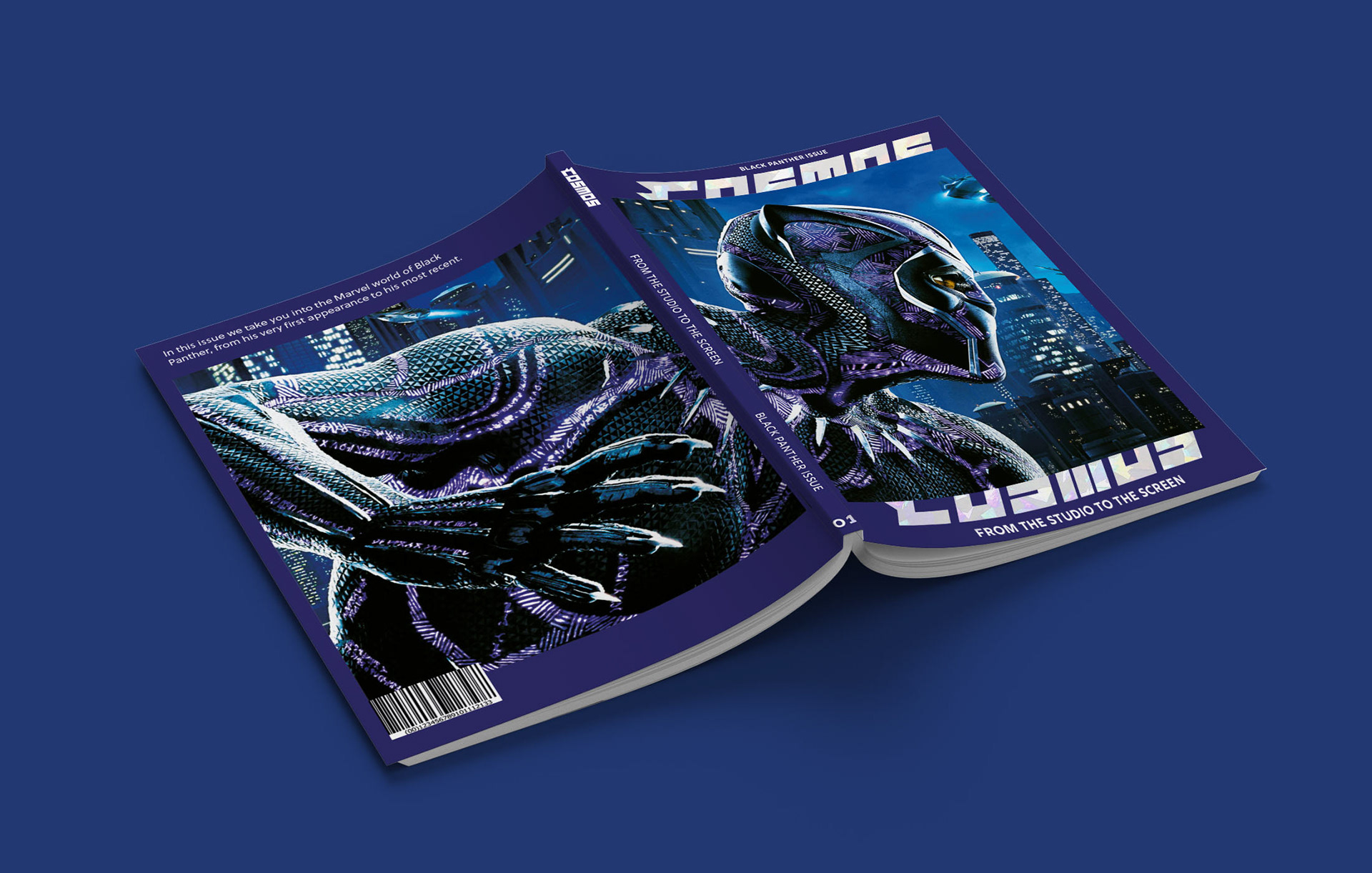
Full cover design
To maximise the cover's impact, it was decided that utilising a shattered-glass print finish on the masthead using vinyl would be beneficial. This choice was made because the pattern aligns with the character's costume on the cover and additionally serves as a background on certain inside pages.
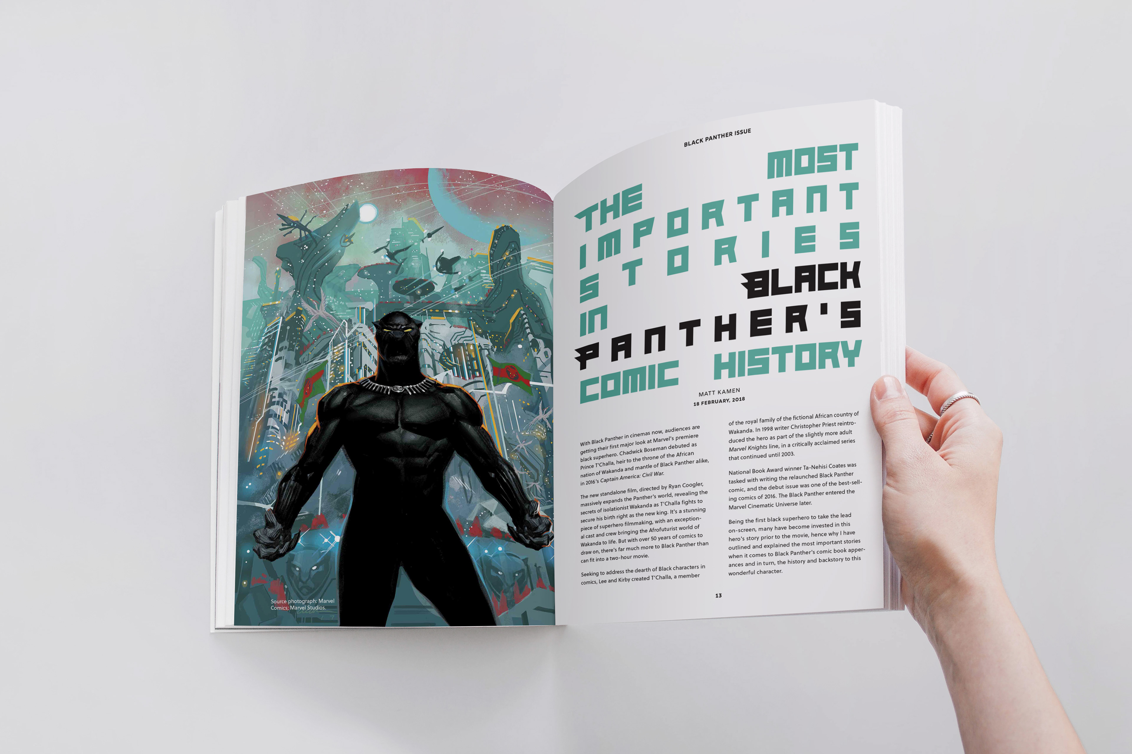
Example of inside pages
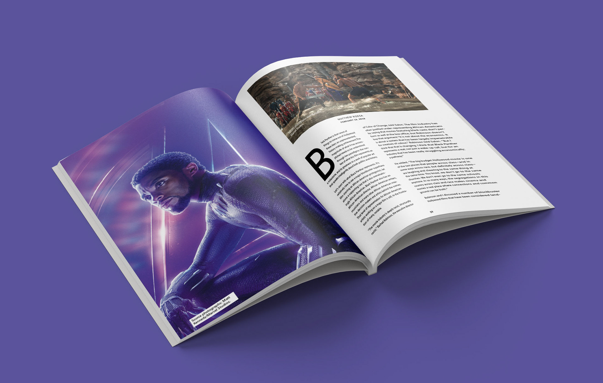
Example of inside pages
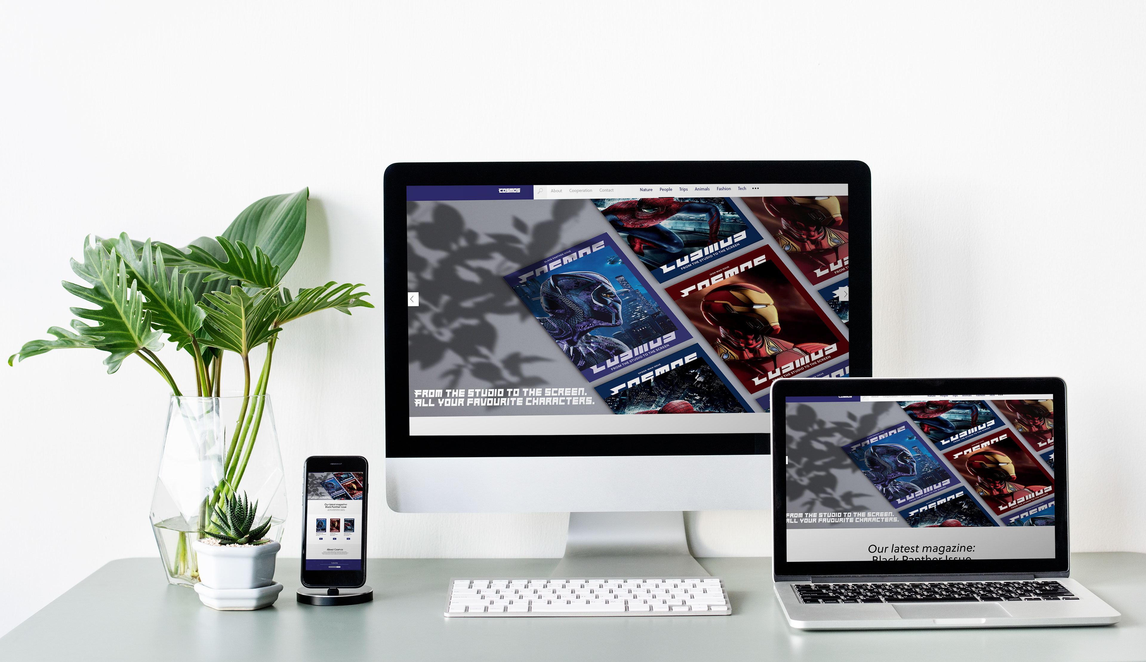
Cosmos website
