
PRODUCT (UX/UI), 2022
DATA VISUALISATION
DATA VISUALISATION
This project explores how COVID-19 data can be visualised in a way that improves public understanding, reduces misinterpretation, and supports faster insight generation. During the pandemic, large volumes of data were presented through dashboards and charts, but many users struggled to interpret trends, compare regions, and understand the real implications of the data.
Data visualisation became a key tool for communicating complex information, particularly through dashboards that combine multiple data types into glanceable views. This project focuses on designing a clear, accessible data visualisation experience that simplifies complex datasets into intuitive, user-friendly insights. View the general audience and experts audience data visualisations.
Data visualisation screens designed to present key task insights and progress clearly, enabling quick understanding and decision-making in time-sensitive situations
BRIEF
The challenge of this project was to design two distinct data visualisation approaches using the same dataset, each tailored to a different audience. One focuses on delivering clear, accessible insights for the general public through simplified visuals and intuitive presentation, while the other provides a more detailed and data-rich experience for expert users, supporting deeper exploration and interpretation.
The goal was to maintain accuracy across both outputs while adapting the level of complexity, information hierarchy, and visual structure to suit the needs, expectations, and behaviours of each audience.
Focus: Data visualisation, information design, usability
Tools: Figma
PROBLEM STATEMENT
COVID-19 dashboards often present large amounts of data without sufficient clarity, making it difficult for users to quickly interpret trends or draw meaningful conclusions. Users struggle with:
• understanding trends over time
• comparing regions or datasets
• interpreting visualisations correctly
• identifying what information is most important
This provides an opportunity to design a system that prioritises clarity, readability, and insight over raw data display
RESEARCH & CONTEXT
During COVID-19, data visualisation became essential for helping the public understand complex and rapidly changing information. However, poor visual design can lead to confusion or even misinformation.
KEY INSIGHTS
• Users rely heavily on visualisations to understand complex data
• Poor hierarchy leads to misinterpretation of trends
• Too many charts equals cognitive overload
• Simplicity improves comprehension significantly
Effective data visualisation is not about showing more data, but about helping users understand what matters.
USER PERSONAS

User personas representing two key audience groups, highlighting differences in data literacy, goals, and information needs to inform tailored visualisation approaches

User personas representing two key audience groups, highlighting differences in data literacy, goals, and information needs to inform tailored visualisation approaches
The two personas created for this project represent distinct user needs and expectations, guiding the design of the data visualisations. Jennie, the general audience persona, is looking for simple, accessible insights that allow her to stay informed without being bogged down by too much technical data. Her goal is to quickly grasp high-level trends that relate to her everyday life, and her aim is to have an easy-to-understand experience with minimal effort.
In contrast, Nick, the expert audience persona, seeks a deeper level of analysis, looking for detailed, actionable insights that can inform complex decisions. His goal is to explore the data at a granular level, while his aim is to interact with the visualisation in ways that allow for customisation and in-depth exploration. Understanding these personas helped shape the design of the visualisations to ensure that both audiences receive the most relevant information in a way that meets their unique needs.
DESIGN GOALS:
• Improve clarity of data presentation
• Reduce cognitive load
• Make trends easy to interpret at a glance
• Support comparison between datasets
• Avoid misleading or confusing visuals
VISUAL DIRECTION
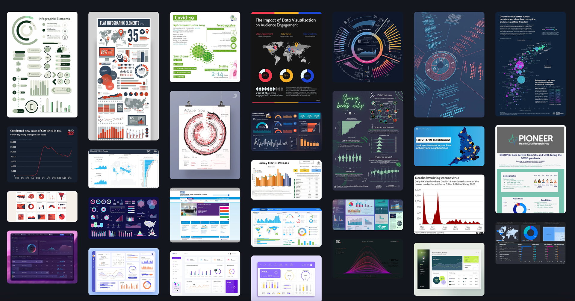
Moodboard exploring visual strategies for communicating COVID-19 data, focusing on clarity, accessibility, and easy interpretation of complex public health information
The moodboard for this project draws inspiration from a variety of data visualisations, dashboards, and long-form data presentations to create a visually compelling and informative design direction. By analysing existing examples of interactive dashboards, infographics, and data-heavy reports, the moodboard reflects how different visual styles can convey complex information in a clear, digestible way.
The influence of long-form data visualisations is also evident, with a focus on creating smooth, narrative-driven layouts that guide the viewer through detailed insights. This approach ensures that the visualisation not only presents the data effectively but also engages the audience, whether they are scanning for quick insights or diving into more granular information. The overall goal is to combine aesthetic appeal with functional clarity, offering a design that is both visually striking and easy to interpret.
The exploration phase focused on identifying the most effective ways to represent COVID-19 data, including:
• line charts for trend analysis
• bar charts for comparisons
• simplified dashboards for overview
GOOD VS BAD VISUALISATION COMPARISONS
By comparing examples of good and bad visualisations, it highlights how design choices directly impact clarity, accuracy, and user understanding. Poor visualisations often rely on cluttered layouts, misleading scales, or excessive complexity, making it difficult to interpret key insights and sometimes distorting the underlying data. In contrast, effective visualisations prioritise simplicity, clear hierarchy, and appropriate chart selection, allowing users to quickly grasp trends such as case growth, recovery rates, and regional differences. Through these comparisons, the project demonstrates how strong data visualisation is not just about presenting information, but about making complex, high-stakes data accessible, honest, and meaningful for a wide audience.
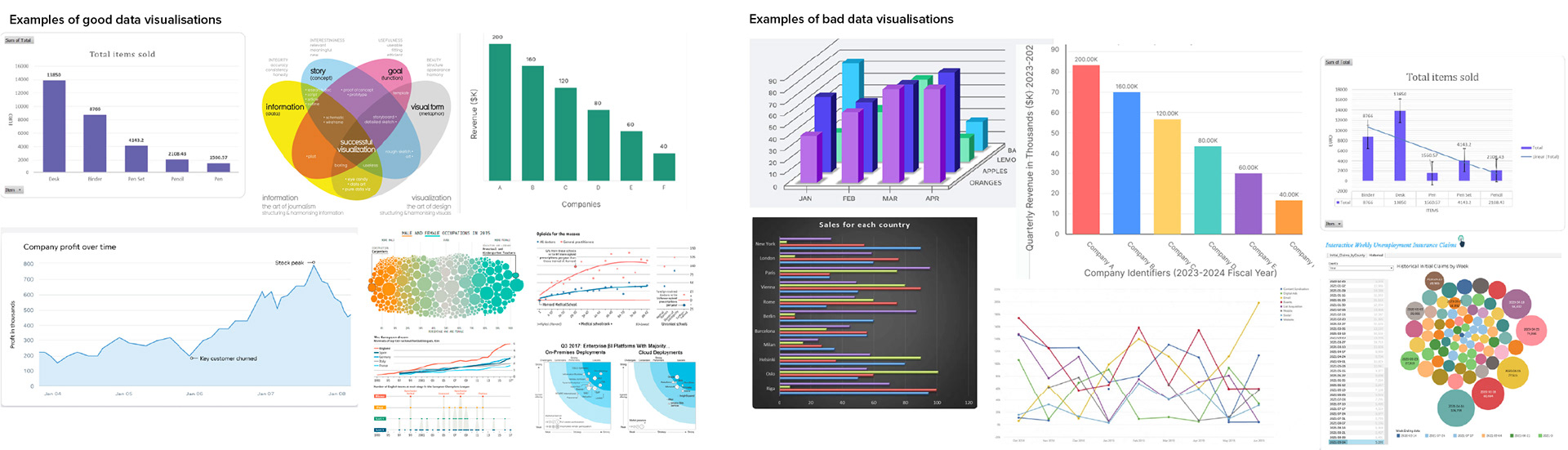
Comparison of ineffective and effective data visualisation approaches, highlighting how clarity, hierarchy, and accessibility impact interpretation of complex information
DATA COLLECTION
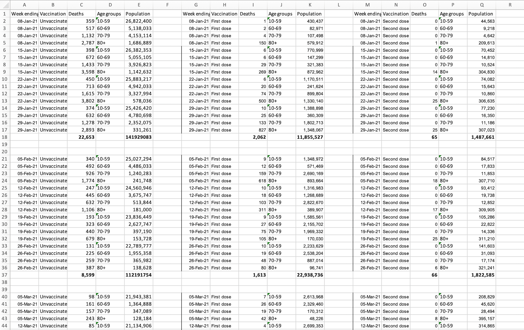
Dataset snapshot used to explore patterns, trends, and relationships within COVID-19 data to inform visualisation design decisions
To ensure the visualisations were both accurate and meaningful, reliable COVID-19 datasets were sourced from established public health platforms, including the NHS statistics archive, which can be readily accessed here.
The dataset was structured and refined to support clear comparison and trend analysis across key variables, including total population, vaccination status (vaccinated vs unvaccinated), and recorded fatalities. Data was aggregated on a monthly basis to reduce noise and highlight broader patterns over time, making it more suitable for visual interpretation.
This approach ensured consistency across both visualisations while allowing flexibility in how the data could be presented for different audiences. By establishing a clean and scalable data structure early on, the foundation was set for creating visualisations that prioritise clarity, comparability, and insight generation.
INFORMATION ARCHITECTURE
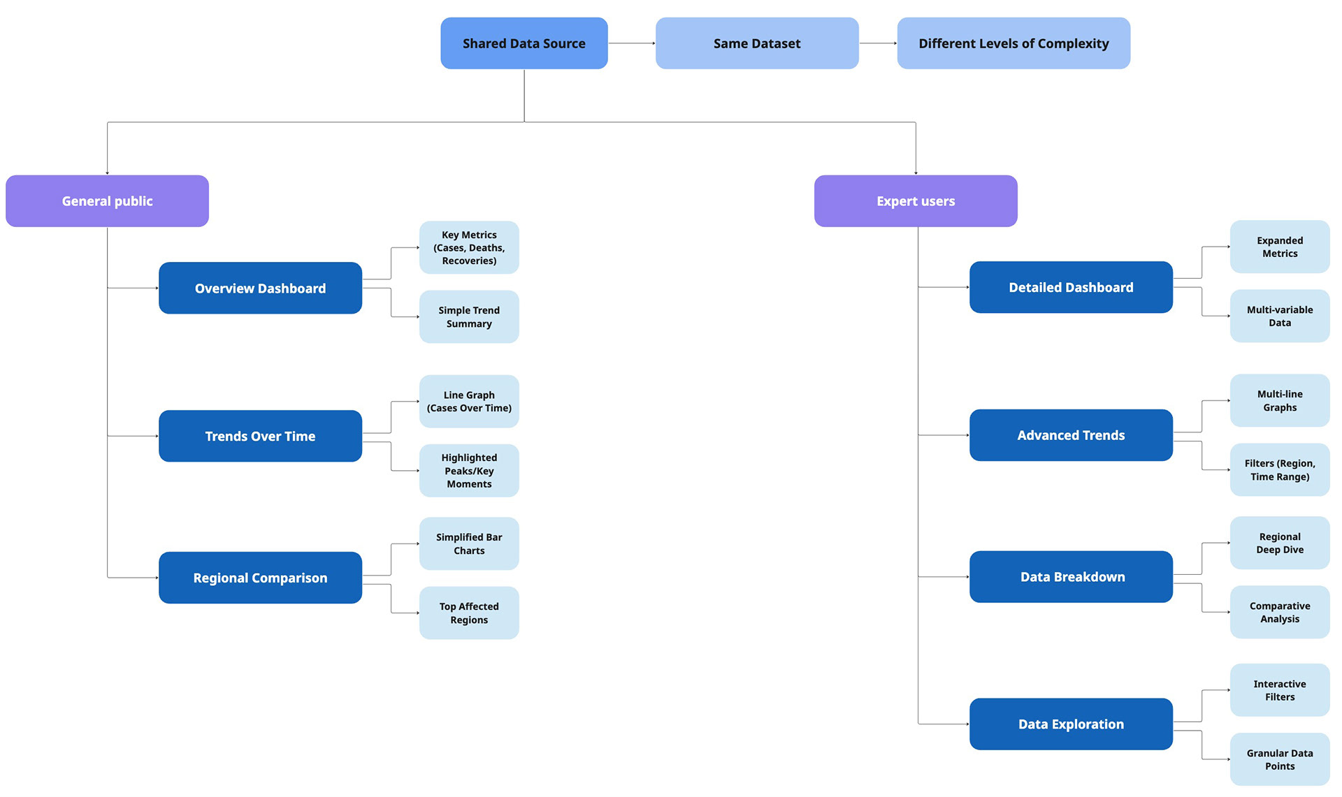
A dual-path information architecture designed to balance simplicity and depth, enabling general users to quickly grasp key insights while supporting expert users in detailed data exploration
USABILITY CONSIDERATIONS
Designing for data visualisation required careful consideration of how users interpret, process, and act on complex information. The goal was to ensure that both visualisations—despite differing in complexity—remained clear, accurate, and easy to understand for their intended audiences.
CLARITY & READABILITY
A primary focus was ensuring that all visual elements could be quickly understood without requiring prior expertise.
• Simplified layouts were used for the general public to reduce cognitive load
• Clear labelling and consistent formatting were applied across all charts
• Unnecessary visual elements were removed to avoid distraction
This ensured users could extract key insights at a glance rather than analyse dense data.
AVOIDING MISINTERPRETATION
Data visualisations can easily mislead if not designed carefully, particularly with scale, proportion, and context.
• Axes and scales were kept consistent to support accurate comparisons
• Visual distortions (e.g. exaggerated differences) were avoided
• Contextual cues were included to help users understand trends correctly
This was especially important given the sensitivity and real-world impact of COVID-19 data.
BALANCING SIMPLICITY VS DETAIL
A key challenge in this project was adapting the same dataset for two different audiences. This ensured that each visualisation delivered value without overwhelming or under-informing the user.
• The general public view prioritised high-level insights and simplified visuals
• The expert view allowed for more detailed data exploration and comparison
• Information hierarchy was adjusted to match each audience’s level of data literacy
BRANDING
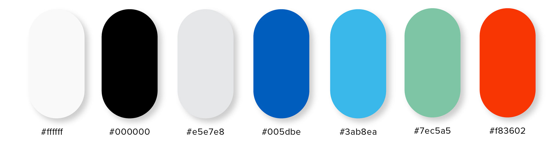
Colour palette designed to support clear interpretation of COVID-19 data, using accessible contrasts and intuitive status associations for improved readability
The colour palette for this design incorporates green, blue, and red, chosen for their strong associations with the health industry. Green is often linked to wellness, vitality, and safety, while blue conveys trust and professionalism—essential elements in healthcare branding. Red, on the other hand, signifies urgency or caution, a colour commonly used to highlight critical issues. Additionally, these colours are widely recognised in data visualisation, where green typically represents positive outcomes, blue indicates neutral or stable data, and red signals negative results. This thoughtful colour scheme enhances both the visual appeal and the functional clarity of the design.
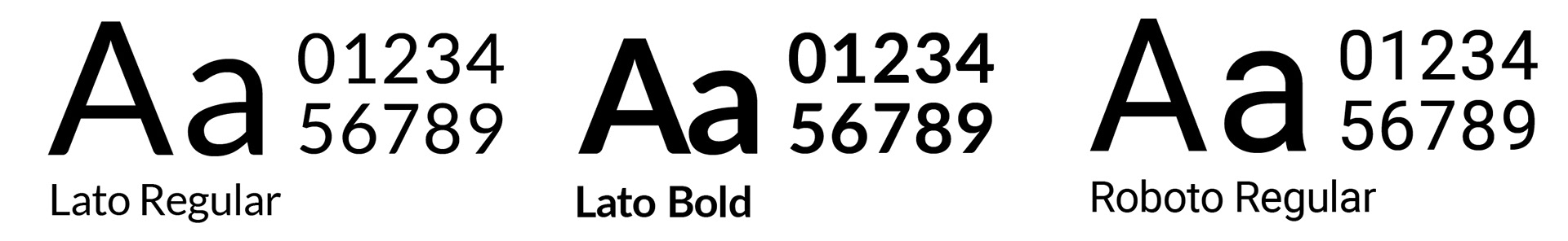
Typeface selected for maximum legibility and clarity, ensuring fast comprehension of COVID-19 data across dense information layouts
The typefaces chosen for this design are Lato and Roboto, selected for their clarity and readability across various devices. Both fonts are widely recognised for their modern, clean lines, which ensure that text remains legible on screens of all sizes, from smartphones to desktops. Lato's humanist style and Roboto's geometric structure make them highly versatile and user-friendly, offering an optimal reading experience on digital platforms. This combination ensures that content is accessible and easy to read, enhancing user engagement and usability.
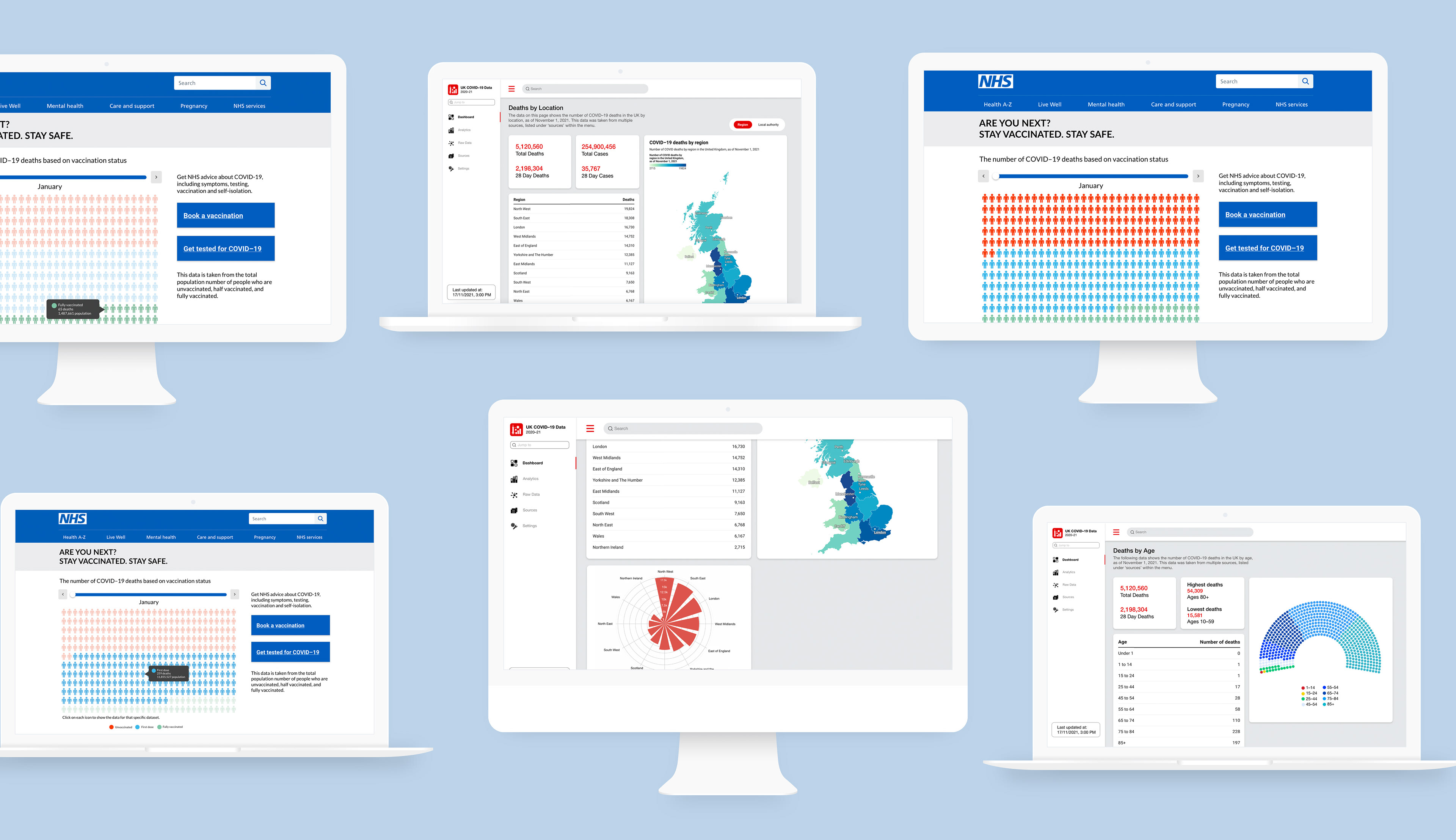
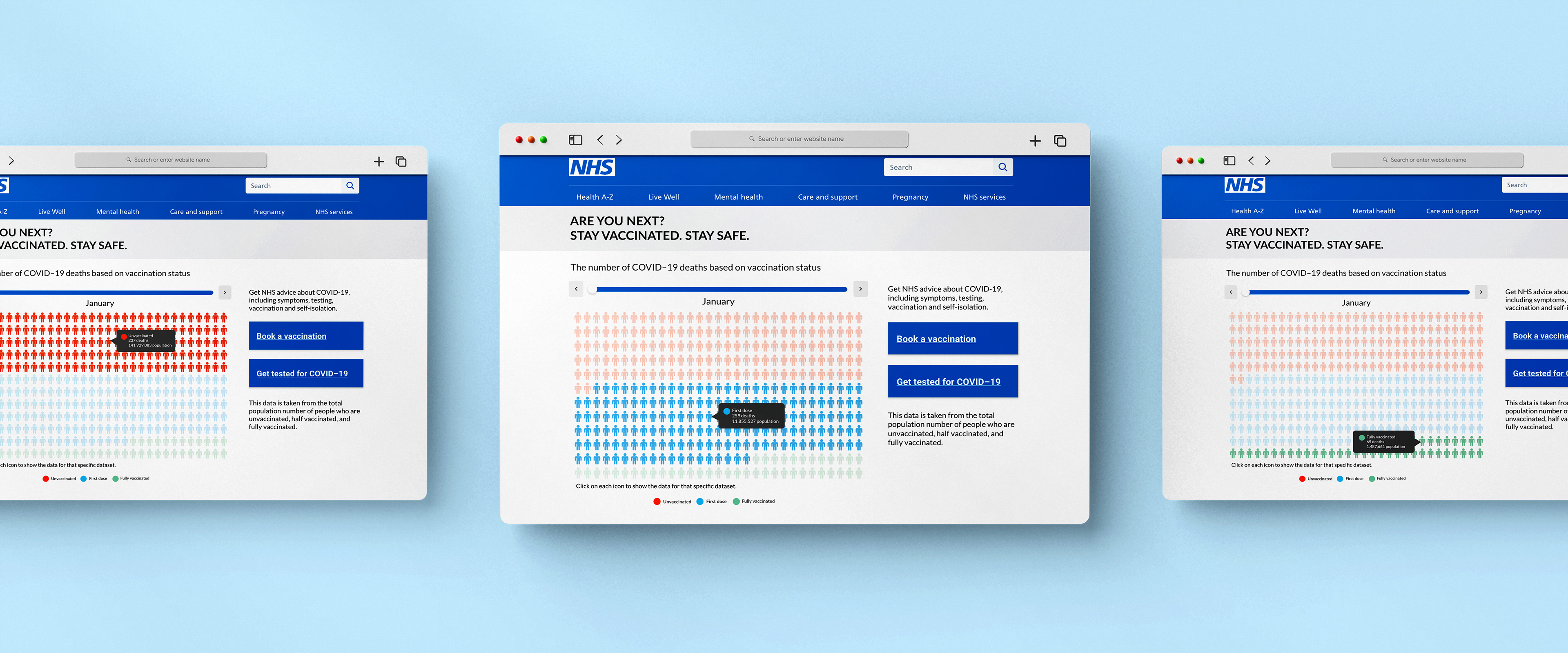
GENERAL AUDIENCE VISUALISATION
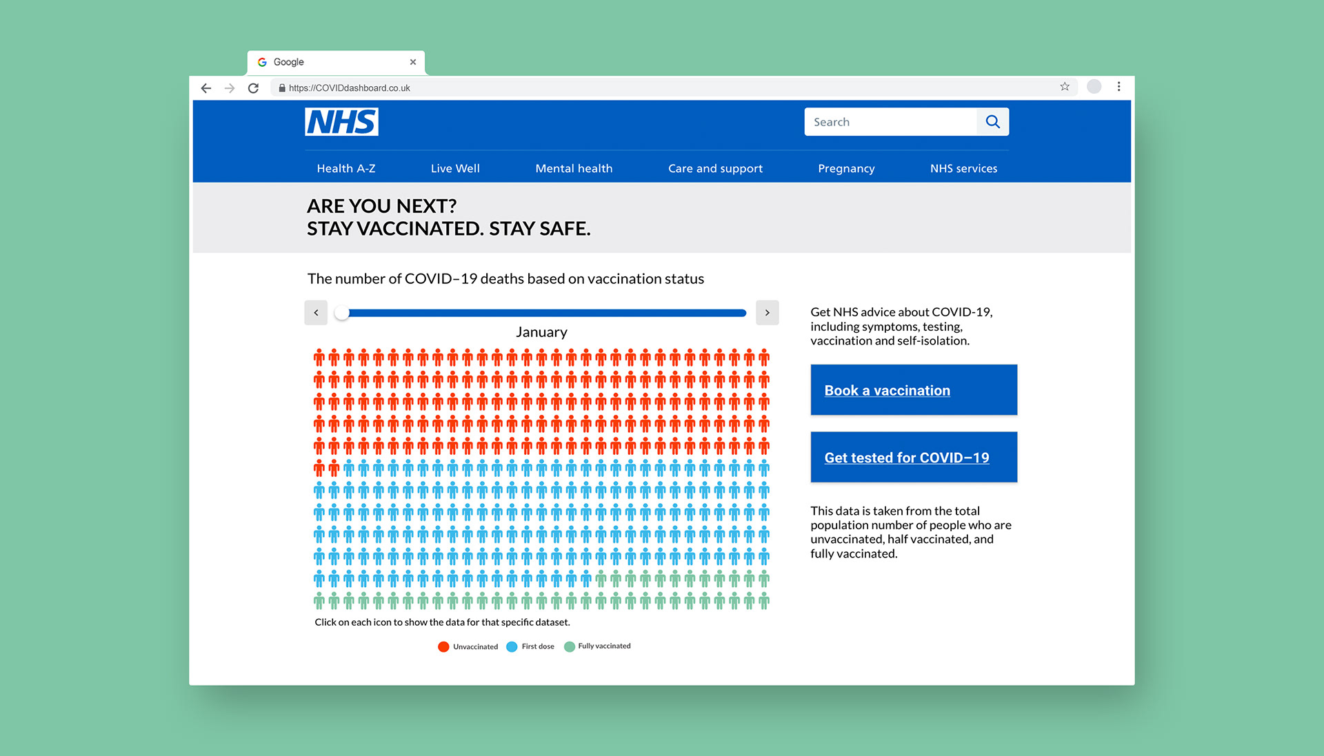
Data visualisation designed for the general audience, focusing on clarity, accessibility, and easy interpretation of complex information without requiring prior knowledge. Displayed on the NHS website
Interface screens exploring relationships and interactions between multiple datasets, designed to reveal patterns and connections in COVID-19 data
The general audience visualisation was designed as an embedded, interactive component within the NHS website, leveraging an existing high-traffic platform where users actively seek COVID-related information. This placement was a deliberate product decision to ensure maximum visibility and relevance, meeting users in a context where they are already engaged and receptive to health guidance.
The visualisation prioritises simplicity and clarity, using a focused layout to highlight the relationship between vaccination status and mortality rates. Complex data was reduced into a clear, digestible format, allowing users to quickly understand the impact of vaccines without requiring prior data literacy.
Visual hierarchy was used to emphasise key insights, ensuring that the most important information is immediately visible. Supporting elements such as labels and minimal text provide context without overwhelming the user.
The goal was not to present all available data, but to communicate a single, impactful insight:
the significant reduction in mortality risk associated with vaccination.
the significant reduction in mortality risk associated with vaccination.
EXPERT AUDIENCE VISUALISATION
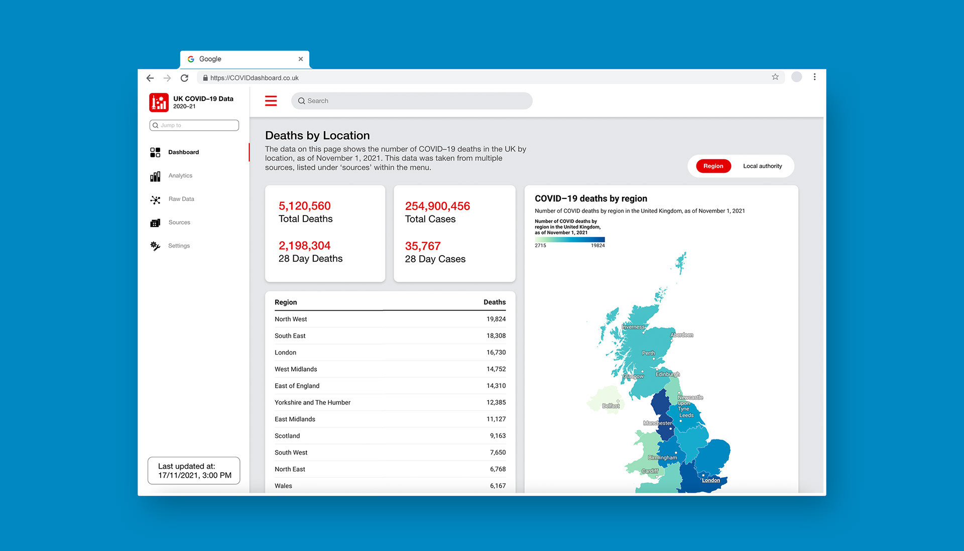
Data visualisation designed for the expert audience, presenting detailed, high-density information to support in-depth analysis and interpretation
In contrast, the expert-facing solution was designed as a data-rich, interactive dashboard to support deeper analysis and exploration. This experience prioritises flexibility and detail, allowing users to engage with the dataset at multiple levels. Both raw data and visual representations are accessible, enabling expert users to validate trends, compare variables, and draw their own conclusions.
The dashboard includes a range of visualisation types tailored to different data relationships, such as:
• regional comparisons
• age-based breakdowns
• time-based trends
This supports more nuanced analysis while maintaining clarity through consistent structure and labelling. Unlike the general view, the goal here is not simplification, but controlled complexity — providing depth without sacrificing usability.

Interface screens exploring relationships and interactions between multiple datasets, designed to reveal patterns and connections in COVID-19 data
The dashboard structure was designed to reflect how expert users approach data analysis, starting with a high-level overview before enabling deeper exploration. On entry, users are presented with a national overview of COVID-related deaths by region. This provides immediate context and allows users to quickly identify broad patterns across the population. From this starting point, users can navigate into more detailed views through clearly defined interaction points. This layered approach reduces initial cognitive load while still supporting complex analysis when needed.
• Overview first establishes context
• Drill-down interactions support deeper insights
• Consistent navigation reduces friction
This ensures users can move seamlessly between high-level trends and granular data without losing context.
REFLECTION
This project highlighted how easily data can be misinterpreted when visual hierarchy and clarity are not carefully considered. I learned that designing data visualisations requires balancing accuracy with simplicity, ensuring that users can quickly understand trends without being overwhelmed.
If I were to revisit this project, I would focus more on user testing to validate how different audiences interpret the visualisations, particularly around data literacy and comprehension.