print, 2024
typography in design
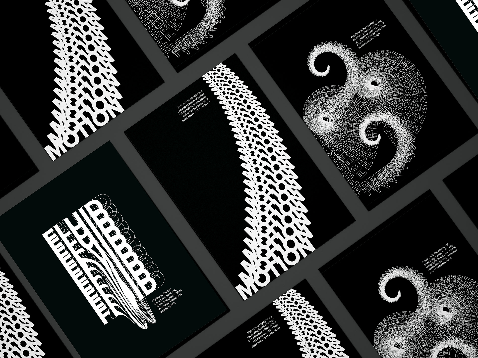
Typography in Design is a project that delves into the world of typography and its myriad elements. This series of typographic posters is a celebration of the dynamic nature of design, where letters, shapes, colours, and textures seamlessly blend together to create visually engaging compositions. Each poster in the collection showcases the versatility and expressive power of typography, exploring various styles, techniques, and typographic treatments.
Typography in Design posters
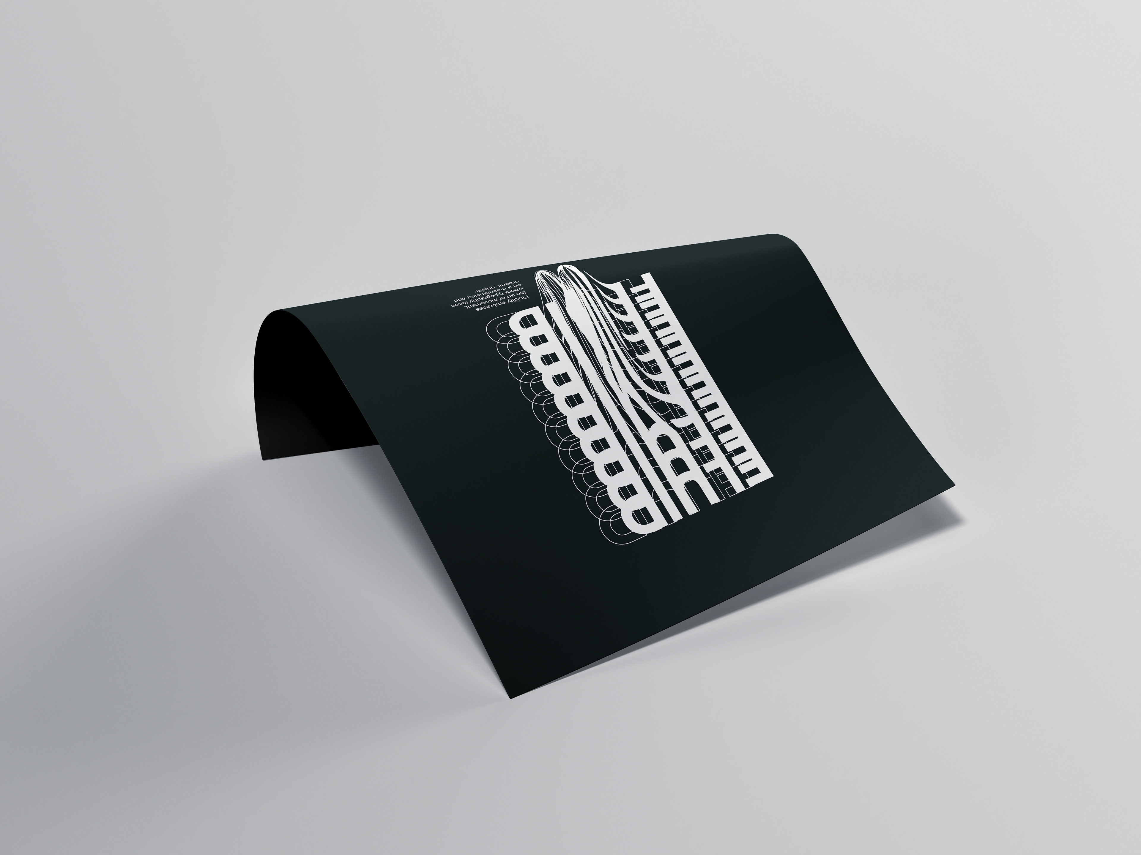
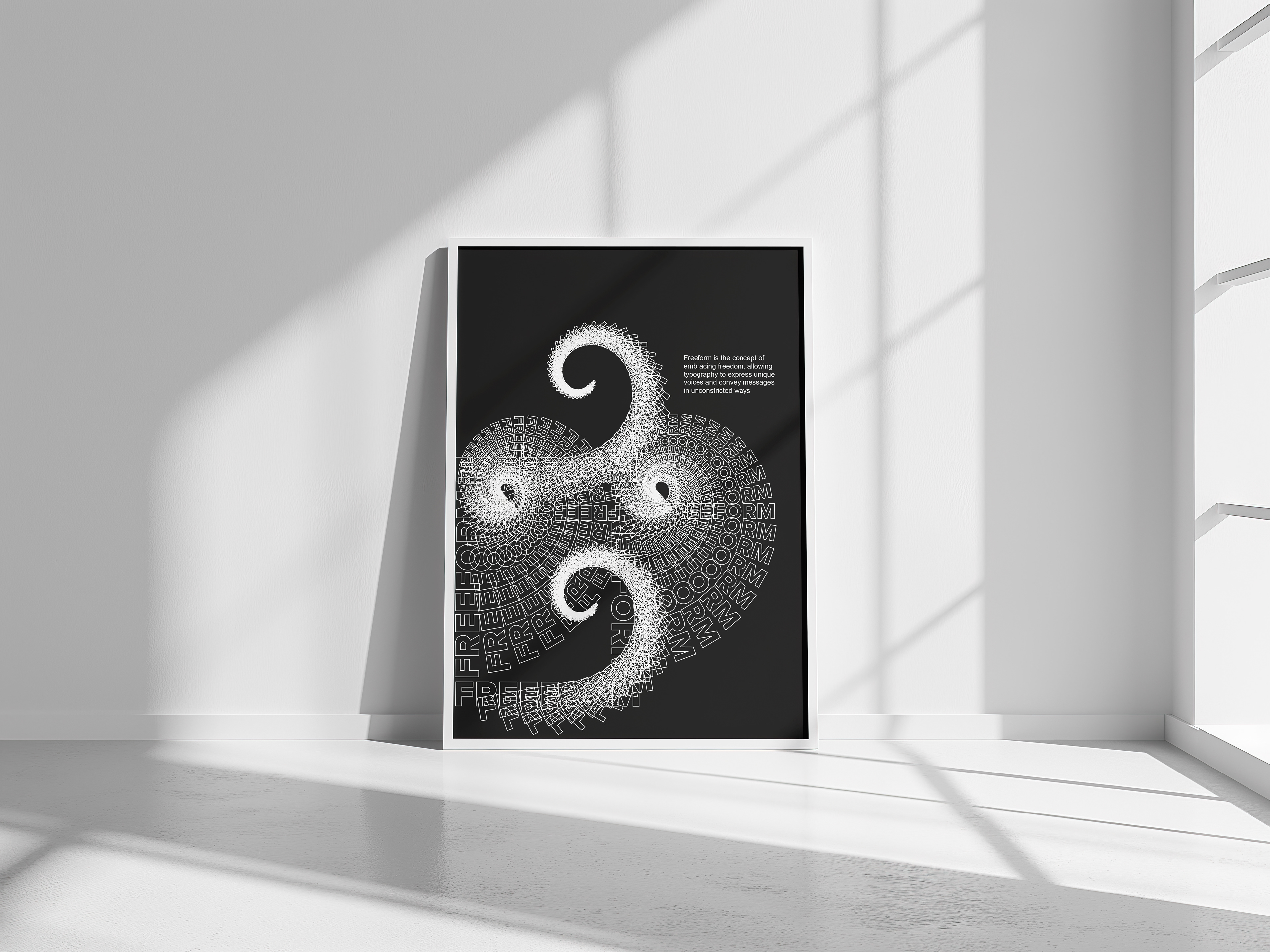
The project delves deep into the idea of fluid movement in typography, emphasising the dynamic interplay between letters and the concept of motion. Through meticulous design choices, the project explores how typography can evoke a sense of movement, energy, and rhythm. By carefully manipulating letterforms, utilising techniques such as kinetic typography and letterforms, the project brings words to life, creating an immersive experience that engages the viewer on a visual level.
BRIEF
The brief for this project was to create a set of typographic posters that used type only as the primary design element, exploring creative and innovative ways to manipulate letterforms, spacing, and layout. The challenge was to push the boundaries of traditional typography by employing bold compositions, varied fonts, and dynamic text arrangements that communicate a message visually, without the need for imagery. Each poster aimed to convey emotion, mood, or meaning through the careful use of typography, experimenting with techniques like overlapping, distortion, and asymmetry. The goal was to create impactful, visually stimulating pieces that showcased the versatility of type as an expressive design tool, while maintaining clarity and balance within each composition.
BRANDING
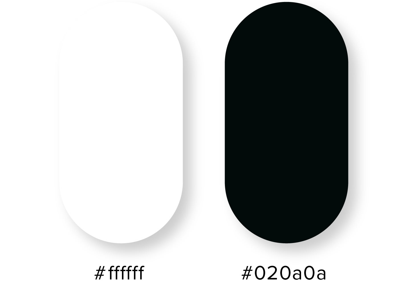
Colour palette
The monochromatic black and white colour scheme was intentionally chosen to create a strong visual contrast, allowing the typography to stand out and capture the viewer's attention. By eliminating distracting colours, the design directs focus solely to the text, highlighting its structure and form. This approach enhances legibility and ensures the message remains clear, while the stark contrast between black and white adds a sense of elegance and sophistication. The simplicity of the colour palette allows the typography to be the focal point, emphasising its impact and reinforcing the design's overall clarity and purpose.
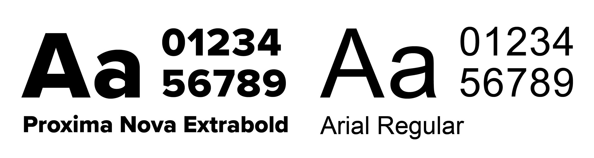
Typefaces
Proxima Nova Extrabold was chosen as the main typeface for its clean, modern, and highly legible sans-serif design. The bold weight ensures strong visibility, while the simplicity of the font allows for greater playability and flexibility within the text. This enables the creation of interesting shapes and visual rhythm from the type itself, providing a dynamic structure to the layout. The geometric forms of Proxima Nova make it ideal for crafting balanced and engaging compositions, allowing the typography to function not only as a medium for communication but also as a key design element that enhances the overall visual aesthetic. Arial was chosen as the secondary typeface for the captions in the posters due to its clarity and readability at smaller sizes.
OUTPUTS
Poster design
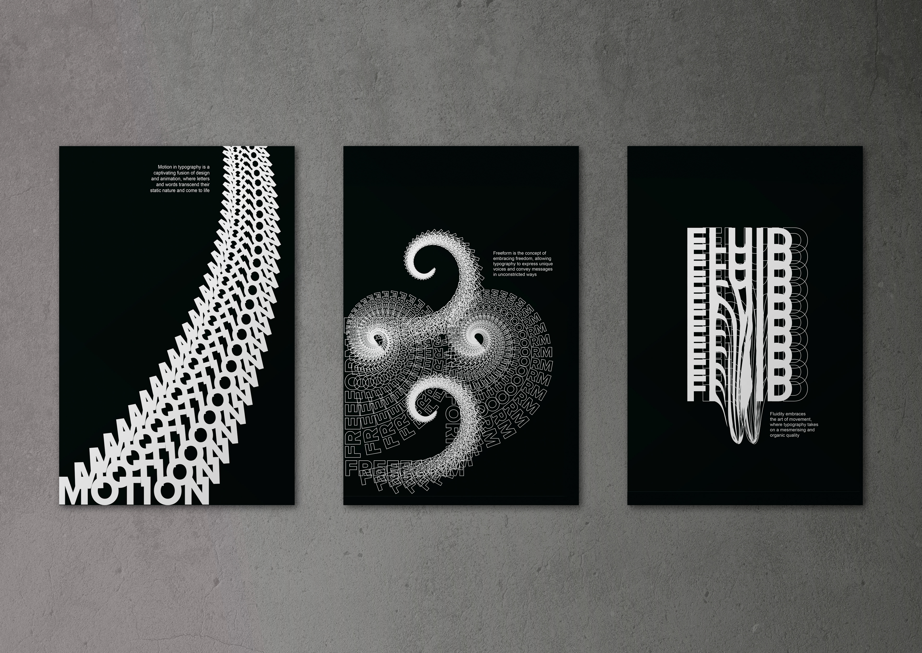
Set of three posters