prINT, 2024
disc two
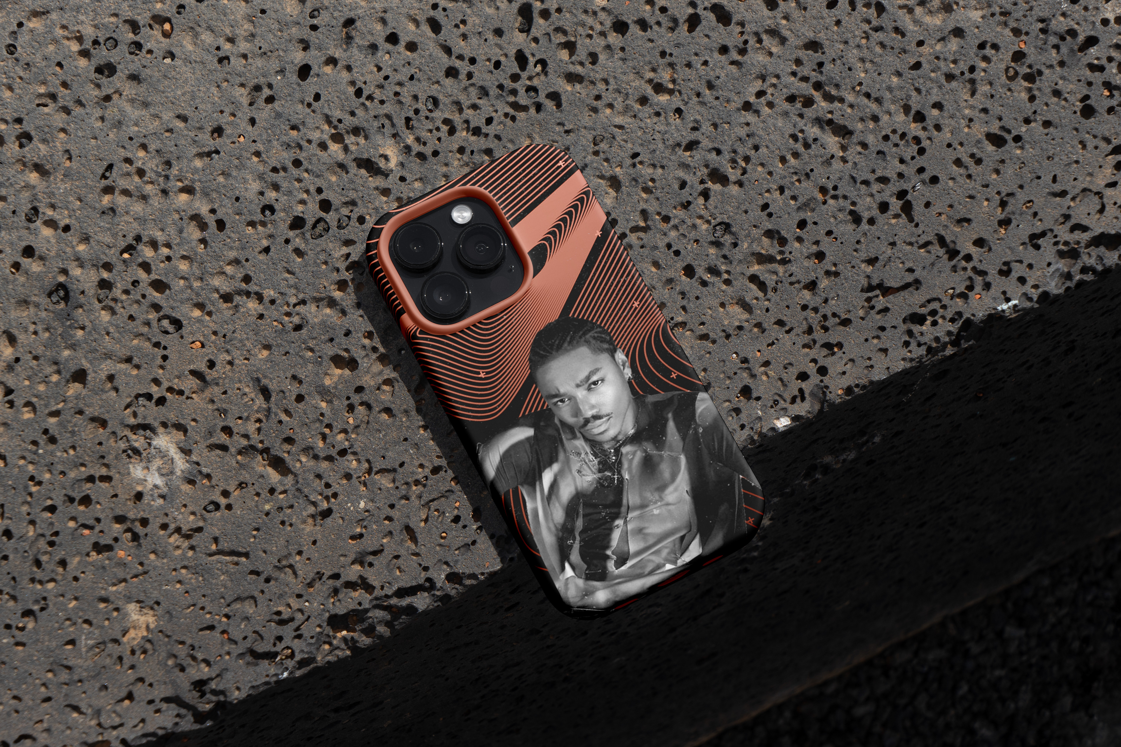
Disc Two is a merchandise design project as a recreation of R&B artist Josh Levi's album 'Disc Two'. Drawing inspiration from the album's themes of introspection, love, and self-discovery, the collection blends contemporary streetwear with bold graphic elements, reflecting the artist's unique style and musical identity. The designs aim to visually capture the emotional depth of the album while offering a cohesive merchandise collection for fans.
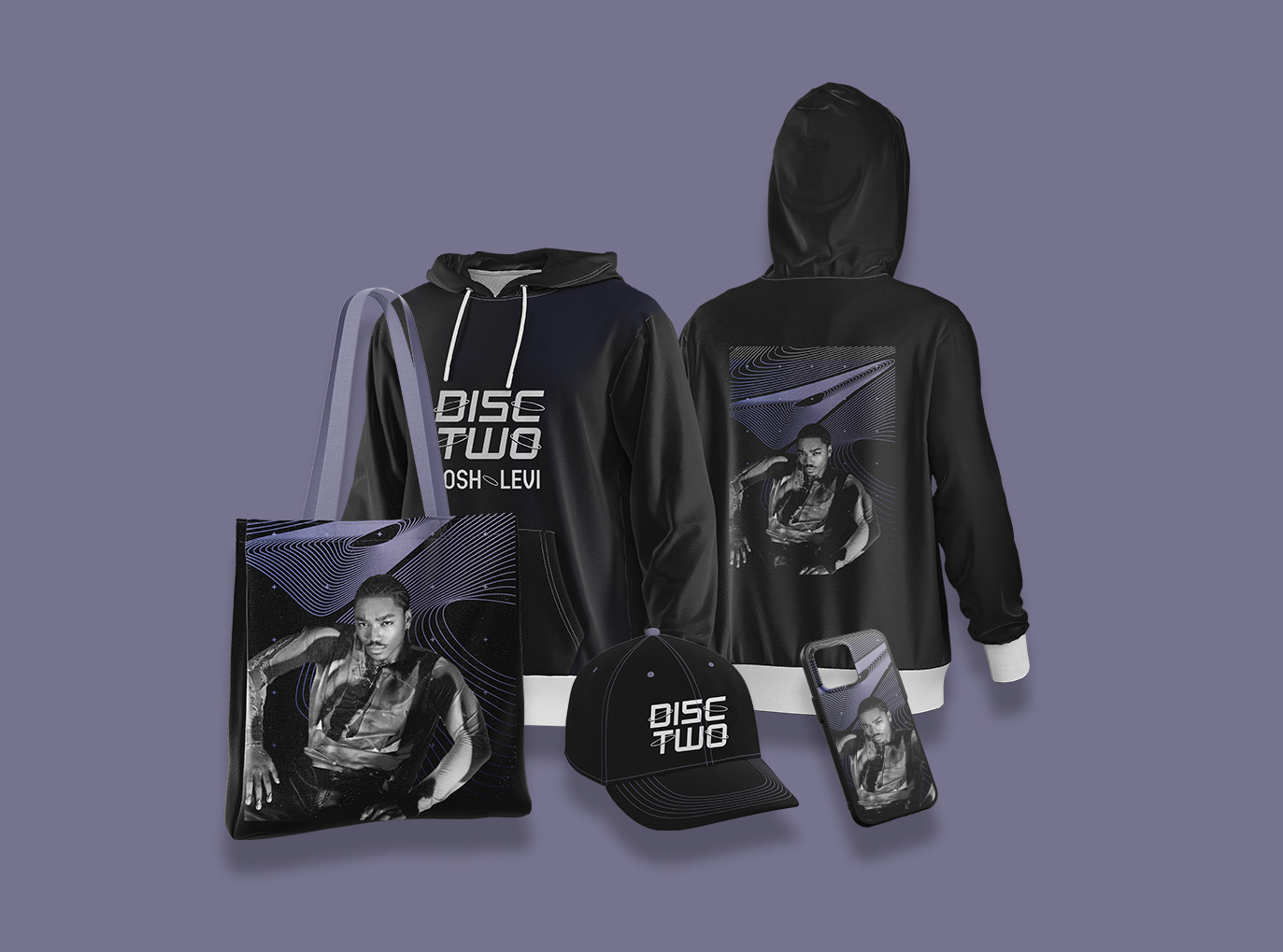
Merch set
BRIEF
The brief for this project was to redesign Josh Levi's album artwork and create accompanying merchandise that reflects his evolving music and personal brand. The goal was to craft a fresh, dynamic visual identity for the album that resonates with both his established fanbase and potential new listeners. The redesign needed to capture the essence of Josh’s musical style—blending R&B, pop, and soul—while offering a modern, bold aesthetic that stands out in the competitive music market. Alongside the album artwork, the project included designing merchandise such as t-shirts, hoodies, posters, and accessories, all of which should align with the new visual identity, creating a cohesive, fashionable collection for fans. The designs should be versatile enough to appeal to a wide demographic while maintaining a premium feel that reflects Josh’s artistry. The aim was to create an iconic, memorable look that not only elevates the album but also translates seamlessly into merchandise, enhancing Josh’s overall brand presence.
RESEARCH
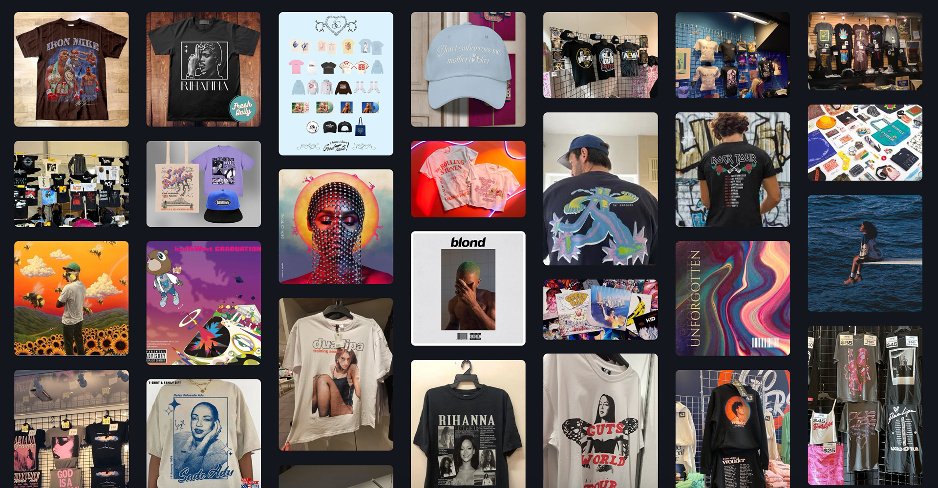
Moodboard
BRANDING
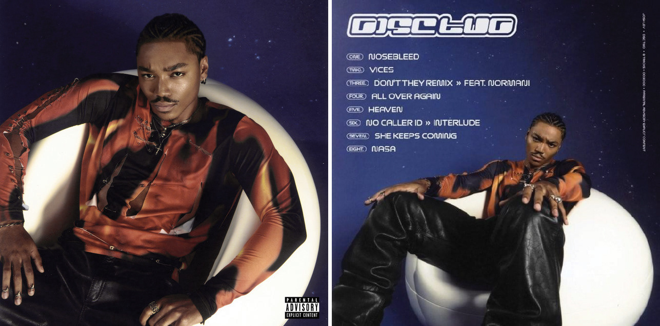
Original album artwork
The original album cover features the artist against a space-inspired backdrop, visually connecting to the cosmic themes woven throughout the track titles. The space theme reflects the expansive, introspective journey explored in the music. For the merchandise, the goal was to retain the essence of the original album cover while creating designs that could be sold alongside the album on the artist's website or individually. By incorporating elements of the space theme and the album's colour palette, the merchandise serves as a natural extension of the album's visual identity, allowing fans to engage with the music in a new, tangible way while maintaining cohesion with the original artwork.

Colour palette
The colour palette for the merchandise was carefully derived from the original album artwork to maintain visual cohesion. The rich browns and deep purples/blues present in the artwork were incorporated into the designs, creating a harmonious connection between the album and its merchandise. These colours were used to craft two distinct variations of the designs, offering fans the opportunity to choose between complementary tones that resonate with their personal style while staying true to the essence of the album. The contrasting yet complementary colour schemes enhance the overall aesthetic, making the collection both visually dynamic and thematically cohesive.

Typefaces
The typeface families chosen for the designs were carefully selected to complement both the album's aesthetic and overall concept. Circular Medium was used for the artist name, as it is a distinctive and modern typeface that offers strong legibility while maintaining a unique character. To further tie the designs to the album's space-themed visuals, SF Outer Limits was incorporated. This typeface continues the cosmic theme seen in the album artwork, adding a fresh, futuristic twist that sets it apart from the existing typefaces on the cover. Together, these fonts help establish a cohesive yet dynamic visual identity, balancing legibility with creative flair.
OUTPUTS
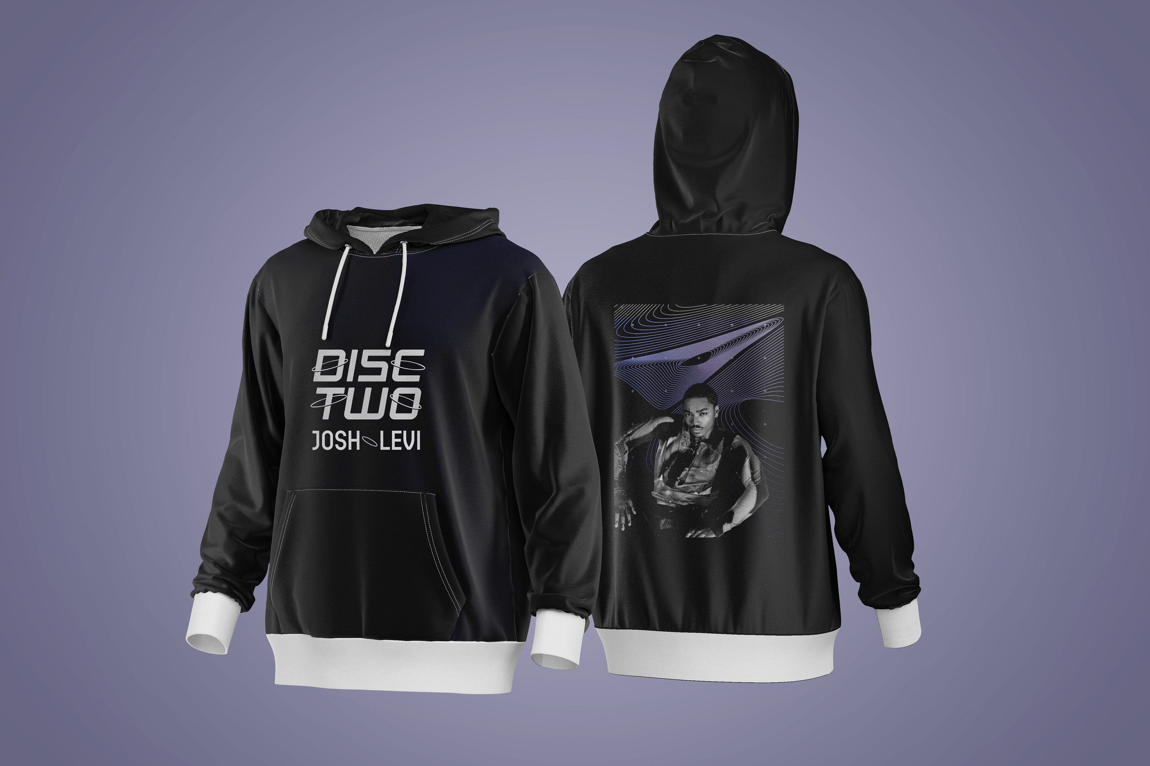
Hoodie design
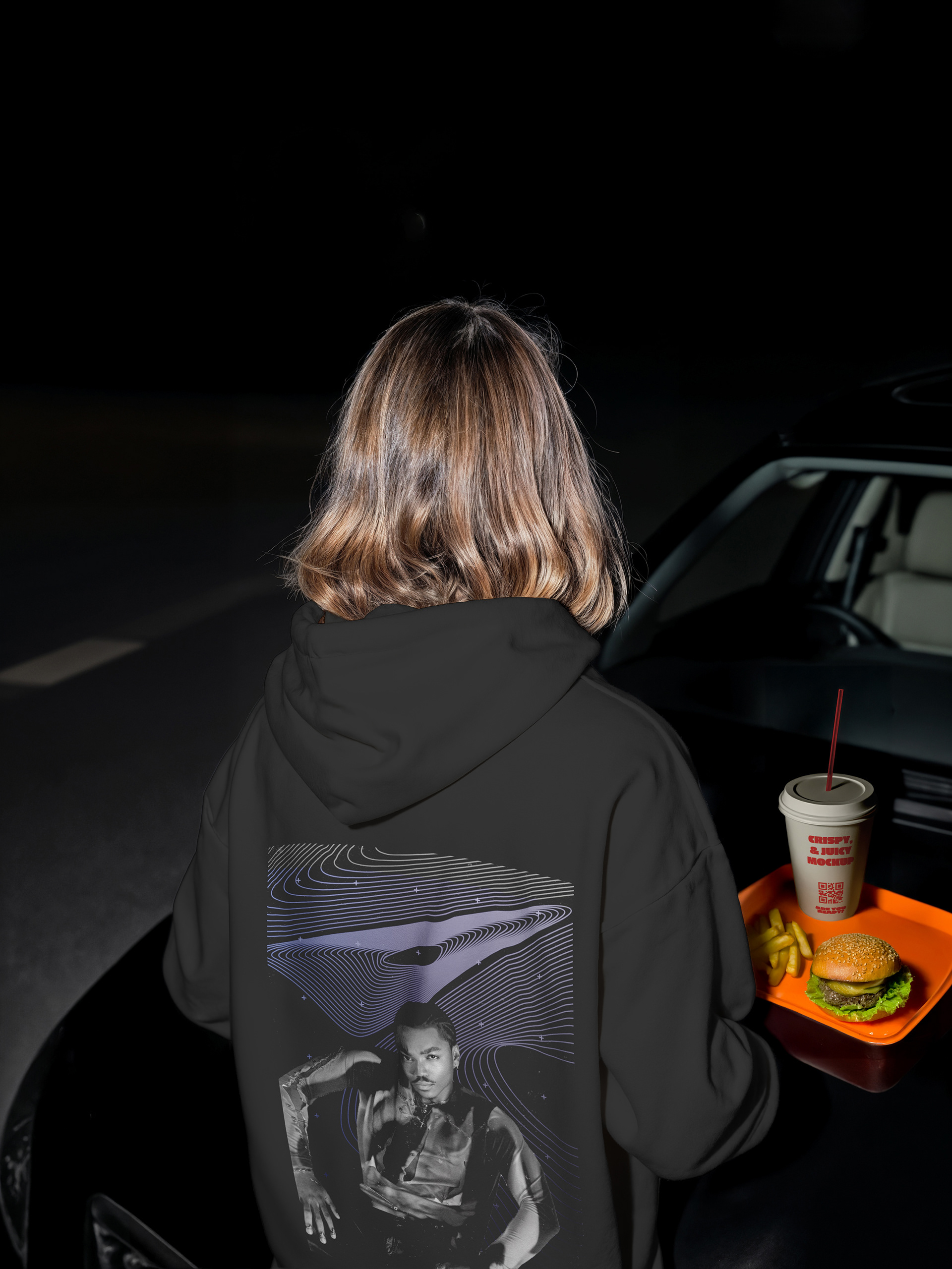
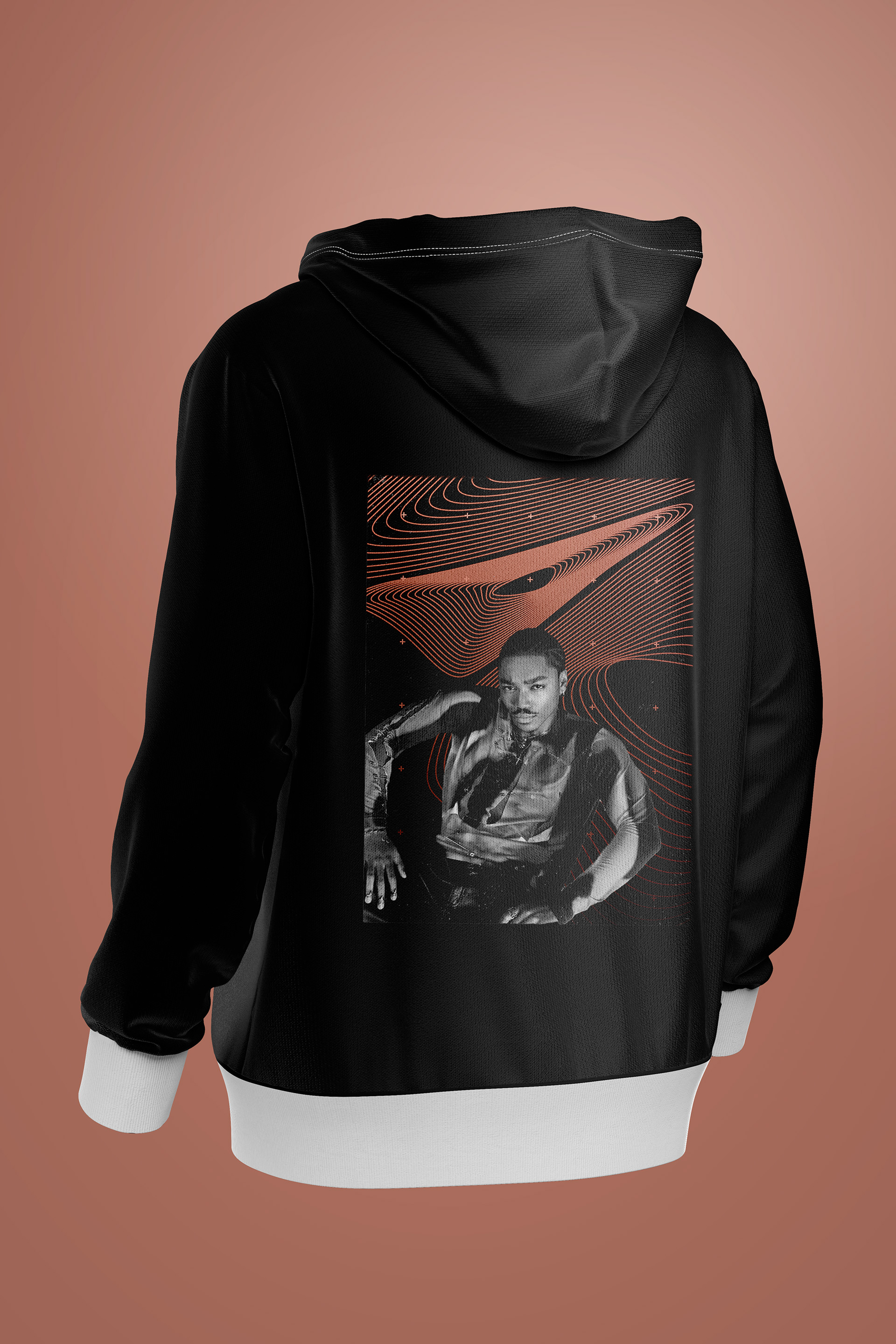
Hoodie design
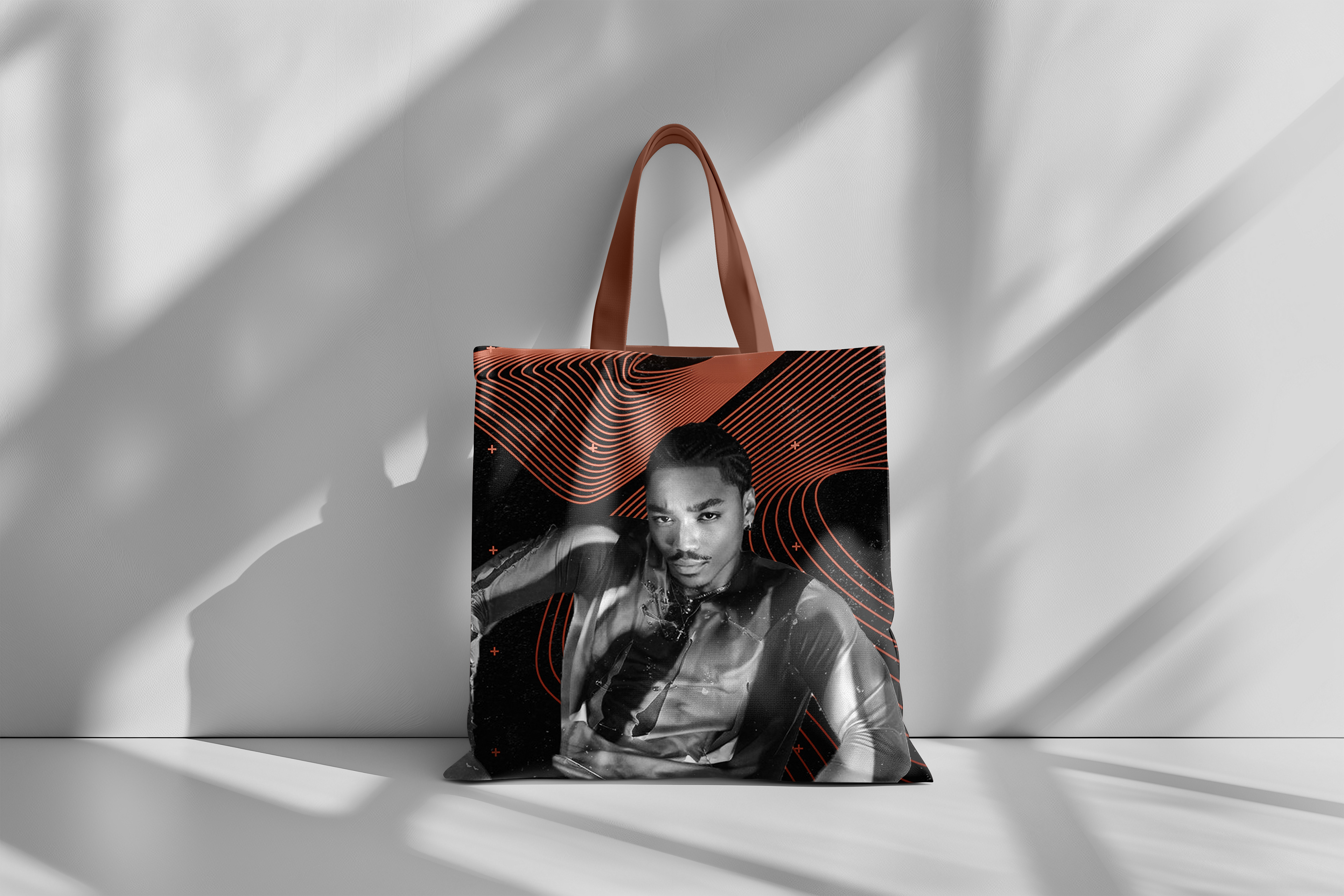
Tote bag design
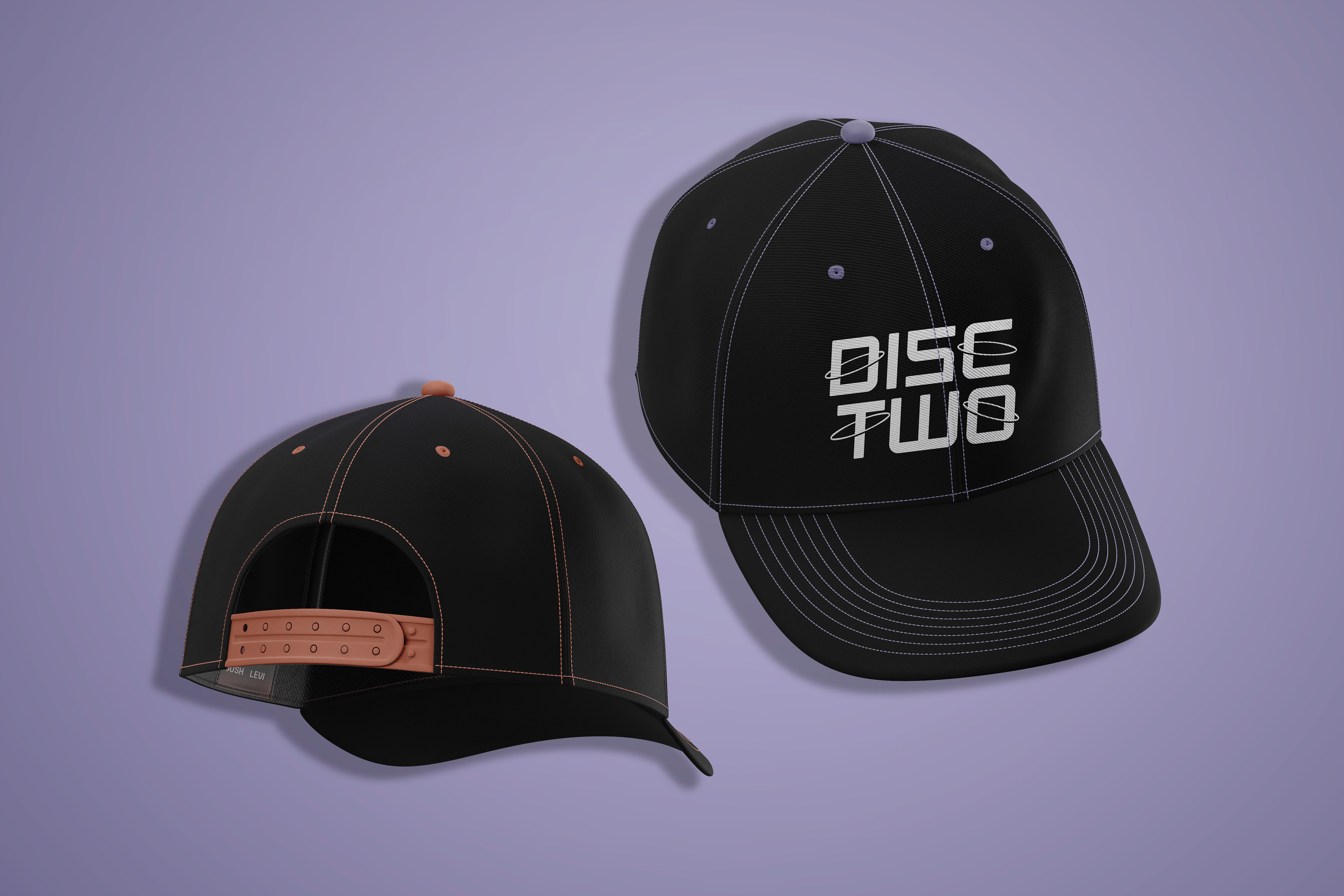
Cap design

