PRODUCT (UX/UI), 2021
EASE-E
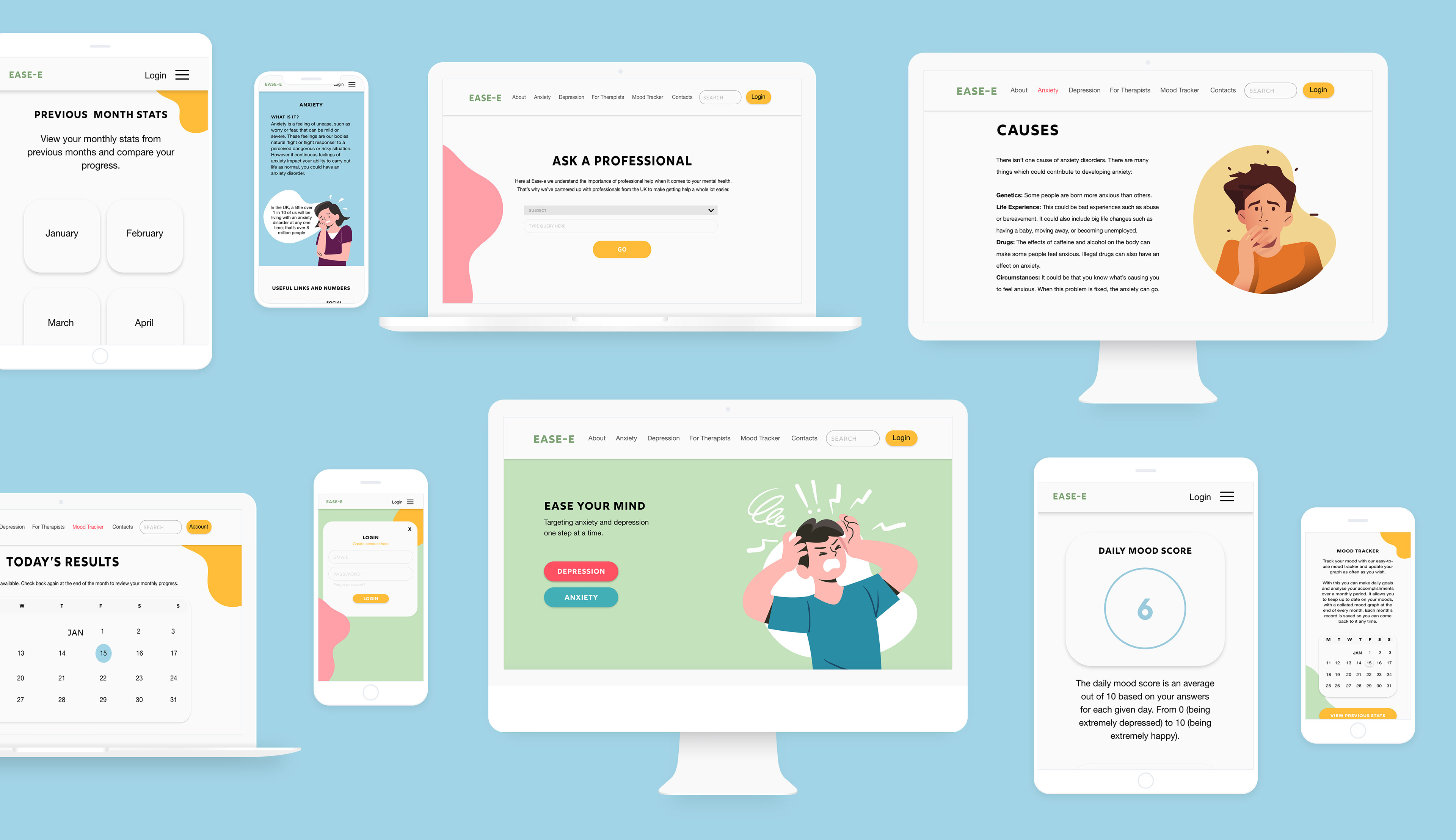
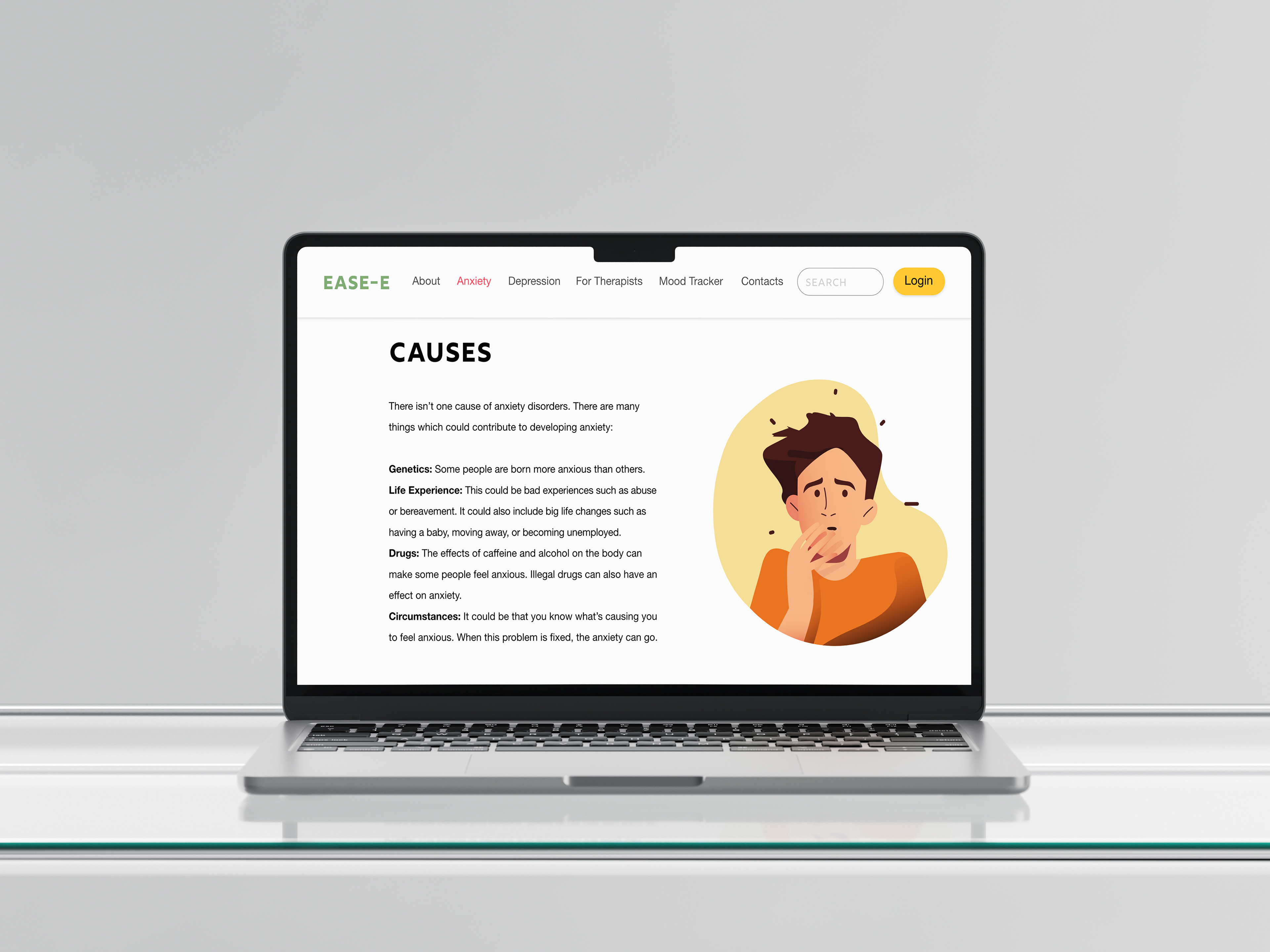
The scope of this project encompassed the development of a responsive website dedicated to a particular aspect of health, accessible across multiple devices including desktop and mobile. Choosing to concentrate on mental health, with a specific focus on depression and anxiety, was a deliberate decision based on the substantial understanding of the topic. Explore Ease-e's desktop website here and accompanying mobile site here.

Website on multiple devices
BRIEF
The brief for this project was to design a responsive website for laptop and mobile that focuses on a specific mental health topic, with the aim of helping users better navigate, understand, and engage with information related to that condition. The website needed to be accessible, user-friendly, and visually calming, with a layout that supports clear navigation, easy-to-read content, and helpful resources. The mobile version was equally important, requiring thoughtful adaptation to ensure a seamless experience across all devices. Key considerations included tone of voice, colour psychology, and usability, all tailored to suit users who may be experiencing emotional distress or seeking guidance. The goal was to create a safe, informative digital space that empowers users through education, self-help tools, and signposting to support services—all wrapped in a design that is empathetic, inclusive, and approachable.
WIREFRAMES

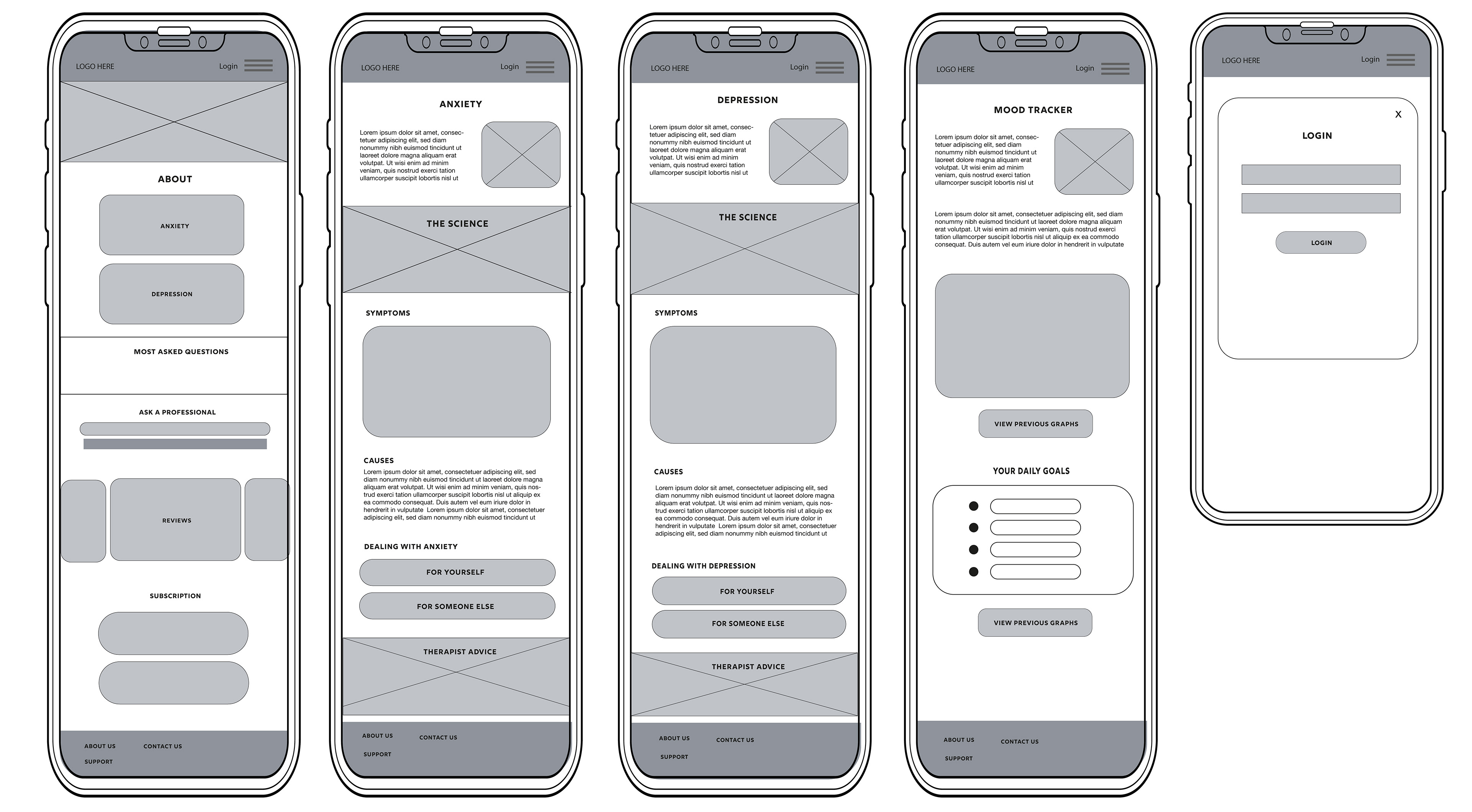
Wireframes
Prior to developing the branding, the initial phase of this project encompassed the creation of wireframes to outline the essential elements to be incorporated into the website. These wireframes were based on user personas and site page flows, outlining the main features intended for implementation. Wireframes serve the purpose of mapping the foundational structure of content placement throughout the site, aiding in the visualisation of the necessary number of pages required for the entire website.
BRANDING

Colour palette
The colour palette features soft pastels, including shades of blues, greens, and pinks, carefully selected for their calming and inviting qualities. Blue is often associated with trust, tranquility, and stability, making it ideal for creating a sense of reliability. Green evokes feelings of health, growth, and balance, reinforcing a soothing, natural atmosphere. Pink, particularly in its pastel form, conveys warmth, empathy, and care, enhancing the overall sense of comfort and approachability. Together, these pastel tones foster a peaceful and positive environment, making them perfect for the website which focuses on wellbeing and mental health.

Typefaces
Rig Shaded and Helvetica Neue were selected as the typefaces, as they offer excellent legibility even at small scales, which was crucial for the mobile version of the site. Maximising legibility was a key consideration to ensure inclusivity for users who may have conditions such as dyslexia. In order to make informed and inclusive design decisions, extensive research from articles and journals were undertaken in order to deepen the understanding of screen design. One article that played a significant role in shaping the design choices was "UX Design: How to Make User Interface Readable" by Marina Yalanska, which can be read here.
OUTPUTS

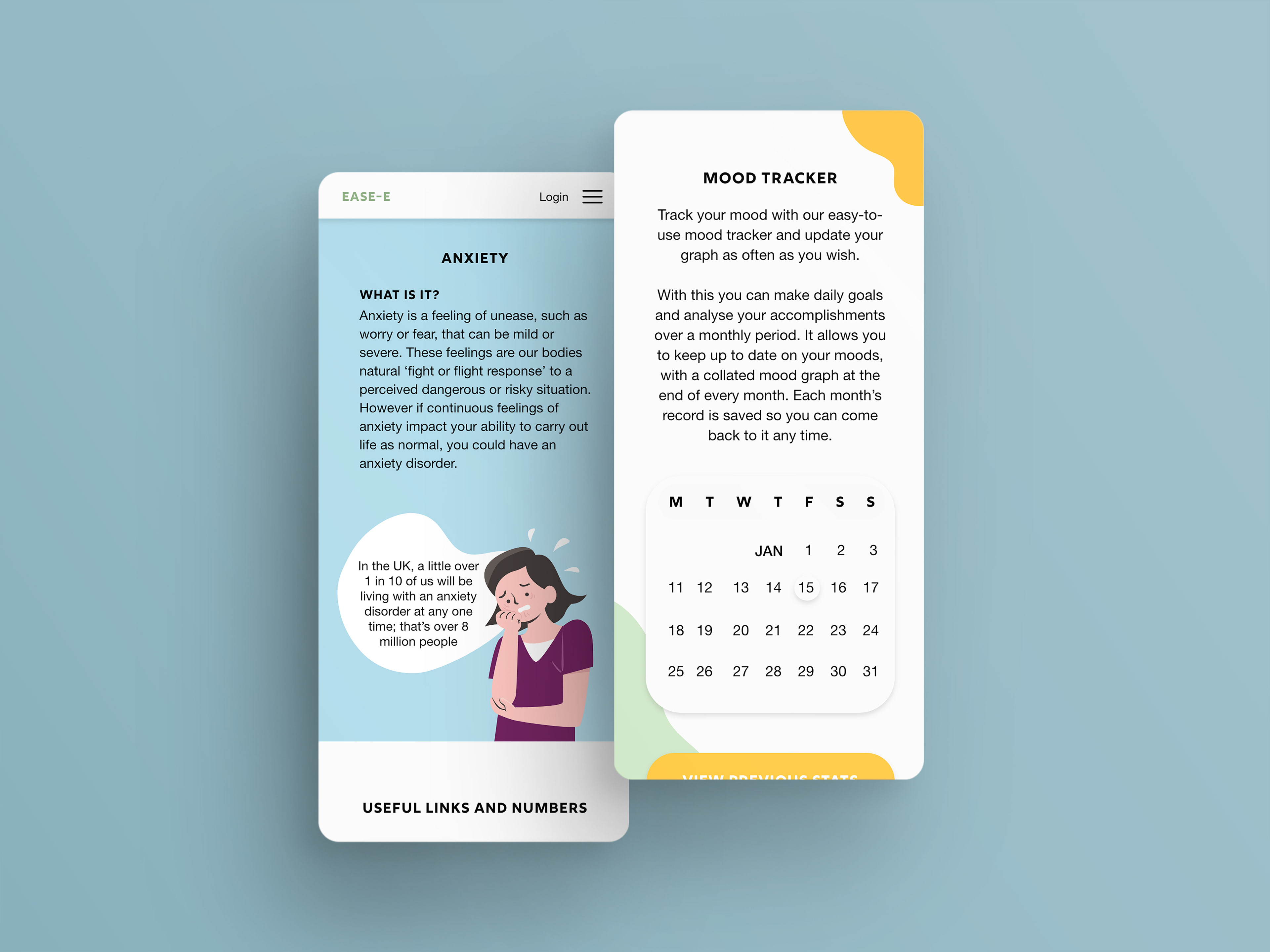
Mobile site

