UX & UI, 2024
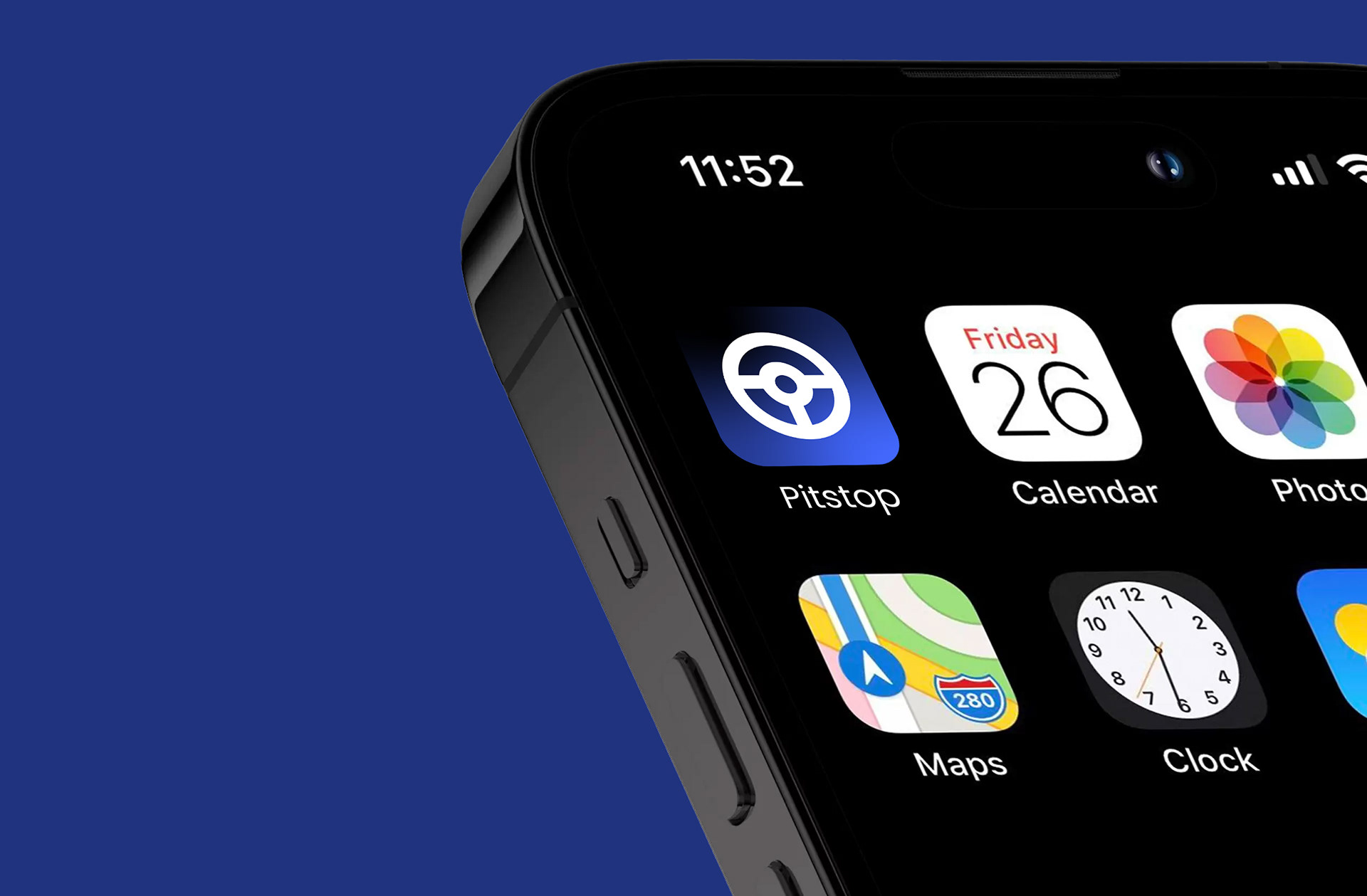
pitstop
Pitstop is a dynamic app designed for passionate F1 fans who want to stay up-to-date with the latest race developments. Offering real-time updates, live timing, and detailed race statistics, Pitstop ensures users never miss a moment of the action. Whether it's breaking news, driver standings, or track conditions, the app delivers the most relevant information at your fingertips, keeping you connected to the world of Formula 1 like never before. With its user-friendly interface and fast-paced updates, Pitstop is the ultimate companion for any F1 enthusiast.
BRIEF
The project brief was to design a standalone mobile application specifically catered to Formula 1 fans, providing quick and intuitive access to the latest news, race updates, driver stats, and performance data. The aim was to deliver a sleek and seamless user interface that not only aligned visually with F1’s existing branding—dynamic, bold, and modern—but also established its own distinct identity as a standalone product. The deliverables included a full UI design that prioritised user experience, responsive layout, and visual consistency, ensuring the app felt premium and engaging while remaining instantly recognisable to F1 enthusiasts.
RESEARCH
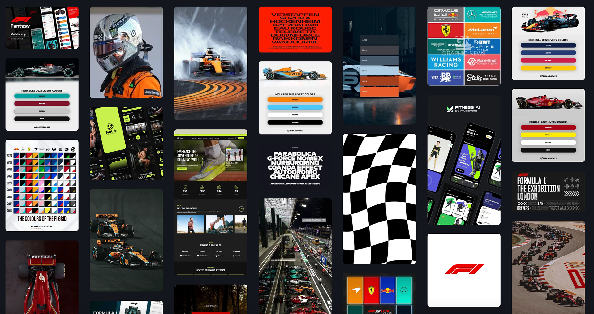
Moodboard
The moodboard takes inspiration from the bold visual language of Formula 1, incorporating elements such as team colours, car liveries, track layouts, and the sport’s overall high-performance aesthetic. It explores F1’s signature palette of red, black, and white, alongside metallic tones and sharp graphic lines to reflect speed and precision. Reference was also taken from existing sports apps, analysing how they present data, news, and stats, while identifying opportunities to create something more visually refined and engaging. The result is a collection of imagery, UI styles, and branding cues that set the tone for a sleek, modern app experience tailored to F1 fans.
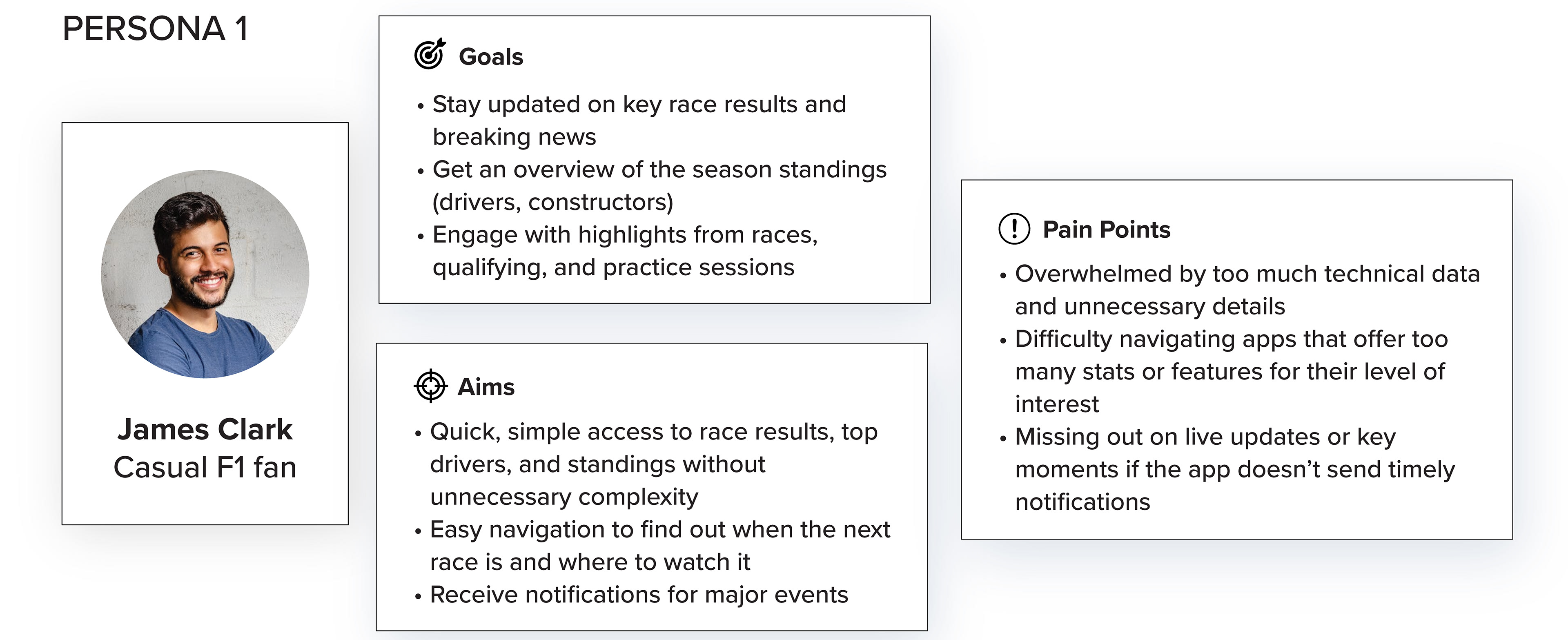
Persona 1
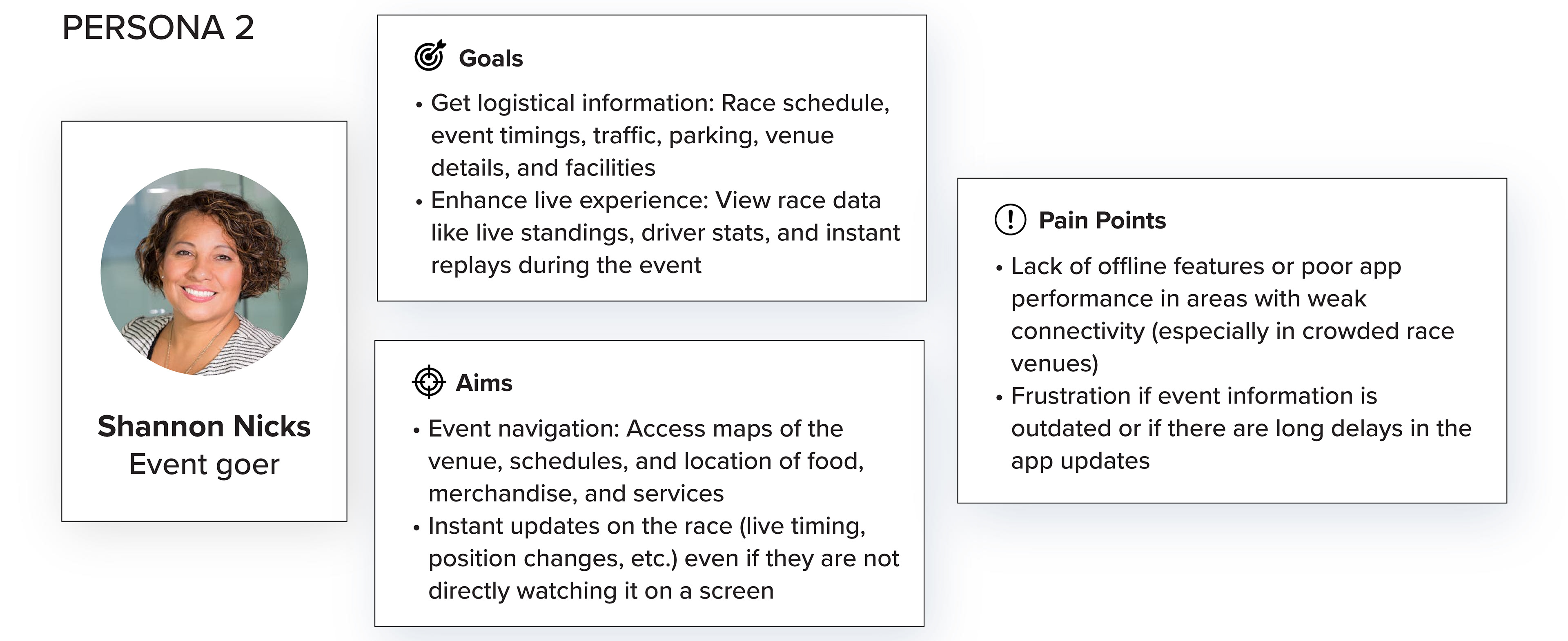
Persona 2
User personas were created to help identify and understand the app’s target audience, focusing on their goals, aims, and pain points. By defining clear personas—such as the Casual F1 Fan and the Event-Goer—I was able to gain insight into who the users are, what they’re looking to achieve, and what challenges they may face when engaging with Formula 1 content digitally.
These personas played a key role in shaping the design of the app, ensuring that features and layouts were tailored to real user needs. For example, the casual fan prioritises quick access to news and results, so the homepage was designed to be clean and easy to navigate, with top stories front and centre. Meanwhile, the event-goer needs live updates and logistical information on race day, which influenced the inclusion of race countdowns, schedule previews, and venue-related content. Using these personas throughout the design process ensured that the app offers a user-centred experience that feels relevant, intuitive, and engaging.

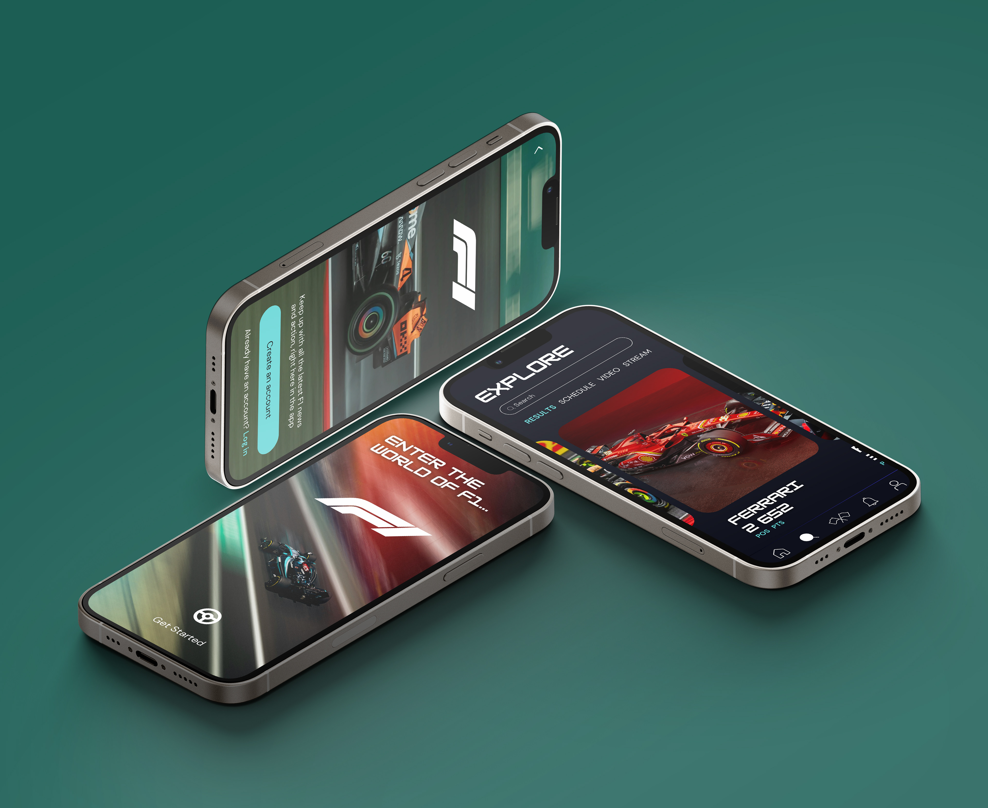
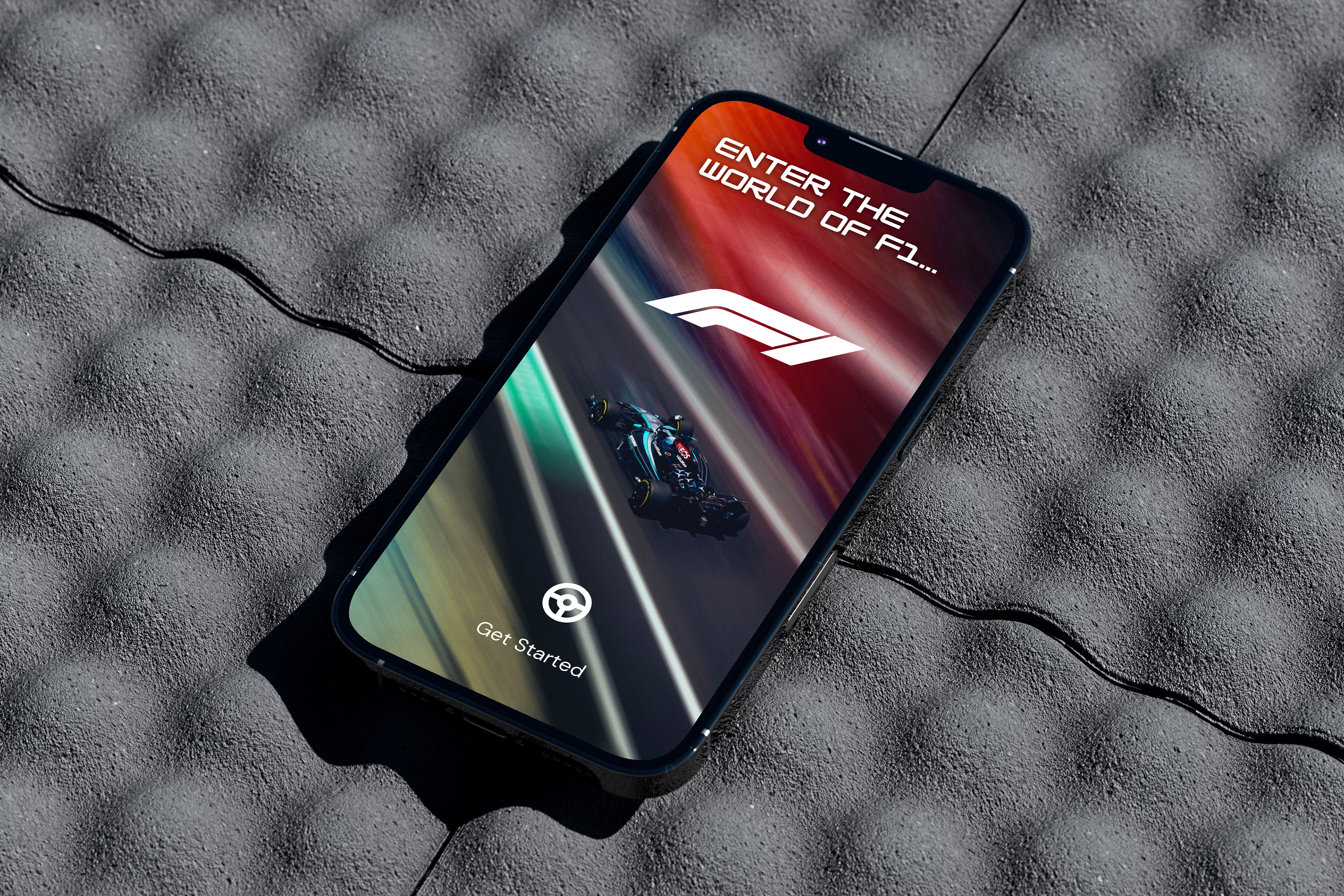
The page flow for the app is designed to guide users through an intuitive journey, ensuring they access key features with ease. It starts with a loading screen, offering a brief introduction before transitioning to the login page, where users can securely access their personal accounts.
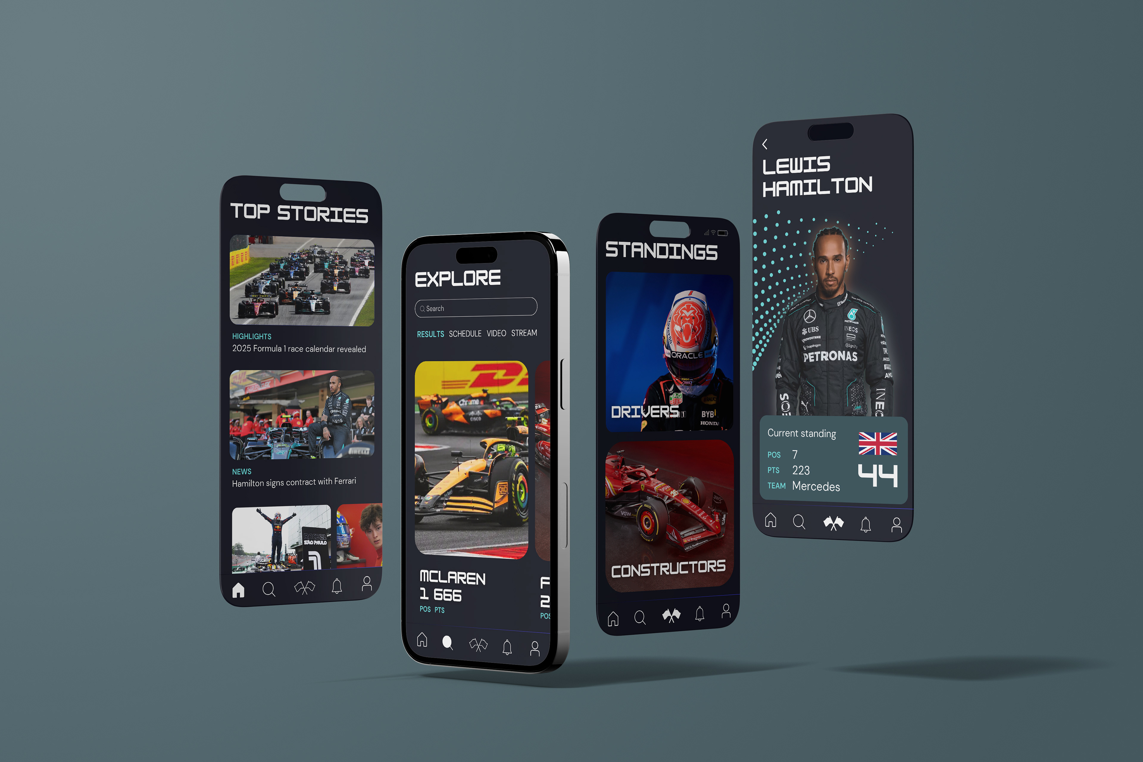
Once logged in, they’re directed to the homepage, which showcases top stories and live race updates. From here, users can navigate to the 'explore' section, where they can dive deeper into team news, upcoming races, and other specific content.
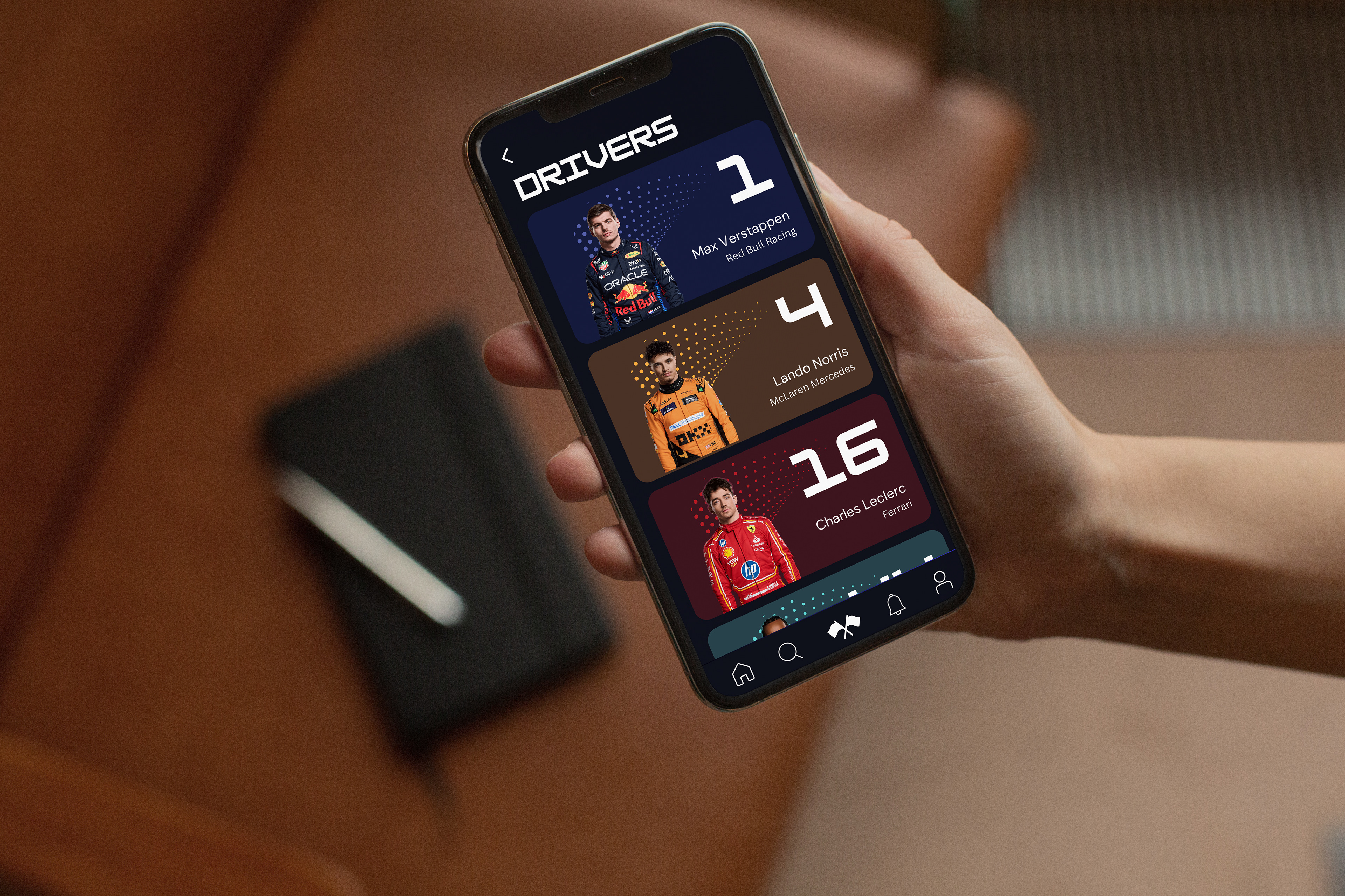
The 'driver standings' page allows fans to track performance, compare stats, and get information on their favourite drivers. The notifications page ensures users stay up-to-date with alerts for live events, breaking news, and race developments. The account page provides easy access to personal settings and preferences. Finally, users can return to the login page as needed for session management, ensuring flexibility and security throughout their app experience. This fluid, structured flow ensures the app is both user-friendly and feature-rich, catering to a wide range of F1 fan needs.
WIREFRAMES
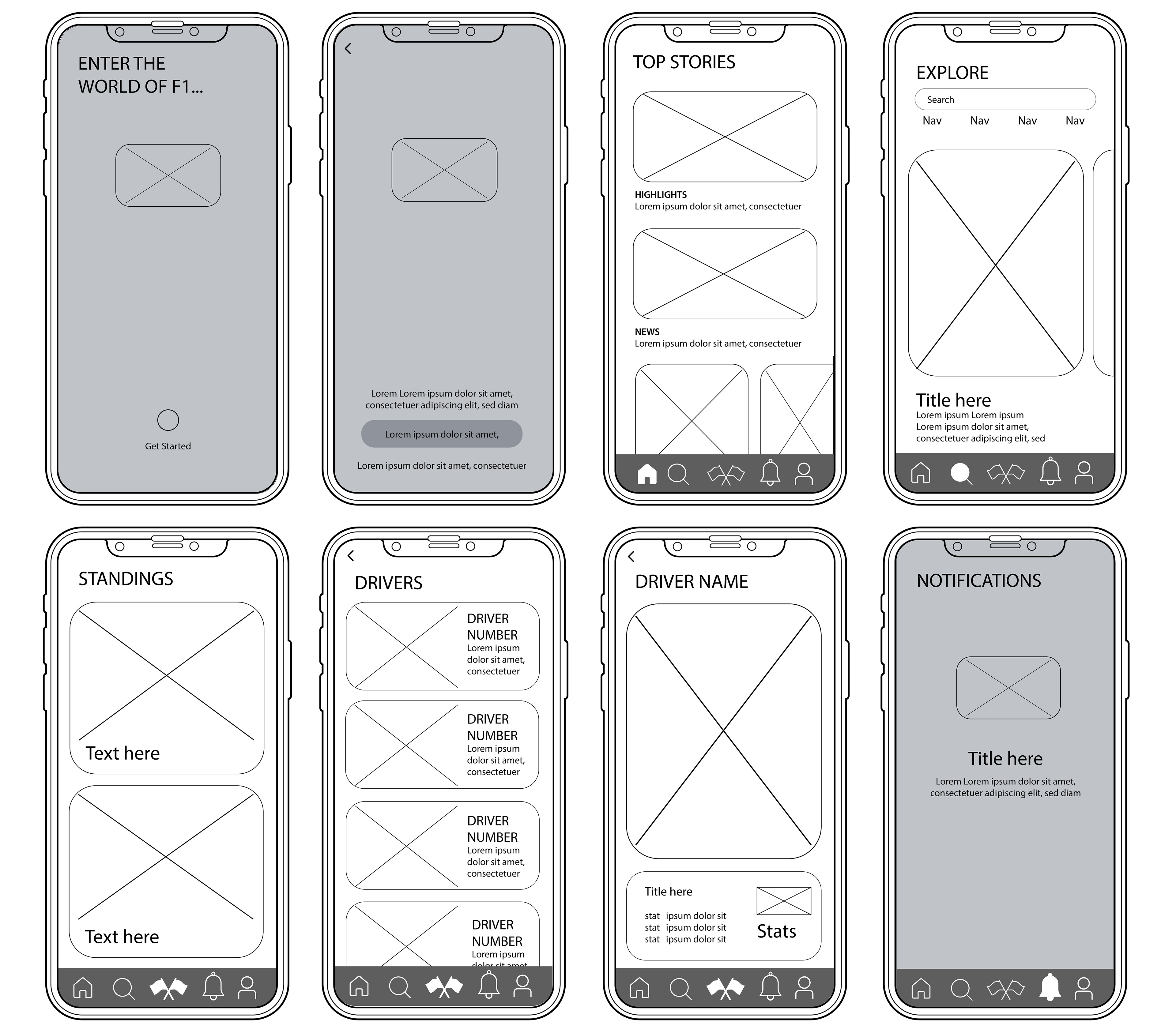
The wireframes in this project were designed to visually map out the structure of each essential page, focusing on the user flow and interactions. By outlining the key steps users would take to navigate through the site, the wireframes served as a blueprint for ensuring a seamless and intuitive experience. This process allowed us to identify potential usability issues early and optimise the navigation, ensuring that users could easily access the content and features they needed.
BRANDING
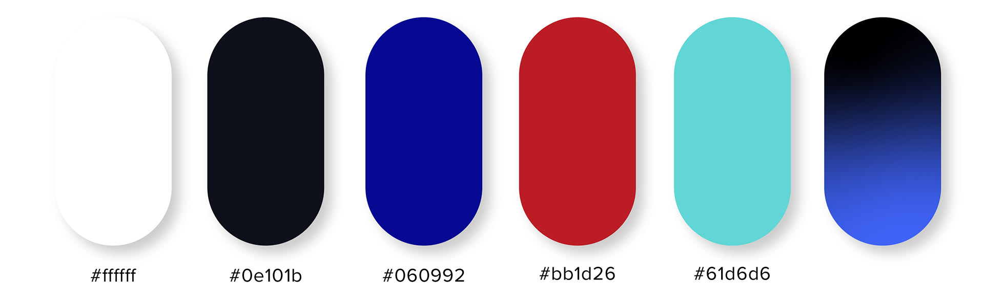
Colour palette
The colour palette draws inspiration from the iconic colours commonly associated with Formula 1 racing. Dominated by bold reds, striking blues, and sleek blacks, these hues reflect the high-energy, competitive nature of the sport. Red symbolises speed and power, often linked with Ferrari and other teams' branding, while blue evokes the precision and technology that drive the sport forward. Black, a staple in F1 aesthetics, represents sophistication, engineering excellence, and the high-performance machines at the heart of every race. Together, these colours create a dynamic, fast-paced look that resonates with the world of Formula 1.
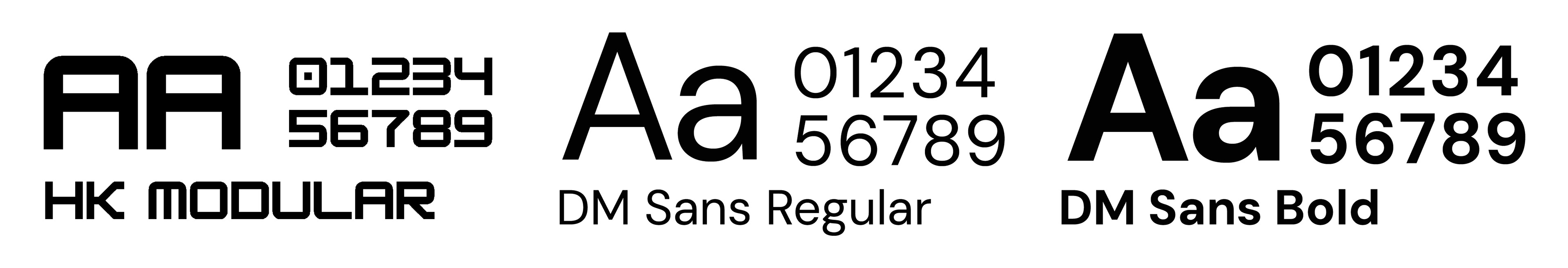
Typefaces
The primary typeface, HK Modular, is reminiscent of classic racing fonts, evoking the bold, dynamic style found in motorsport branding while offering a modern twist. This choice creates a strong, impactful presence that mirrors the energy of F1 racing. For body text, the DM Sans font family was chosen for its clarity and legibility, especially on smaller screens. Its clean, sans-serif design ensures that users can easily read updates and race information, even in fast-paced or on-the-go contexts, offering an optimal reading experience across all devices.
OUTPUTS