EDITORIAL, 2022
LONDON'S GUIDE TO FAMOUS MURDERS
LONDON'S GUIDE TO FAMOUS MURDERS
London's Guide to Famous Murders initiates a captivating series of guide books that delve into the realm of notoriously famous crimes across the globe. This meticulously crafted publication aims to bridge a gap in the guide book market, specifically catering to the ever-growing audience fascinated by true-crime narratives. With a target audience of young adults who harbour a keen interest in the genre, this series endeavours to fill the gap and offer an immersive and enthralling exploration of some of the world's most infamous cases.
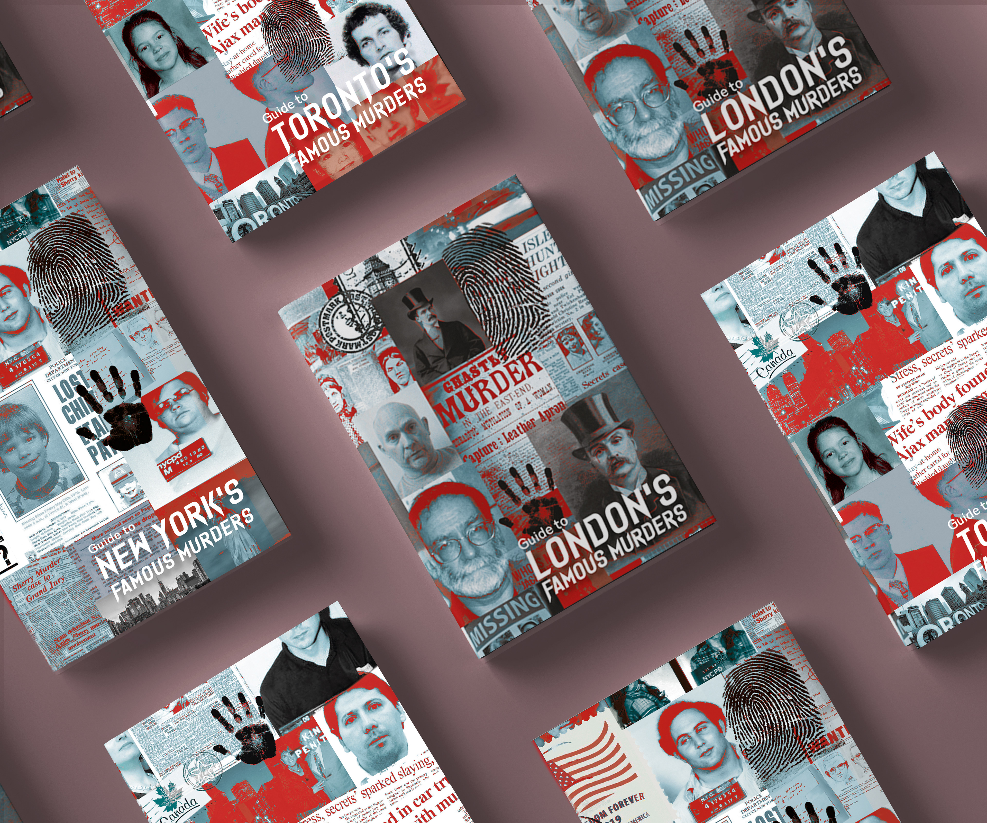
Guide to London's Famous Murders
Within each issue, readers can expect a comprehensive exploration spanning approximately 200–250 pages, delving into the top 10 most renowned criminal cases within a specific city. Departing from the conventional true-crime genre aesthetic, this series embraces a distinctive visual approach. Instead of relying on the prevalent use of shadows and silhouettes, it adopts a captivating 'murder-map' style. This innovative design merges multiple images of evidence, suspects, and newspaper articles, creating a compelling visual tapestry that immerses readers in the intricate web of each case. The result is a visually captivating and thought-provoking journey through the realm of true crime.
BRIEF
The brief for this project was to create a guidebook series on a specific topic that has potential space in the market, targeting a niche audience with clear, unmet needs. The series had to be designed in a way that each individual book was both informative and engaging, yet also ensured cohesiveness across the entire collection. This involved careful attention to size, subject matter, and branding, ensuring that each guidebook fit seamlessly into the series while maintaining a strong individual identity. The content had to be tailored specifically for the target audience, with an emphasis on making the information accessible and practical. The visual design needed to reflect the branding of the series as a whole, with consistent use of colours, typography, and imagery to tie the guides together. The challenge was to balance distinctive branding with functional design, ensuring that the series felt like a unified body of work, offering a comprehensive, yet varied approach to the subject matter.
RESEARCH
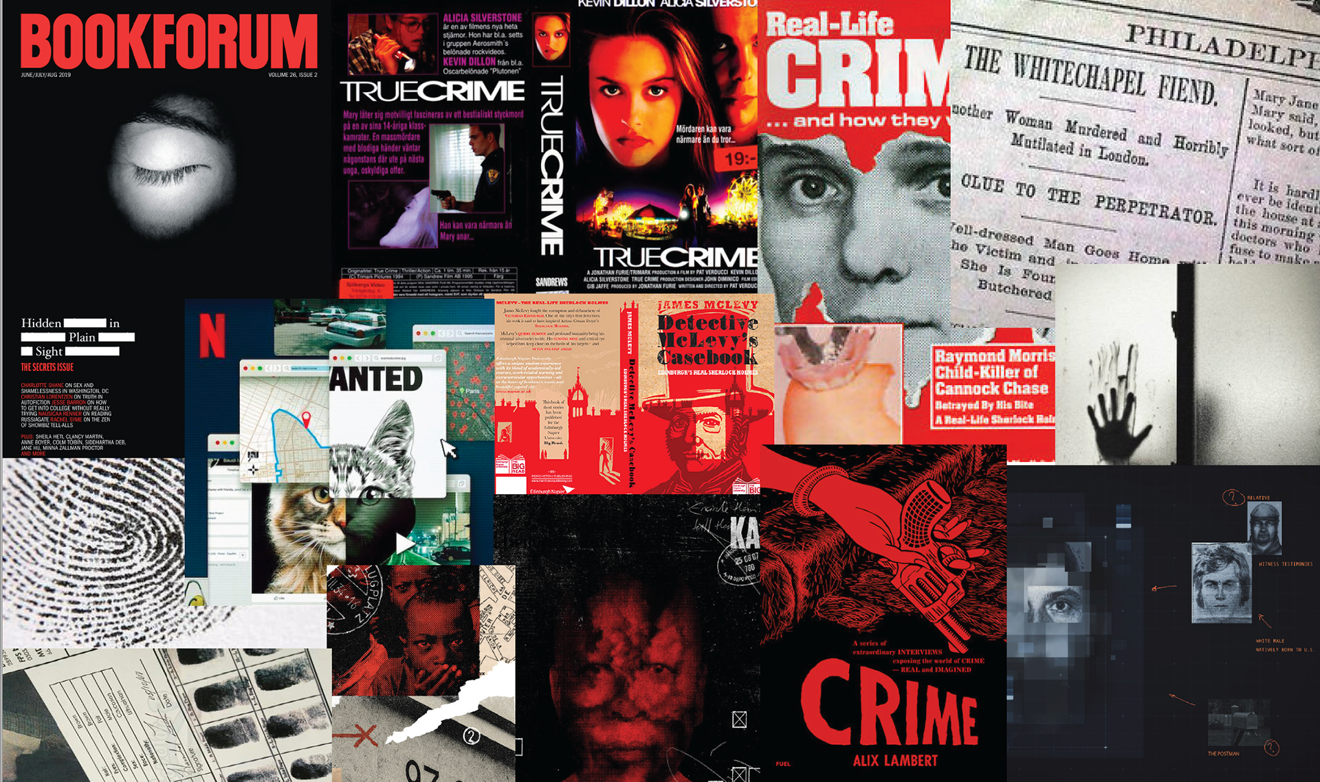
Moodboard
Prior to researching content for the guide, careful consideration was given to its overall aesthetic and dimensions. The primary objective was to craft a guidebook that stood out from the existing market offerings. Moving away from the conventional imagery typically associated with the genre of 'crime,' which often features shadows, silhouettes, and enigmatic figures, a deliberate shift was made towards incorporating authentic real-life visuals. This involved integrating elements such as newspaper clippings and suspect photographs, thereby immersing readers in a more tangible and evocative representation of the subject matter. The intention was to create a visually distinctive and engaging experience, capturing the essence of true crime in a novel and captivating manner.
BRANDING

Colour palette
For the colour palette, dark hues like red and black were used to reflect the book's darker, more intense genre, creating a mood that aligns with the subject matter. To balance this and provide clarity, brighter colours like yellow and blue were introduced to distinguish between different chapters and sections. However, to maintain a cohesive, moody aesthetic, the shades of these brighter colours were selected to be slightly darker, ensuring they complemented the deeper tones without overpowering the overall design. This combination allows for visual hierarchy while keeping the guidebook's tone consistent and engaging.

Typefaces
During the process of selecting a suitable typeface for the body text, an array of serif options was thoroughly explored. Cochin, when scaled down, exhibited decreased legibility compared to Garamond and Bodoni, which showcased higher legibility due to their bolder weights. A meticulous analysis of each typeface's performance on sample pages was undertaken, leading to the final selection of Freight Text Pro Book. The decisive factor in choosing Freight Text Pro Book was its generous x-height, contributing a contemporary touch to the overall page spreads. To ensure clear differentiation between the main text and subheadings within individual chapters, the bold variant of Freight was retained as the typeface for subheadings, maintaining visual hierarchy and enhancing readability.
OUTPUTS
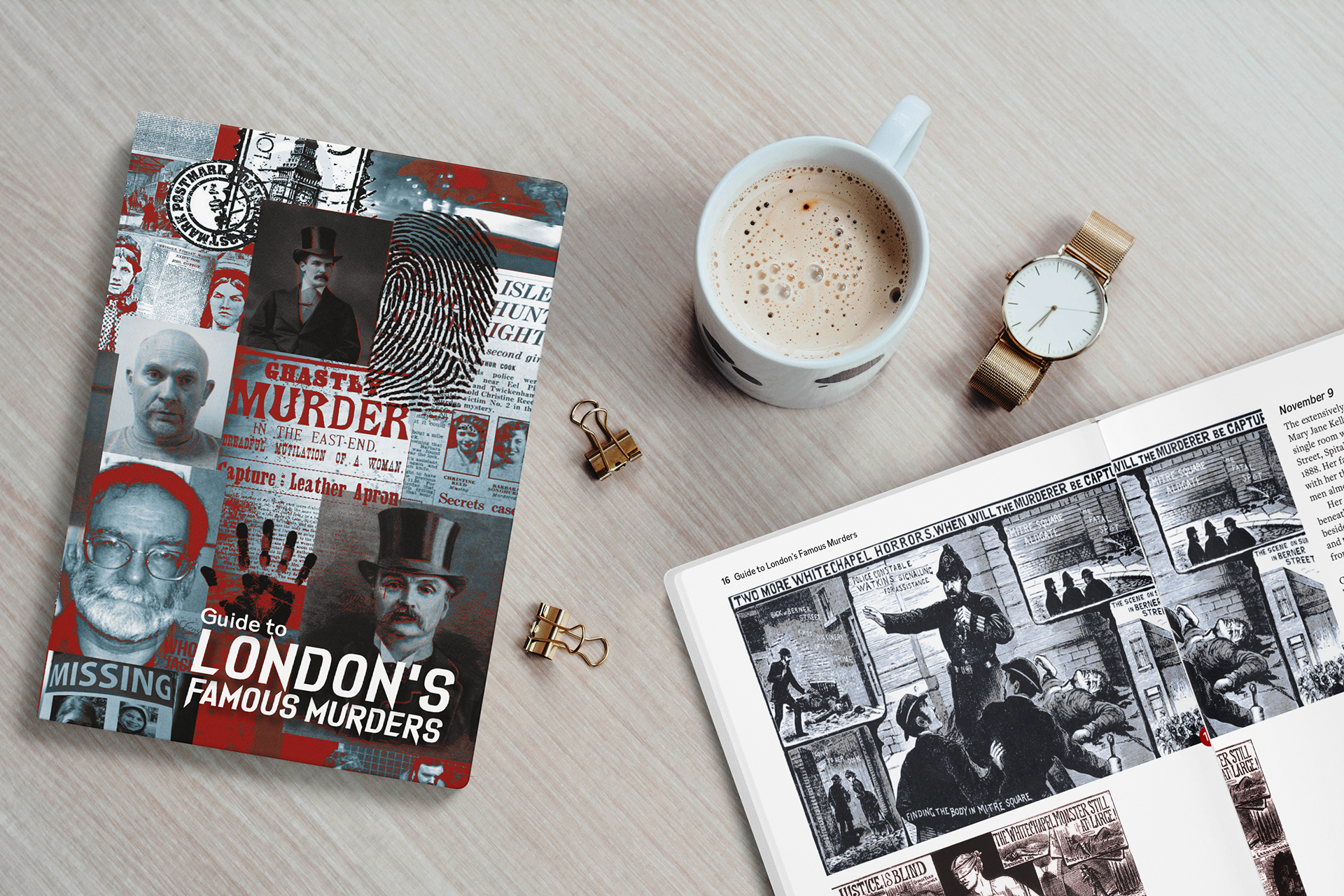
Guide book
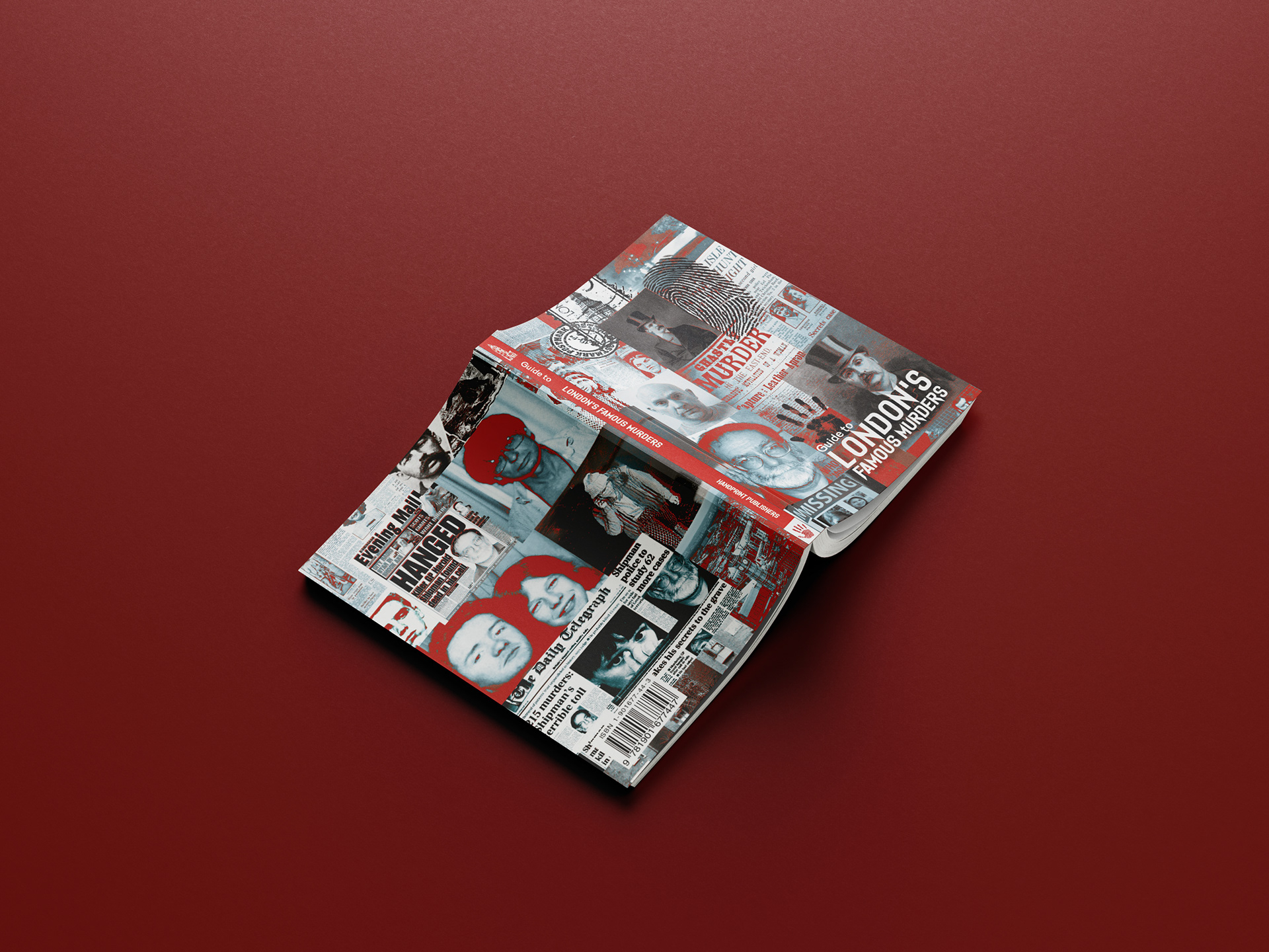
Full cover design
When considering typography, the choice of typefaces played a crucial role in conveying the desired atmosphere of the genre. The headings were elegantly set in Dark Seed, a typeface renowned for its angular and sharp edges, effectively reflecting the brooding animosity inherent in the true-crime genre. To complement this aesthetic, Cansu, a complementary sans-serif typeface, was employed for the subheadings. The pairing of these typefaces worked harmoniously to evoke a rugged and gritty ambiance, aligning with the overall tone and intent of the guide book, capturing the attention and curiosity of readers. In terms of print finishes, a gloss spot varnish was applied on the title and red areas of the cover, in order to allow these to stand out against the darker shades of black and grey. This gloss effect also mimics the glossy sheen which is often found in blood, fitting well into the genre.
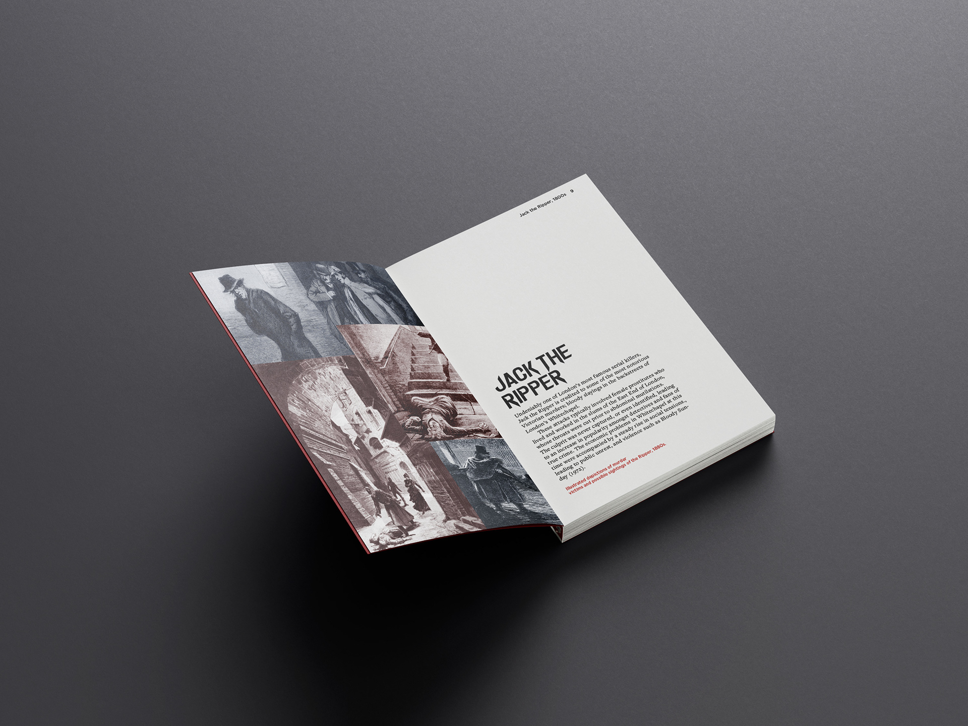
Inside pages
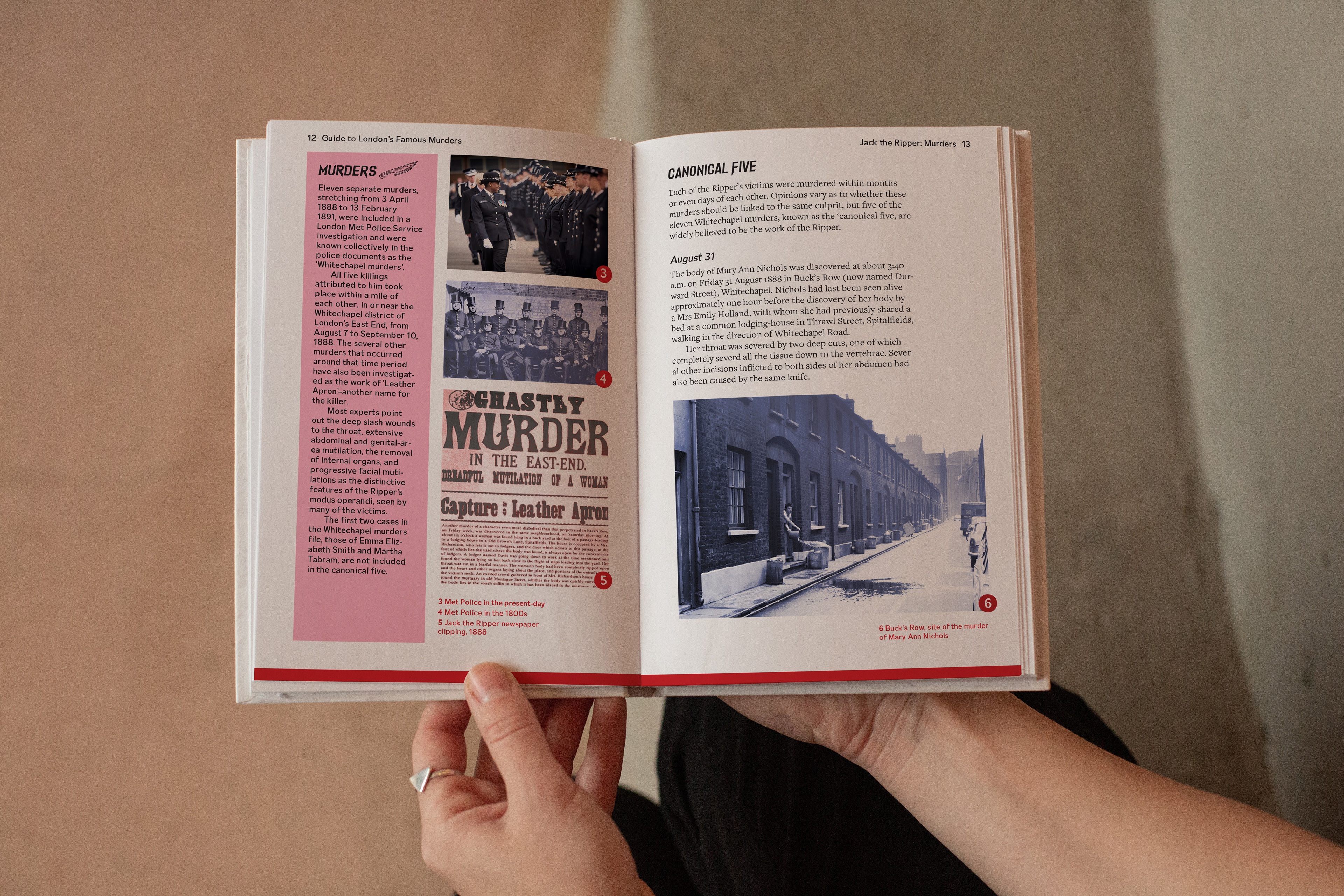
Inside pages
ONLINE PRESENCE

Guide book available on Amazon
The series of guides is readily accessible through major online book retailers, including Amazon and WHSmith, ensuring widespread availability for the intended target audience. By making the guides easily obtainable, they have become an essential addition to the true-crime genre. Notably, the uniqueness of the series lies in the fact that a comprehensive 'guide to murders' has been absent from the market until now. This gap has been filled by the availability of these guides, establishing them as an invaluable resource for true-crime enthusiasts and captivating readers with their unparalleled content.
