EDITORIAL, 2020
LARGE TYPE IN PUBLIC SPACES
LARGE TYPE IN PUBLIC SPACES
Design for a typographic book titled ‘From the Book to the Streets: Large Type in Public Spaces'. The aim was to design a book cover and page layouts which was purely typographic, reflecting the feel of the inside pages and genre.
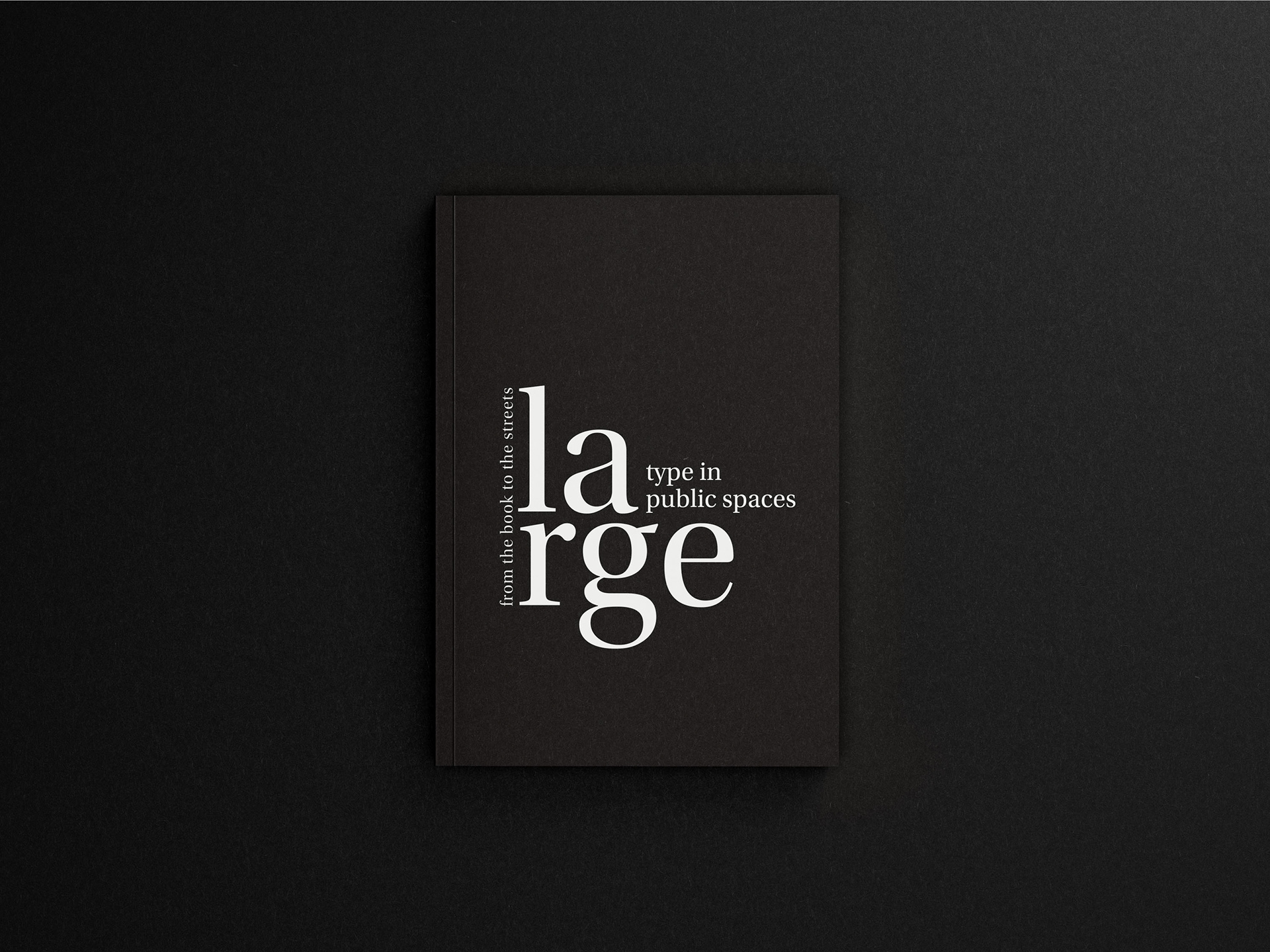
Front cover design
BRIEF
The brief for this project was to design a cover for the book Large Type in Public Spaces, using typography as the sole design element. The challenge was to create a bold, eye-catching cover that effectively communicates the book’s focus on large-scale type in urban environments, without relying on any imagery or illustration. The design needed to explore creative uses of scale, hierarchy, spacing, and font choice to reflect the impact and presence of typography in public spaces. The goal was to produce a cover that feels both modern and striking, capturing the essence of the subject matter purely through innovative typographic treatment.
BRANDING
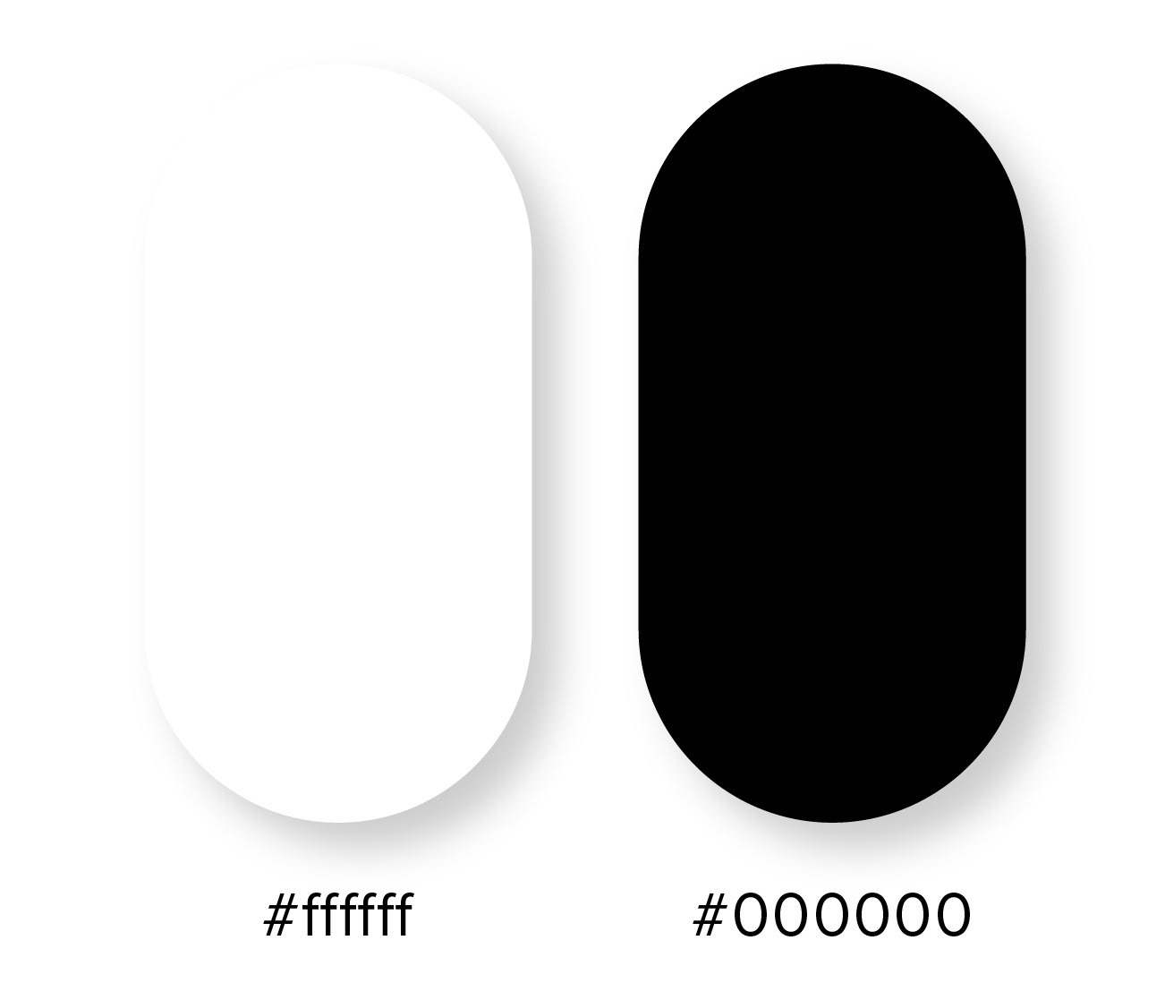
Colour palette
The colour palette of black and white has been deliberately chosen to complement the book’s focus, as the topic lends itself to a more monochromatic aesthetic. By using a minimalistic approach, the stark contrast between black and white emphasises the impact of typography and text, drawing the reader's attention to the content itself. This simplicity allows for a clearer focus on the structure, form, and flow of the written word, ensuring that the message is communicated with clarity and sophistication. The restrained use of color also enhances the visual rhythm of the layout, allowing the typography to take center stage without distraction.

Typeface
The design choices for the typography were carefully selected to enhance the overall aesthetic and readability of the book. The display typeface, Bodoni Poster, was chosen for its bold, sophisticated presence, with its thick strokes and high contrast adding a sense of elegance and visual impact to the headers and cover. For the main header and cover text, Utopia Standard was used, offering a perfect balance of creativity and structure with its distinctive serifs and varying thicknesses, which added a touch of refinement while still maintaining a modern feel. The body text was also set in Utopia Standard for its superior legibility, ensuring a smooth reading experience. To create a clear distinction between different sections, subheaders and captions were set in Gill Sans Nova, a sans-serif typeface chosen for its clean, contemporary look and its ability to provide contrast without overpowering the rest of the content. This thoughtful combination of typefaces ensures both aesthetic harmony and functional clarity throughout the design.
LAYOUT
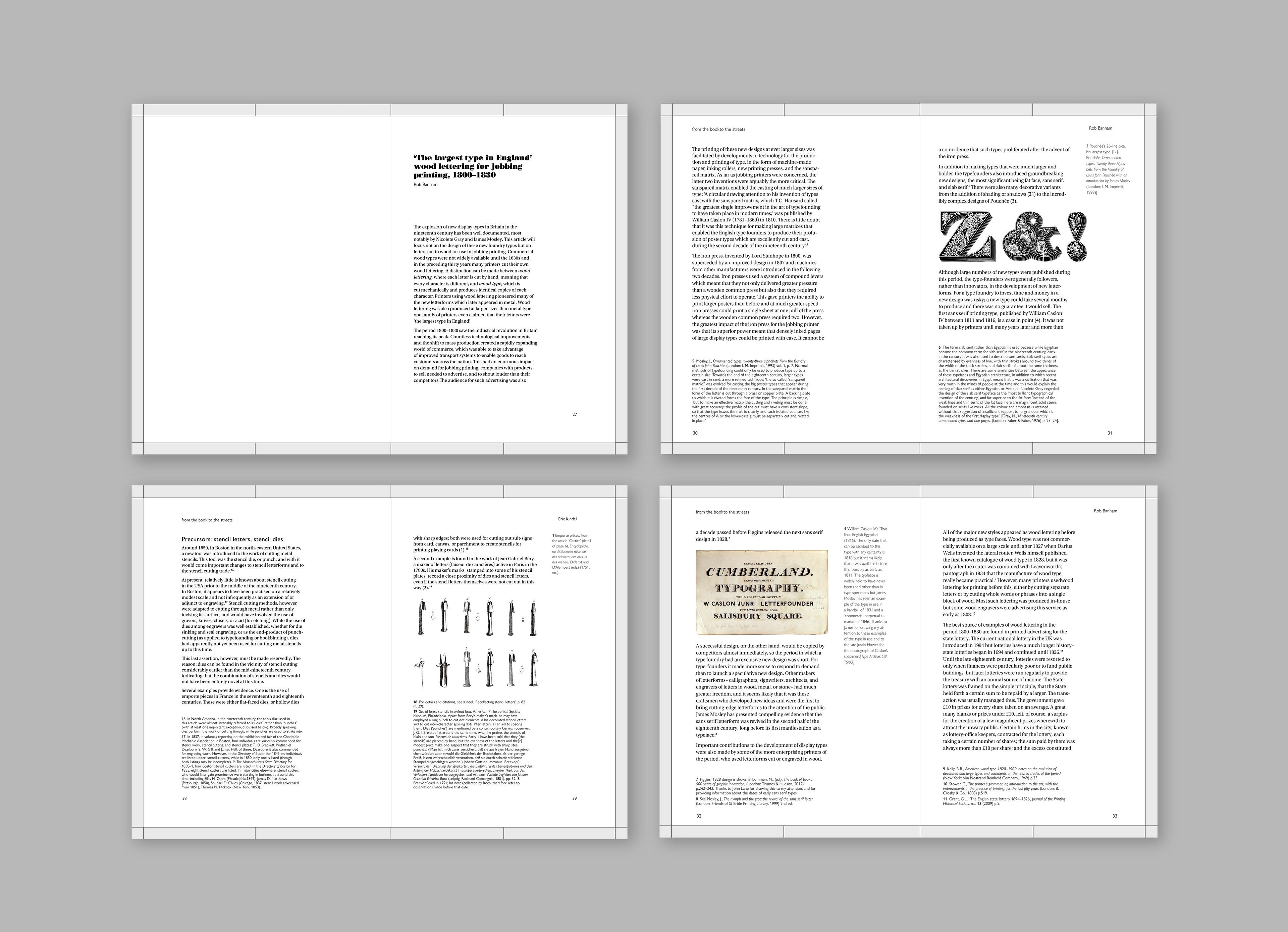
Page layouts
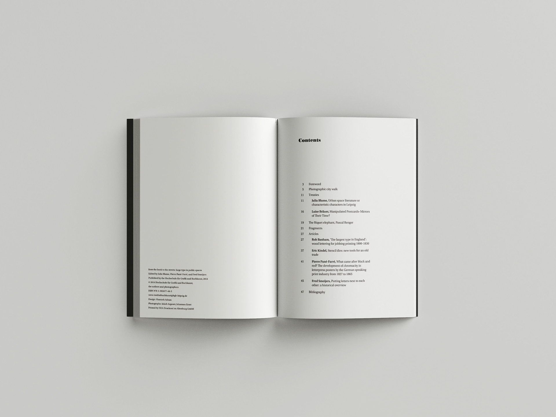
The primary objective in designing this book was to highlight meticulous typographic skills, crafting a visually striking cover that aligns with the genre and captivates the audience. To achieve this, the approach involved maintaining a predominantly minimalistic aesthetic for both the front and back covers. Given the potentially mundane nature of the genre, it was essential to create a design that would resonate with the intended audience and pique their interest.
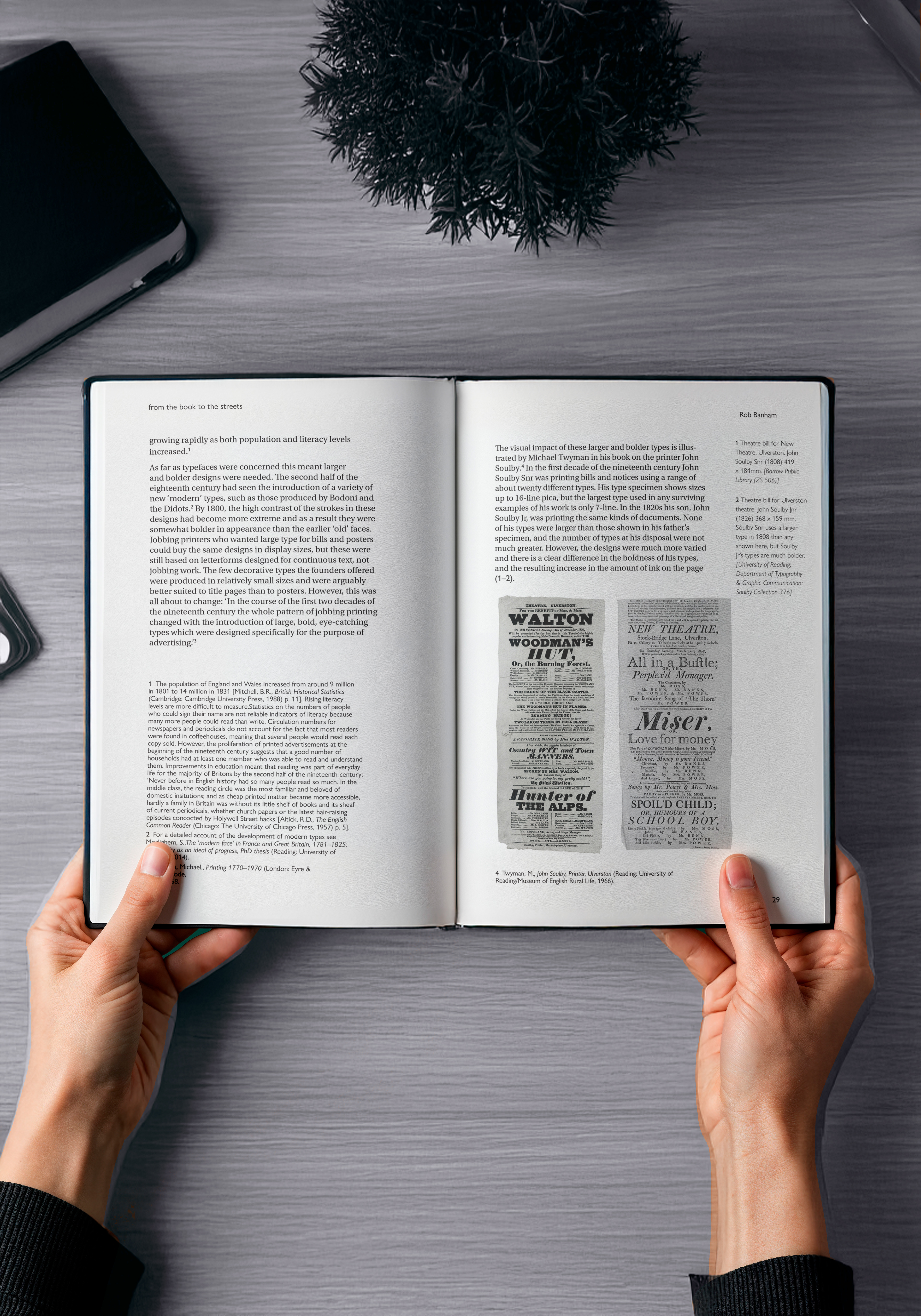
In the process of designing the inside pages of this book, special attention was given to incorporating smaller elements of information, such as footnotes and figure numbering. This necessitated a meticulous focus on typographic details to ensure optimal legibility and clarity of the content on each page. By carefully attending to these finer typographic elements, the goal was to enhance the readability and accessibility of the information presented throughout the book.
WEBSITE
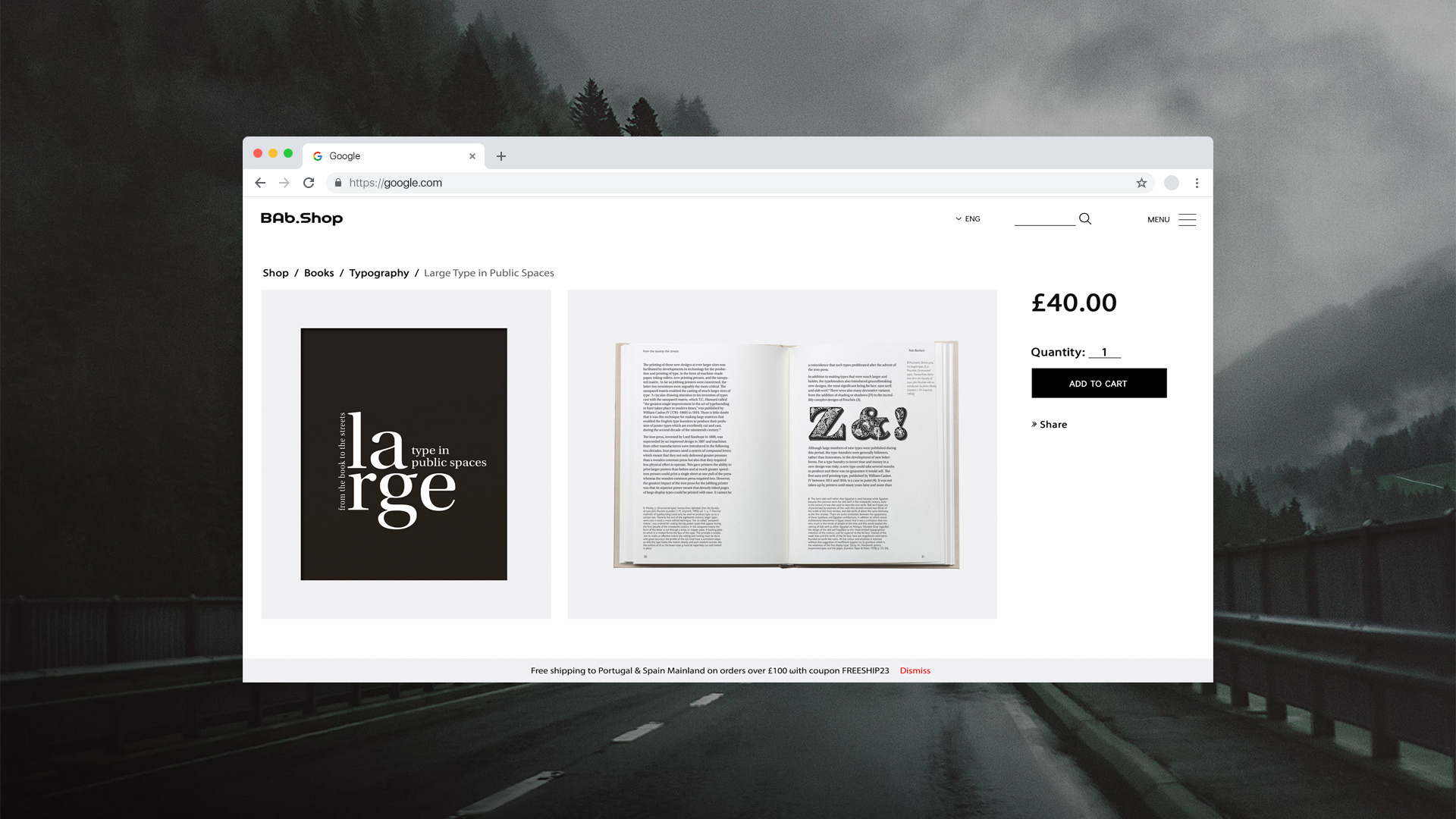
The website showcases the book available on an online retailer. It highlights the cover design, key features, and purchasing links, offering a glimpse into the book’s content and accessibility for a wider audience.
OUTPUTS
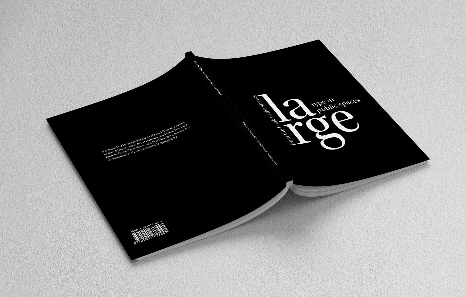
Full cover design
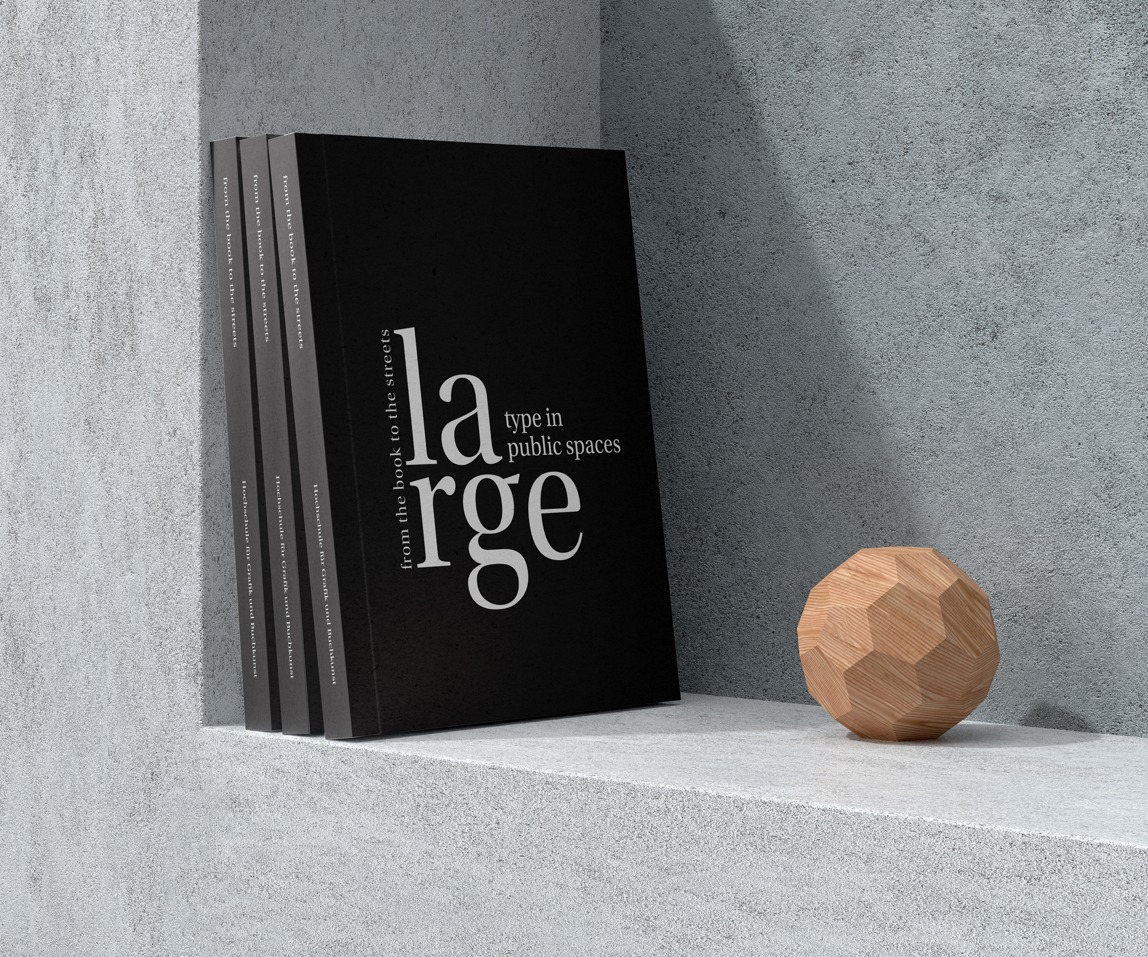
The decision to use a matte print finish on the whole cover was done to create some textural diversity. These in-situ mockups provide a realistic representation of the final product as well as offering a glimpse into the book's potential impact and the immersive experience it can provide to readers.
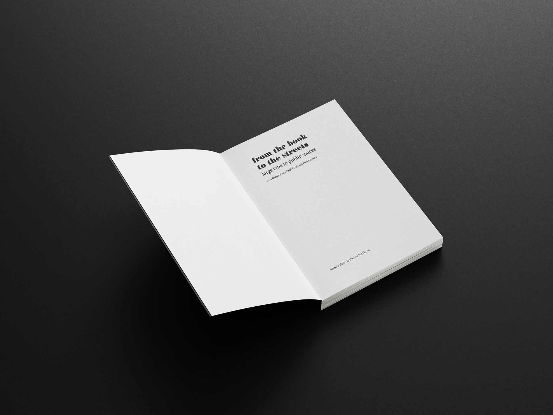
Example of inside pages
Example of inside pages
