INFOGRAPHICS 2023
LITTLE PICTURES
LITTLE PICTURES
The Little Pictures project, spearheaded by the European Space Agency Climate Office, is an innovative initiative that encourages designers, data analysts, and developers to leverage the wealth of datasets collected by the ESA. The project's fundamental aim is to transform complex climate data into easily understandable and visually appealing ‘little pictures.’
By providing access to these datasets, the project encourages creative minds to explore novel ways of portraying scientific information, making it more accessible to a broader audience. Through the fusion of artistic vision and data analysis, Little Pictures enables the creation of visually captivating representations that not only convey the underlying scientific insights but also evoke an emotional response. By fostering collaboration between the realms of science and design, the project plays a vital role in bridging the gap between complex climate data and public understanding, ultimately contributing to a greater awareness and appreciation of our planet's changing climate.

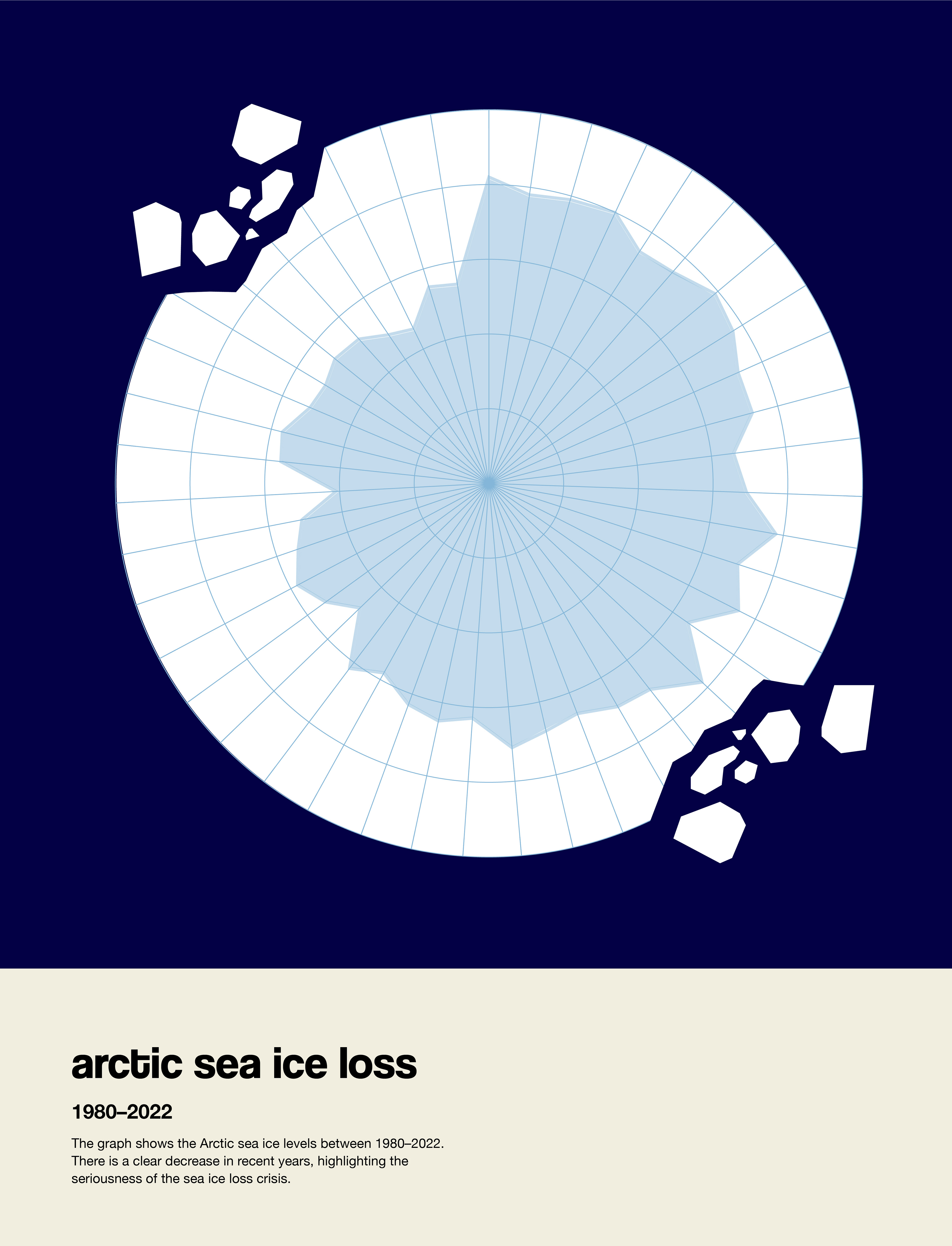
Radar graph showing Arctic sea ice loss data

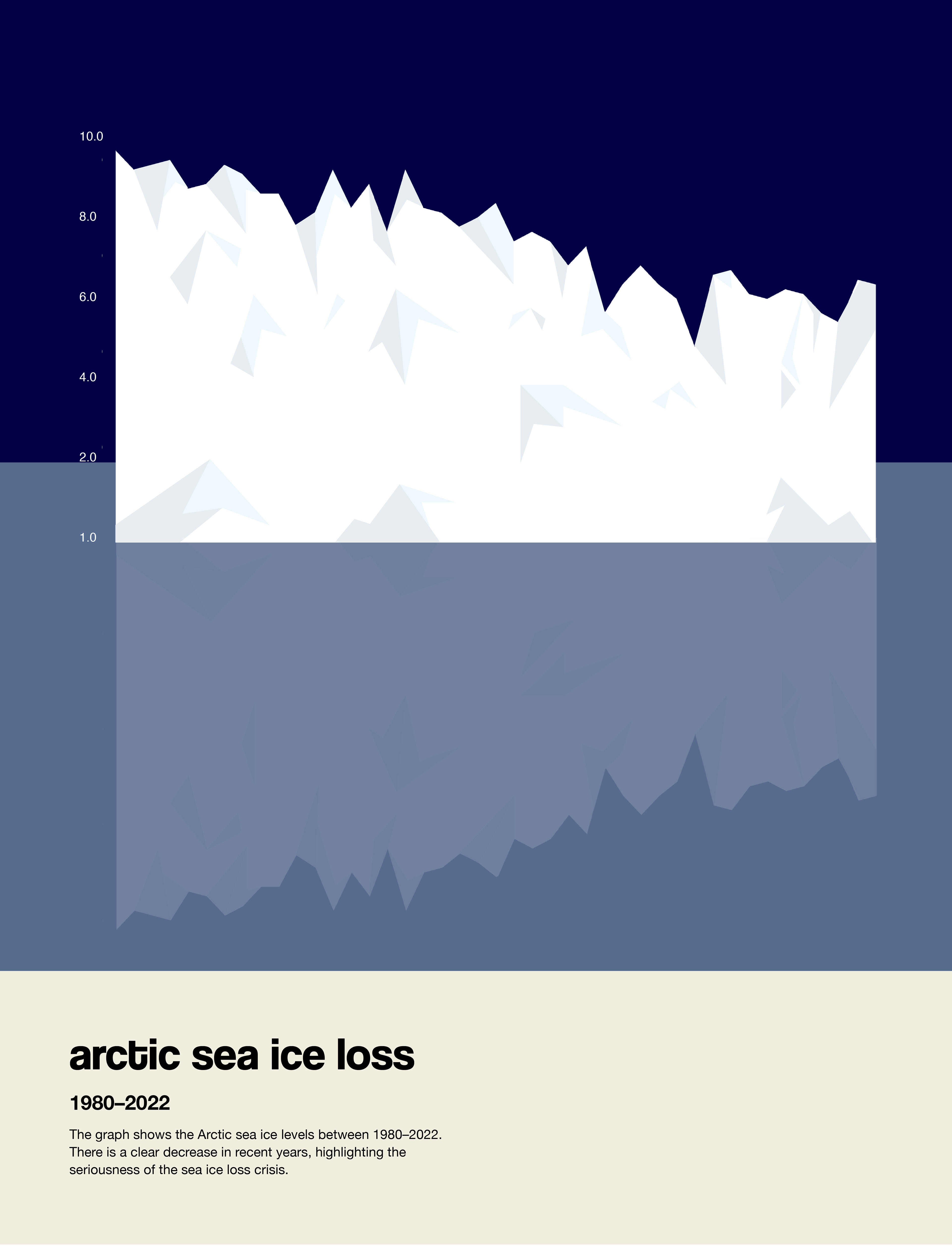
Area graph showing Arctic sea ice loss data
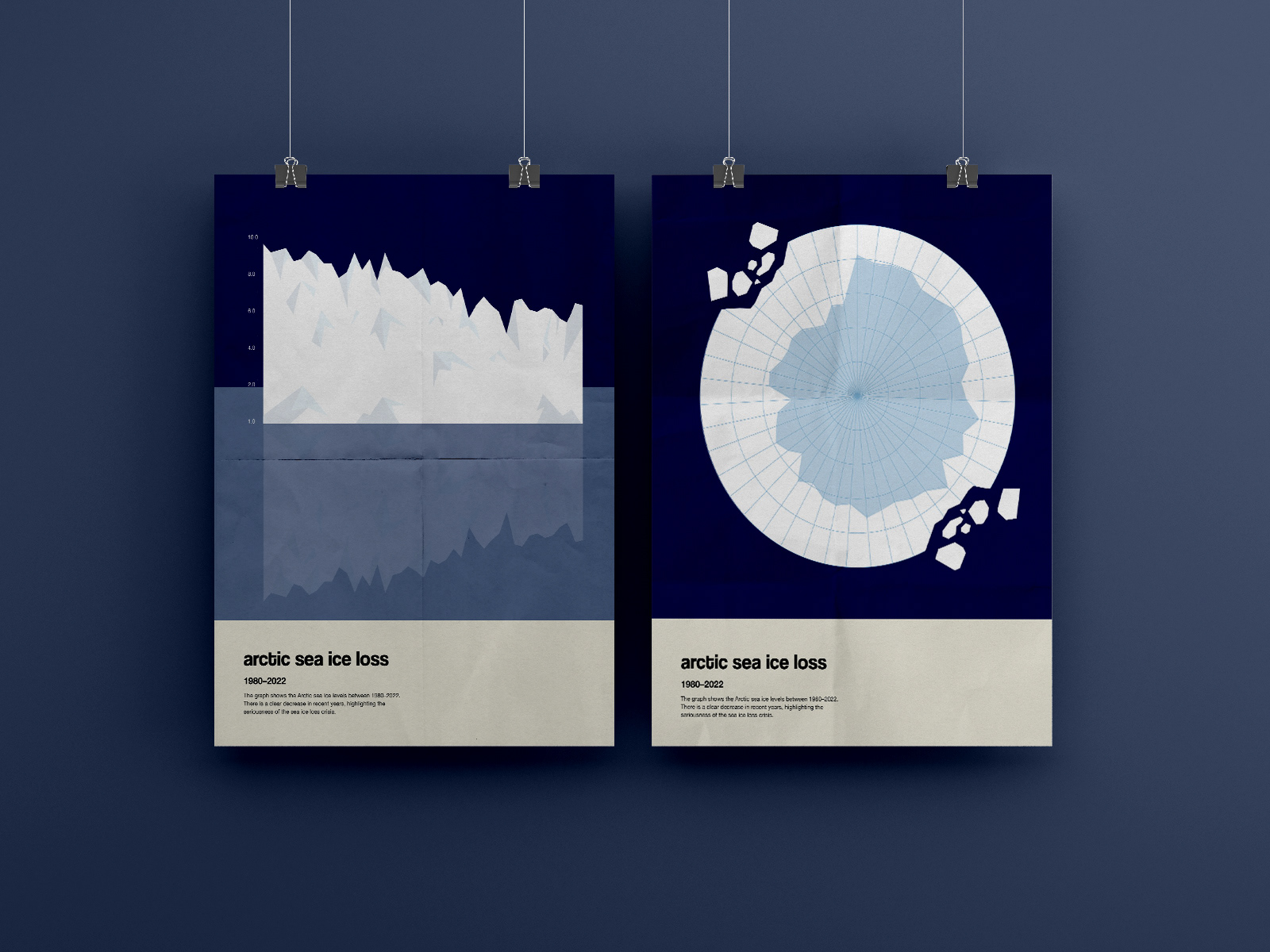
Utilising the same dataset provided by the ESA on Arctic sea ice extent, two sets of visuals were developed in order to portray the data in contrasting ways. Through careful analysis and thoughtful consideration of the dataset's intricacies, two unique visual representations were created, conveying different perspectives of the same topic. The radar graph shows a visual representation of a bird’s eye view of the area covered by arctic sea ice, and its decrease in recent years. On the other hand, the area graph showcases the rapid decline in sea ice levels through a more literal iceberg visual.
The data used was the ESA’s Arctic sea ice extent, given in million km2 as measured by satellites from 1979–2022 and can be accessed here.
BRIEF
The brief for this project was to create a data visualisation poster based on a provided dataset surrounding environmental data. The aim was to transform complex information related to environmental factors—such as carbon emissions, deforestation rates, or climate change trends—into a visually compelling and easily digestible format. The deliverables included a large-scale poster that not only communicated key insights from the data but also told a visual story, engaging viewers with both informative and aesthetic elements. The challenge was to present the data in a way that was both accurate and accessible, using techniques like charts, graphs, and illustrative elements to break down the information clearly, while ensuring the design remained impactful and thought-provoking.
DESIGN PROBLEM & SOLUTION
The project’s fundamental aim is to transform complex climate data into easily understandable and visually appealing ‘little pictures.’ The problem was making dense climate data, such as trends and environmental impacts, accessible and meaningful to a broad audience without oversimplifying it.
The solution was a data visualisation poster that distills key insights into an intuitive visual hierarchy, using charts, graphic elements, and illustration to guide the viewer through the story. The final design balances accuracy with visual impact, transforming raw data into an informative, thought-provoking piece that encourages understanding and reflection on environmental change.
DATA ANALYSIS


Dataset

Dataset
The data used in this project was provided by the ESA and was collected over a span of more than four decades, from 1979 to 2022. Through the use of satellites, the ESA diligently captured and recorded a wealth of valuable information pertaining to various aspects of climate, which can be accessed here.
BRANDING

Colour palette
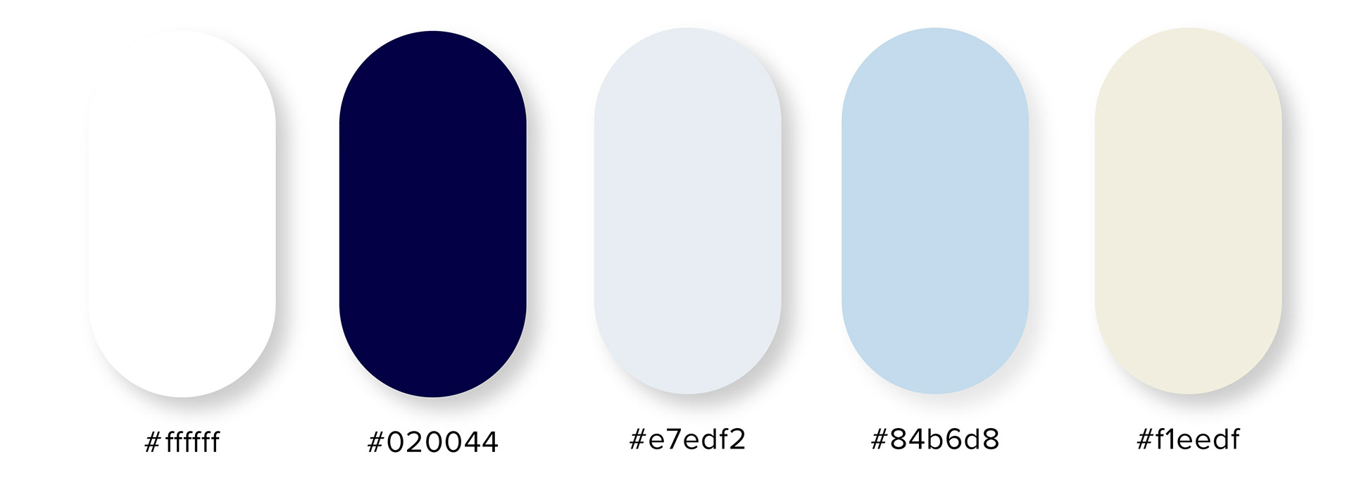
The colour palette of blue and white hues has been carefully chosen to reflect the nature of the data, specifically exploring the effects of Arctic ice loss. The varying shades of blue symbolise the cold, icy environment of the Arctic, while the use of white evokes the vast, snow-covered landscapes that are at risk due to climate change. These colours help to communicate the serious and urgent nature of the topic, while maintaining a calm and scientific tone. The palette not only reinforces the connection to the Arctic's natural environment but also creates a sense of clarity and focus, allowing the data to take centre stage and making the information both visually compelling and thematically appropriate.

Typeface
Coolvetica Bold and Helvetica Neue were chosen for this project for their clean, modern aesthetic and versatility. Coolvetica Bold is a playful yet strong variant of the classic Helvetica, offering a more dynamic, rounded edge while maintaining the timeless appeal of the original. Helvetica Neue, on the other hand, is a refined and updated version of Helvetica, known for its neutral and highly legible design. Together, these fonts strike a balance between contemporary style and readability, making them ideal for a variety of design applications, from branding to web content.
OUTPUTS

