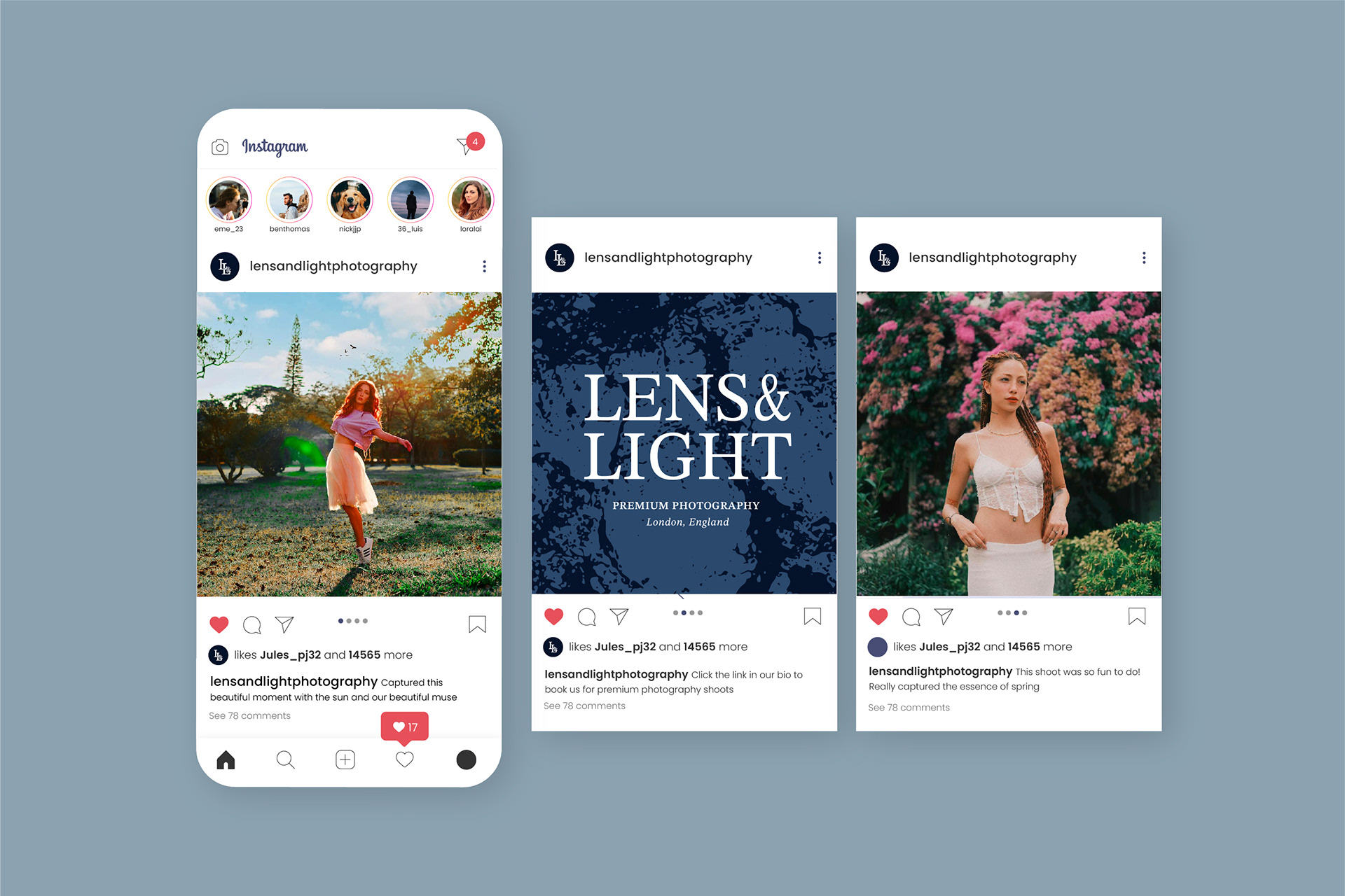
branding, 2024
lens & light
Lens & Light is a photography company dedicated to capturing exquisite, high-quality images for its clients. Their mission is to showcase the premium quality of their services while fostering a connection between the subject and the viewer, inviting individuals to embark on a journey of exploration and appreciation.
Business cards
BRIEF
The aim of this project was to design a complete brand identity for a photography company, creating a visual language that reflects the company’s style, values, and target audience. The brief focused on developing a brand that feels professional, creative, and contemporary, while also being adaptable across various platforms and materials. Key deliverables included a logo, typographic system, colour palette, and examples of branded assets such as business cards, social media templates, and watermarks for imagery. The goal was to ensure the branding not only stood out within the competitive photography industry but also clearly communicated the company’s specialism—whether that be portrait, event, lifestyle, or editorial photography. The result needed to be clean, memorable, and flexible enough to grow with the business over time.
BRANDING
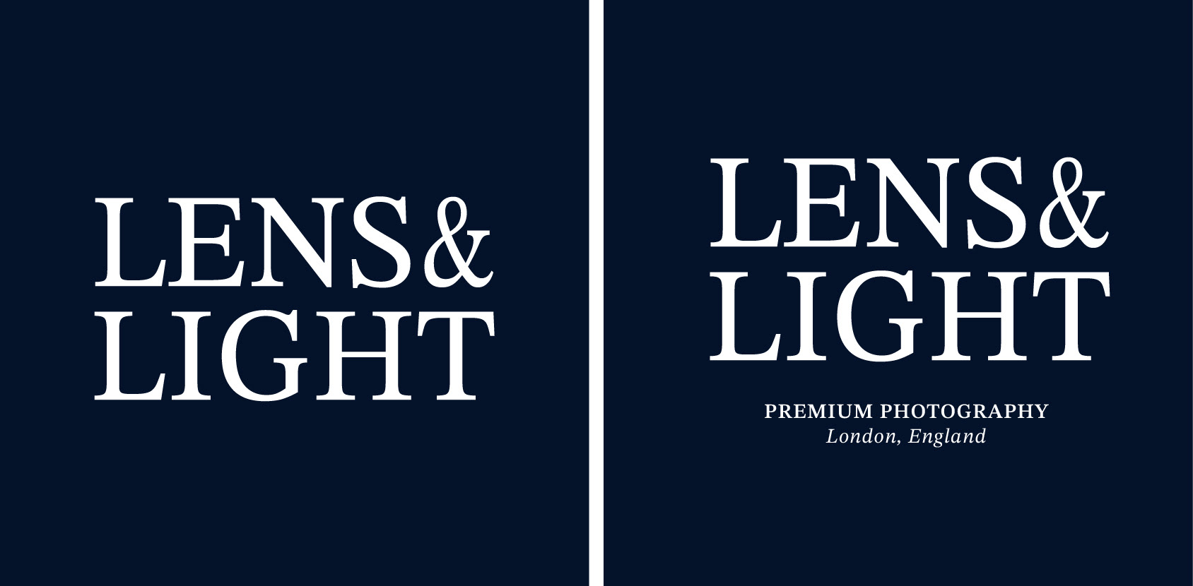
Primary logos

Secondary logos
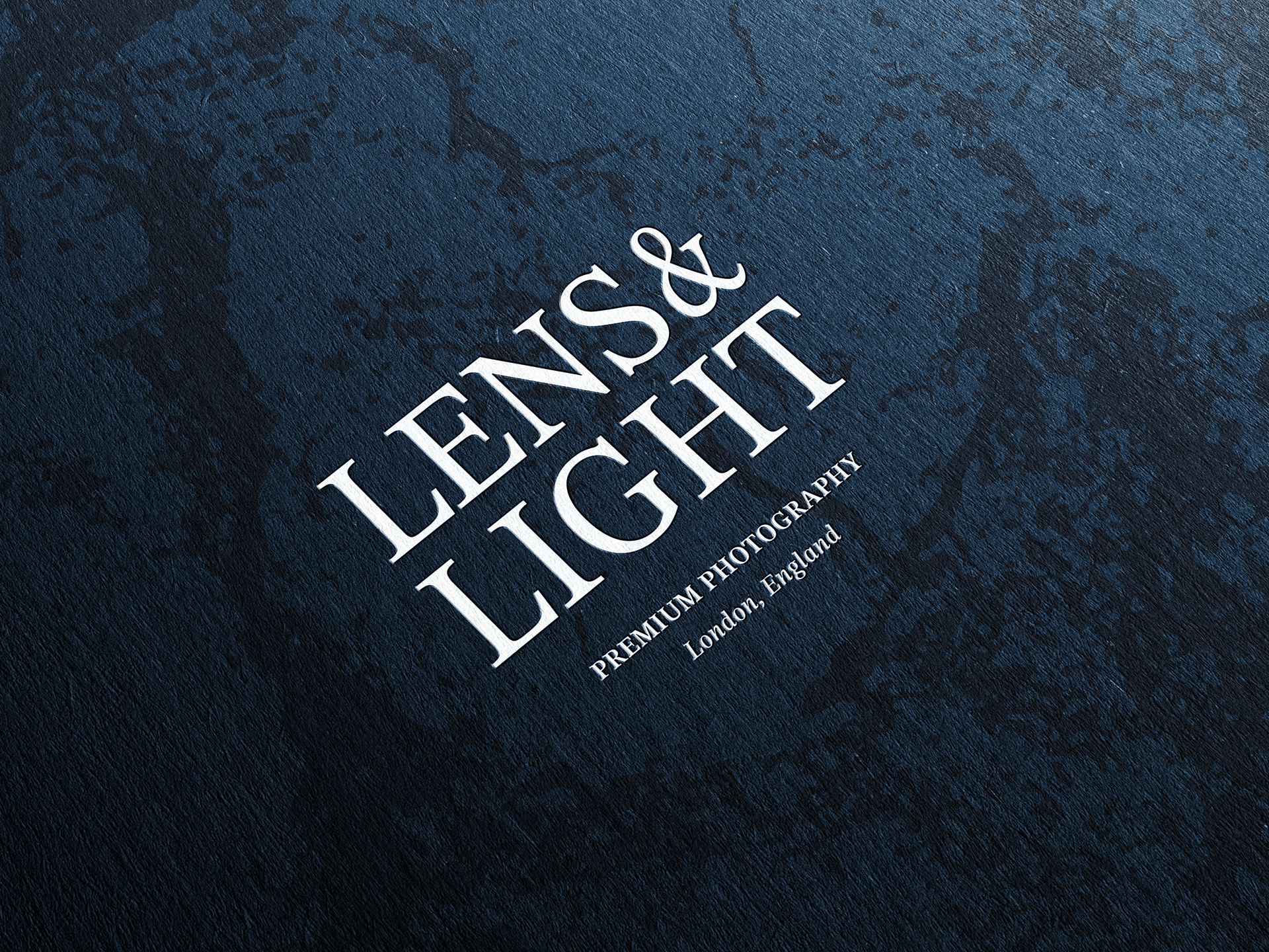
The logo design aimed to integrate elements traditionally associated with photography, particularly cameras, to create a visually striking and meaningful symbol. The intent was to combine key features like the lens, camera outline, and initials, symbolising the company's commitment to capturing fleeting moments. By merging these recognisable elements, the logo effectively conveys the company's luxurious portfolio and its dedication to preserving and celebrating special experiences through their work.
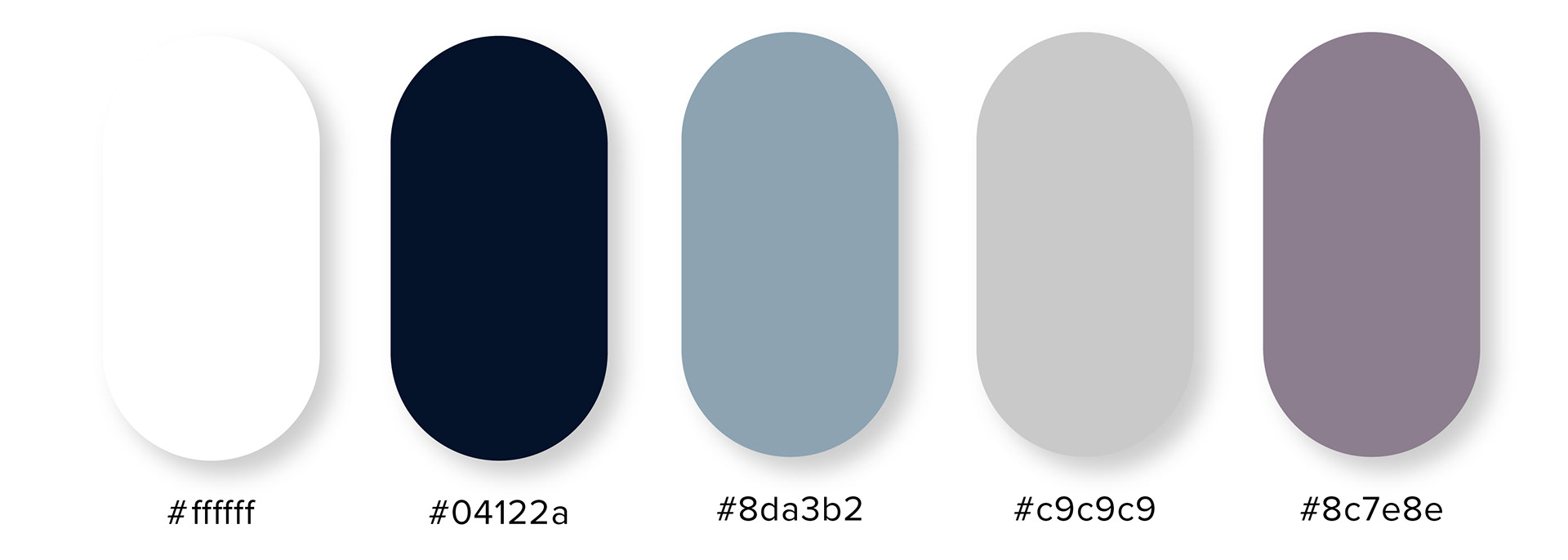
Colour palette
The chosen colour palette embraces a darker, grunge-inspired aesthetic, designed to convey sophistication and depth. The combination of rich mauve and deep navy creates a striking contrast that feels both contemporary and refined. The mauve, with its muted purple undertones, evokes a sense of calm and introspection, while the navy adds a grounding, professional tone, enhancing the overall feeling of trust and reliability. Together, these colours work in harmony to create an atmosphere of understated elegance.

Typeface
The typeface family chosen is STIX Two Text, a serif font that contributes to a professional and polished aesthetic. Its clean lines and classic form not only enhance the overall design but also ensure optimal legibility, even in smaller spaces. The serifs help guide the eye, making the text easier to read and more approachable, which is particularly important for the various touch-points where space is limited, such as brochures and social media. This typeface balances sophistication with functionality, ensuring that the message is both clear and visually appealing.

Textures


The texture pattern used throughout the design incorporates a blend of dark and light shades, symbolically reflecting the brand name "Lens and Light." The interplay between these contrasting tones creates depth and dimension, representing the balance between focus and clarity, much like how a lens captures and refines light. This subtle yet impactful pattern not only reinforces the brand's core identity but also adds visual interest and texture to the design, aligning perfectly with the themes of perception, insight, and illumination that are central to the NGO’s mission.
OUTPUTS
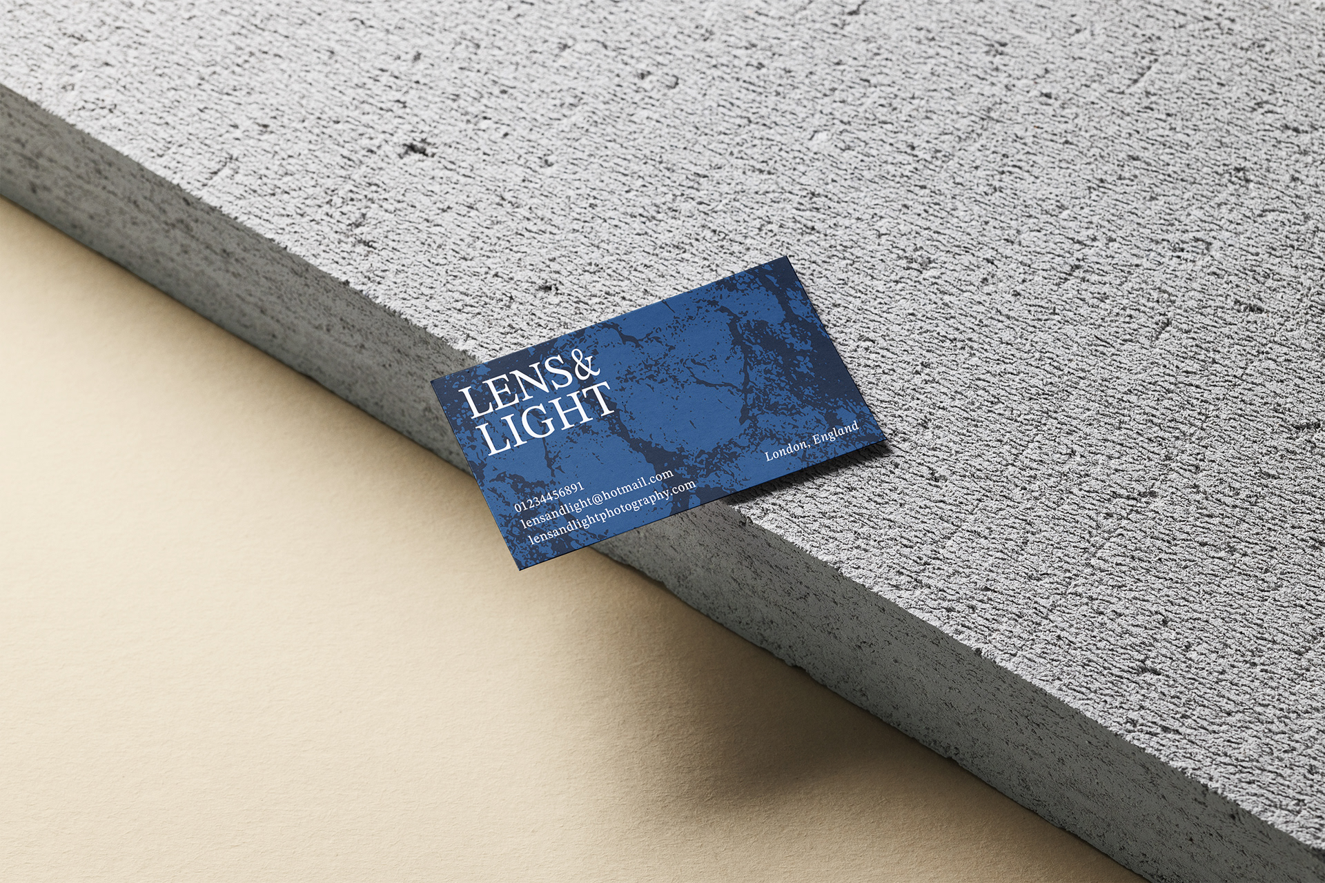
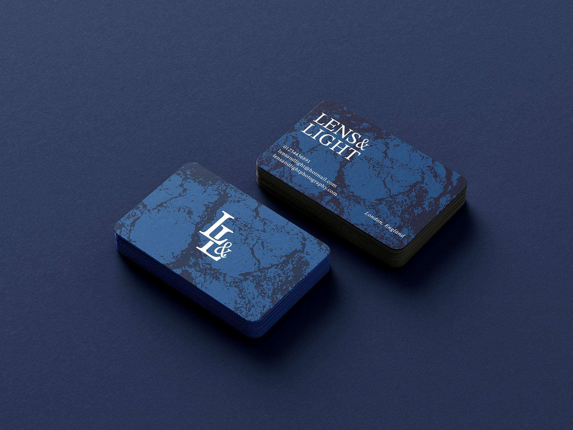
Business cards
