Print, 2020
RIBA
RIBA
This project involved developing material for the RIBA 2020 architectural conference. The primary objective was to design a poster, animation, and brochure that resonated with the conference theme of 'change in the city.' These materials were intended to be available for attendees at the conference, which specifically targeted architects and individuals with an interest in architecture.
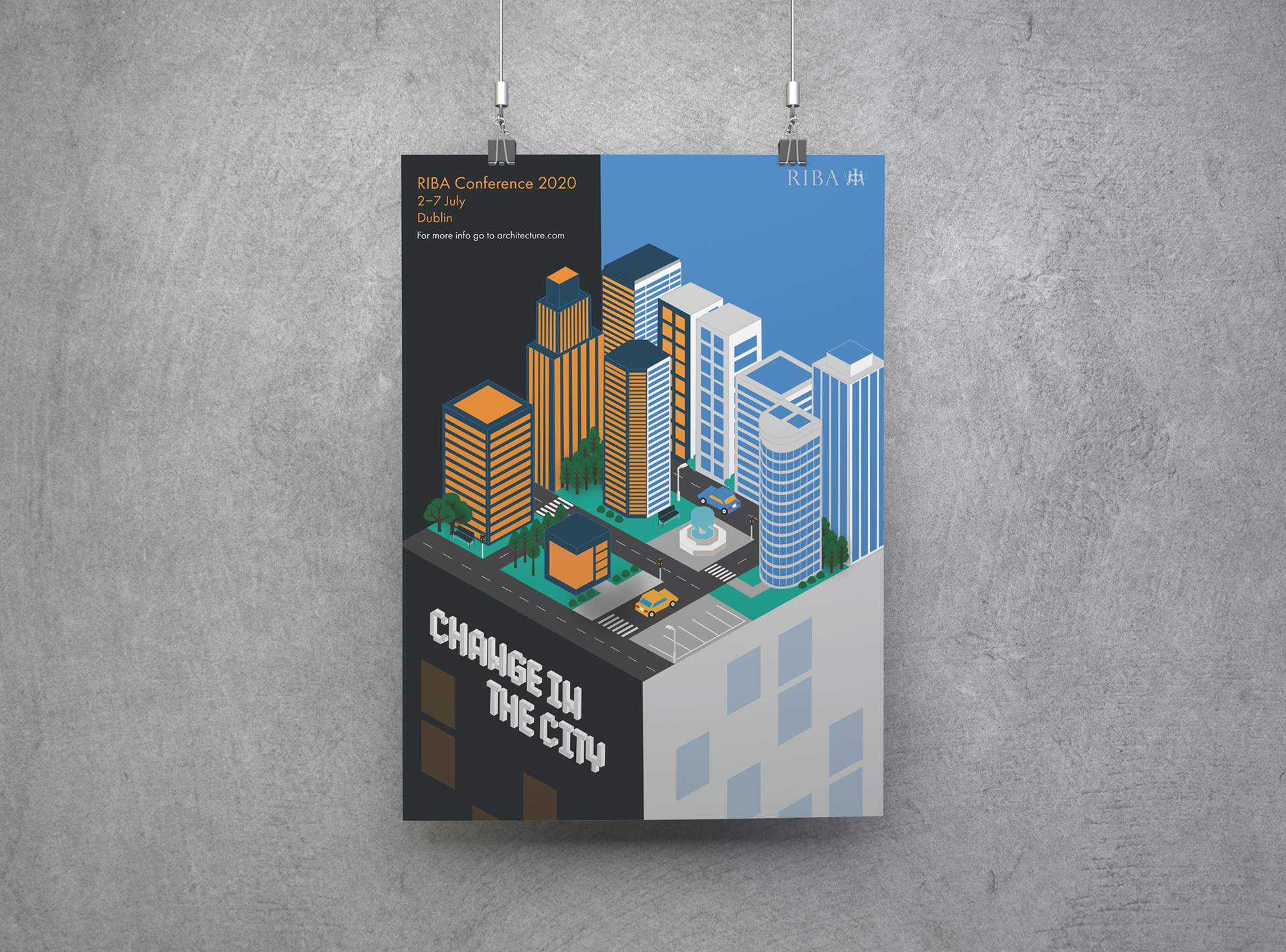
The design concept drew inspiration from the idea of incorporating the notion of change within an urban setting, involving both architects and the city's residents. The interpretation of 'change in the city' centred around the visual and literal transformation from daytime to nighttime. This concept sought to capture the dynamic and evolving nature of urban environments, reflecting the interaction between architectural design and the lived experience of the city's inhabitants.
BRIEF
The brief for this project was to design a poster and accompanying animation for the RIBA 2020 Architectural Conference, centred around the theme ‘Change in the City’. The aim was to create a striking visual identity that captured the evolving nature of urban spaces and how architecture responds to shifting social, environmental, and cultural demands. The design needed to reflect both the forward-thinking spirit of the conference and the architectural focus of the event. Alongside the main poster and animation, the deliverables included supporting collateral such as event brochures, digital assets, and promotional materials. The challenge was to ensure consistency across all formats while making each element visually engaging and informative. The animation brought the theme to life through motion, using visual metaphors and architectural elements to reflect transformation and progress within the urban environment.
BRANDING

Colour palette
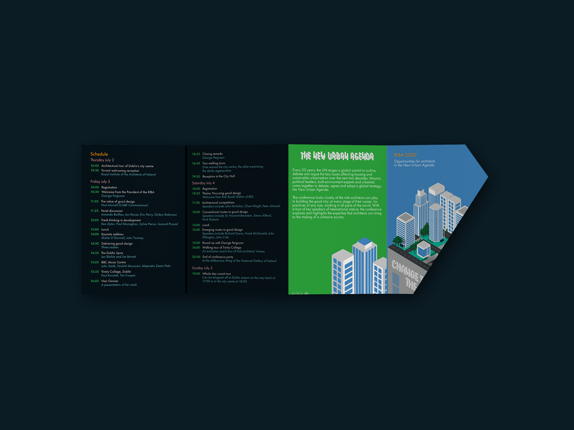
The colour palette featuring shades of blues and greens has been carefully chosen to reflect the themes of the conference, which focuses on architecture and urban spaces. Blue evokes a sense of structure, stability, and modernity, often associated with the built environment and the sky that frames it. Green, on the other hand, symbolises nature, sustainability, and the integration of green spaces within urban design. Together, these colours represent the harmonious balance between man-made structures and the natural world, aligning with the conference’s exploration of how architecture shapes and interacts with urban environments.

Typeface
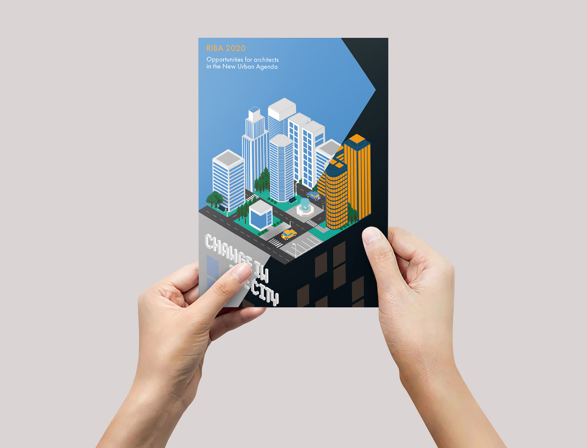
Multiple iterations were explored before arriving at the final colour palette and design for the project. During the process of refining these versions, it became evident that the typography was most effective when seamlessly integrated within the illustrations. Consequently, a choice was made to develop a custom 3D isometric typeface that would harmonise with the imagery and complement the selected existing typefaces. This decision was driven by the aim to create a cohesive visual experience where typography and visuals merge harmoniously.
OUTPUTS
Brochure design
Brochure design
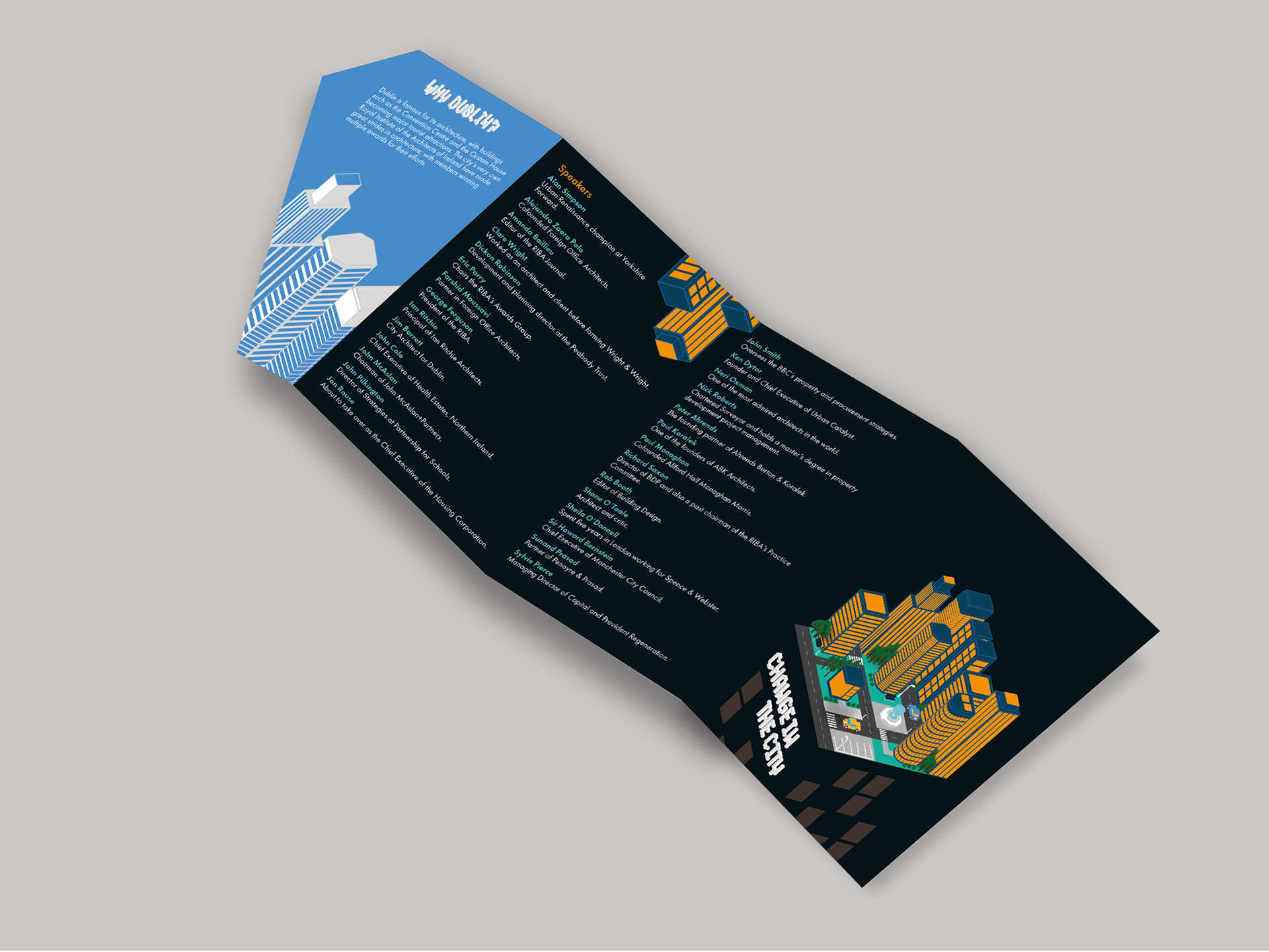
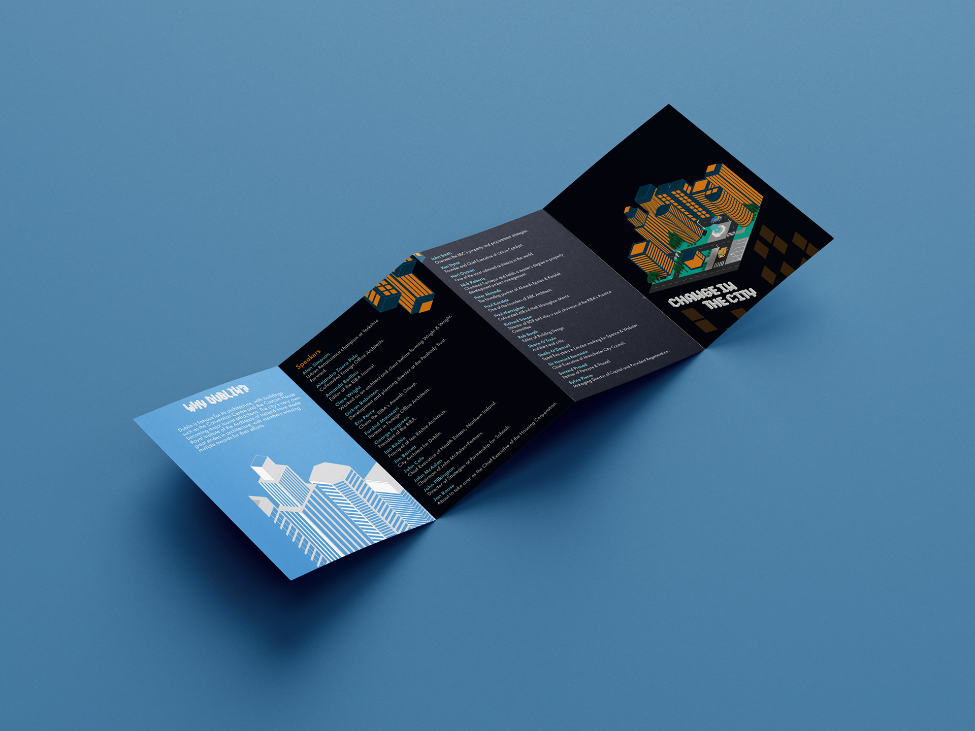
An accompanying brochure was created to complement the conference poster and provide attendees with additional information. The brochure included background details about the conference, a comprehensive list of speakers, and a schedule for the week's events. From a design perspective, the objective was to maintain a consistent visual style and carry forward the theme of 'change' evident in the poster. This was achieved by incorporating a cut-out feature on the front page of the brochure, symbolising the transition from daytime to nighttime. Furthermore, to ensure visual coherence, several colours from the front cover's illustration were employed in typography and background elements throughout the rest of the brochure.
ANIMATION
In the accompanying animation, the choice to further explore the concept of transitioning from daytime to nighttime, building upon the visual motif found in the poster and brochure. This involved creating individual frames for each sequence, each depicting a distinct time of day. As the animation progresses, viewers witness the evolving scenery, with lights illuminating and dimming on the buildings, symbolising the city's transformation throughout the day. This dynamic representation effectively captures the essence of change within the urban environment.
